


An update to the DfE Longitudinal Educational Outcomes (LEO) data means for the first time we can understand the industries in which graduates are working.
There’s a lot of detail and a lot of potential in this release, so strap in tight because we’re going to go in hard from the start.
One for the applicants
One of the initial LEO dreams was to support applicants in understanding how a particular course would have an impact on a future career path. Sam Gymiah (remember him?) even ran an app competition encouraging us to use the LEO dataset in innovative ways to make sure young people made the “right” choices.
These efforts always stumble over the problems set out in Kernohan’s First Law of Output Metrics:
You can’t meaningfully examine output metrics without controlling for sex, background characteristics, subject, provider, and region of residence, and any attempt to do this makes for unusably small sample sizes.
And with the release under examination ticking only four and a half of these six boxes, there’s a world in which I end this article here.
The fact that I haven’t should tell you that something interesting is going on – for the first time we can see the industry (indeed, to a sublime level of detail) in which graduates are working 1,3,5 and 10 years after graduation, and cross reference this over a number of other attributes including region of residence, background characteristics (including prior attainment, ethnicity, and free school meals status), and subject of study.
It’s probably easier just to see that:
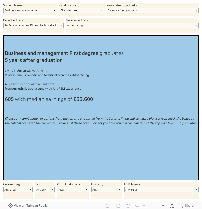
Choose as many categories as you like from the top and one from the bottom (what is this, Countdown?) to get a first look at the long term impact of characteristics plus career choice plus subject choice.
Stories we can now tell
One of the strengths of a degree is that it is not (in the main) vocational. There is a huge category of “graduate jobs” accessible with any degree, to balance alongside the jobs where a specific degree is needed to qualify. And even graduates from those very specialised courses don’t always go to (or stay in) the jobs you might expect.
For the first time we can look at how this happens over five years.
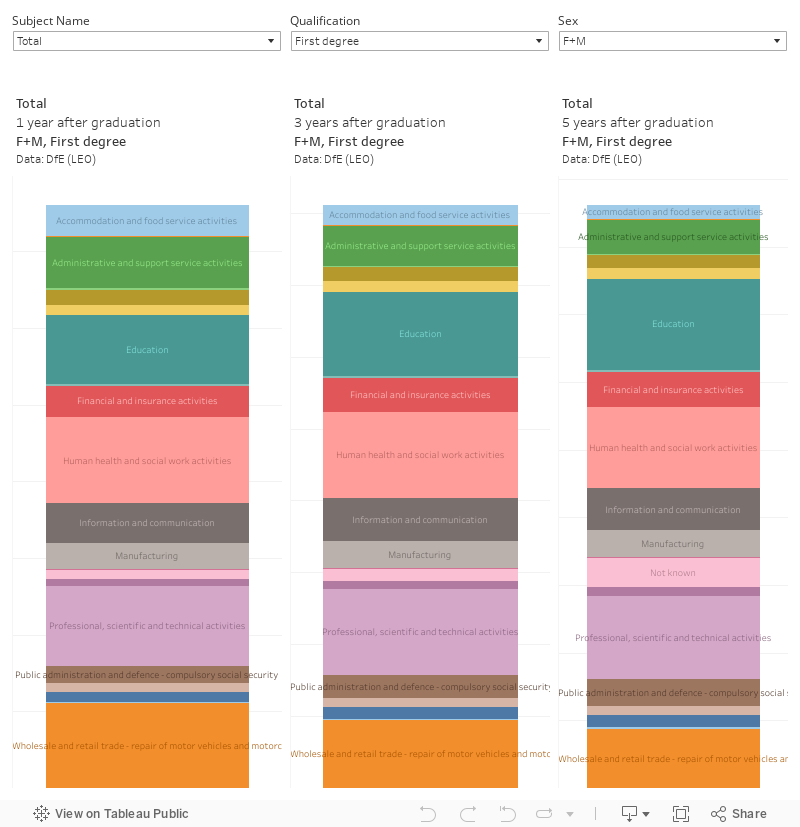
One common pattern for the professional courses is a move towards the “expected” industry between one and three years, and a move away over three and five years. You see this in nursing, medicine, and allied health graduates – but not in law, engineering, or architecture. There’s a pathway in which more graduates of all disciplines gradually move into teaching and to a lesser extent into “professional, scientific, and technical” activities over time.
This makes me think that destinations after five years give applicants (and indeed all of us) a better understanding of graduate destinations than the three years (LEO) or 18 months (Graduate Outcomes) we usually get to see. From a regulatory perspective this more useful outcomes data makes it harder to use graduate experiences linked to what a provider was like between 6 and 9 years ago to justify sanctions placed on providers now. Good.
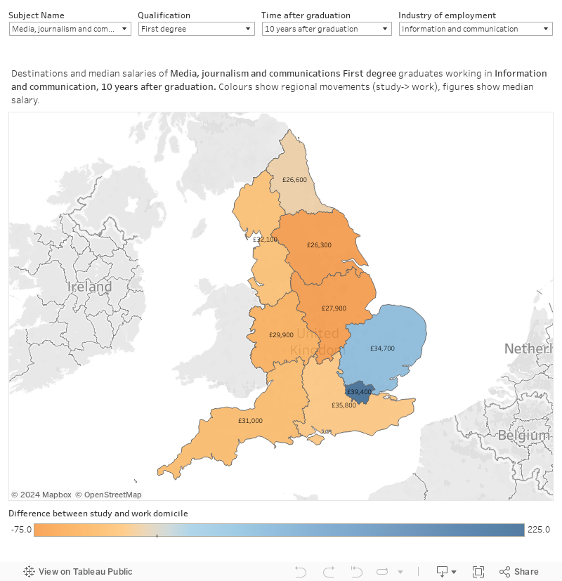
Overlaying region and salary
But we also know that the region a graduate lives in has an impact on career opportunities and earnings. If you studied business and want to work in finance you’ll be, there are more jobs in London and you’ll earn more.
To be precise, a decade on from graduation there’s 350 more graduates in London than trained there in this profession – and they earn a median salary of £66,400, compared to 65 less graduates and a median salary of £29,600 in the North East. For professional service workers who studied law, for communications-focused graduates working in communications roles, and for politics graduates who work in public services, the pattern is similar.
Conversely, you can use this interface to show nurses and doctors moving away from London due in part to a more standard salary after 10 years across the UK. And arts courses leading to careers in the arts don’t pay very much, wherever you work – because we as a nation are unable to countenance paying artists.
Moving on up (moving on out)
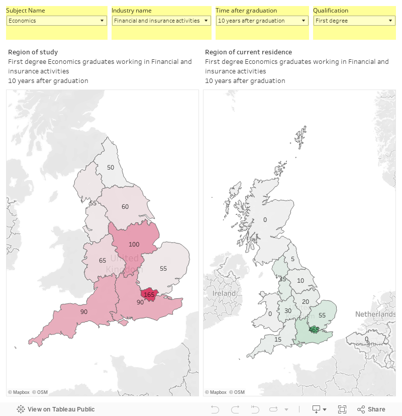
Another view lets us see the impact of subject and industry on where graduates lived to study and now live to work. You can use the filters at the top to select the population you are interested in, and clicking on a region of interest on the red map on the left shows you where those graduates ended up on the green map on the right (no click means you see graduates from all regions).
Again, the powerful gravitational pull of London has an impact whatever your industry – manufacturing is the only real outlier here. We saw this effect in the levelling up strategy – here we might start to consider that the subject of study may not in fact be the key to place based planning. Or we may understand the rationale behind the Treasury campus in Darlington when four fifths of economics graduates in the North East worked in the South ten years on – demand, not supply-side, interventions are key.
Job market inequalities
Another view facilitated by this new industrial lens allows us to see how prior attainment, ethnicity and social class (using free school meals history as a proxy) impact on employment in each industry.
There is a subject of study filter here, but keeping it on total I’ve stacked three graphs to allow us to examine the median salary by these reckonings for each industry.
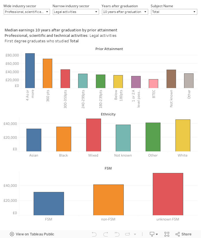
So – for “Fund management activities” we can see that prior (pre-HE) attainment has a marked impact on earnings even 10 years on, and that white people from a non-disadvantaged background earn more (on the bottom graph, note that no FSM data usually indicates a private school). In comparison, though the earnings are a hell of a lot lower the playing field is much more level in “higher education” – 10 years on Black graduates earn (as a median) more than white people.
There’s not really enough data to make similar determinations by subject of study – the data is there in part but it refers to low numbers and is riven with artefacts the further you get from graduation.
We also need to be aware that here we are looking at industry (SIC) rather than occupation (SOC) – I’m sure the latter will arrive one day, but for now your industry is “higher education” whether you are the vice chancellor or an early career researcher. Median salaries (especially rendered, as here, without quartiles or any indication of variance) need to be taken with a pinch of salt.