


HESA’s latest open data staff release is likely to send shockwaves across the sector. But it shouldn’t.
Opening up much of the old, charged-for, HESA Staff Record gives us a sobering insight into the poor salary and promotions deal women get from HE.
Nothing has changed
On average, in any institution, 2.5 times more men than women were on academic contracts worth more than £60,410 in 2017-18. And, again in any given institution, there were 2.9 times more men than women on a professorial contract.
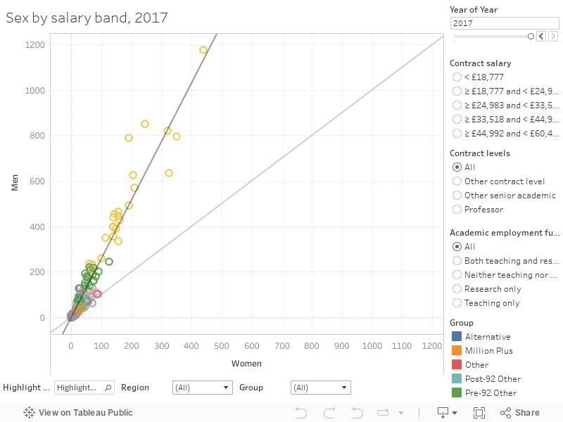
There’s no need here to rehearse arguments explaining why this is unfair. It should be clear to anyone looking at this graph that this state of affairs is indefensible. Even if you insist on arguing about career breaks and family responsibilities – as if men are not equally able to juggle a career, a family, and caring for relative – these numbers are an embarrassment to the sector.
I’ve plotted a 45 degree angle in pale grey to let you see quite how bad things are as you use the filters to zero in on any aspect of the data. I’ve also included the usual highlighter and group/region filters at the bottom of the graph.
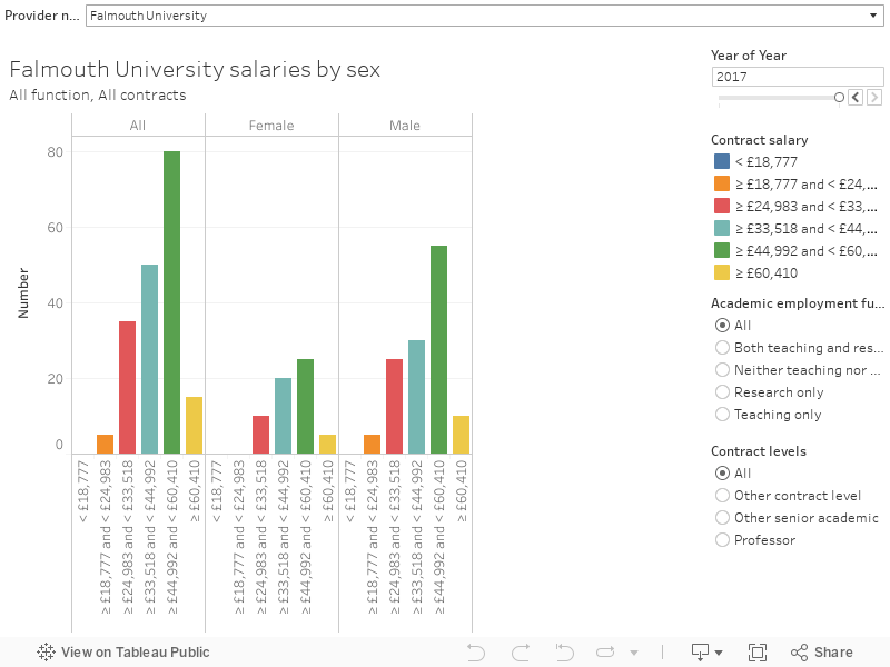
There’s an easier way to examine these trends by institution, should you wish to hold your own employer to account.
There’s surely many more of these to detonate over the coming weeks – HESA has provided data by cost centre as well as by institution, and it is possible to look at salary differential across a range of characteristics – ethnicity, disability, age group. There’s data on contractual types – including zero hour contracts, though the latter is not available by institution. The data, in the main, goes back four years (I’ve only plotted the most recent two above).
Remain and leave
I could easily have spent all day visualising this data, and I am sure I’ll do more in the future. But one other aspect of this release did catch my eye.
I’ve long been fascinated by the rates by which staff enter and leave institutions – both in absolute terms (is a provider growing or shrinking its workforce?) and as an insight into the kind of “churn” that short term contracts, or poor staff morale, can cause.
This is the first time I’ve even seen data like this so I went a bit overboard and built a dashboard (I’d strongly recommend viewing the full screen in another tab, and using a decent-sized monitor).

The main graph is sorted by the overall increase in academic staff numbers minus the decrease for the most recent year (though you can select any year) – with the colours showing full- and part-time staff. Mouse over the graph or use the highlighter to find an institution (you may need to scroll along using the scroll bar at the bottom), and click on it to see further detail on the change over the full four years of data and the total size of the institutional academic workforce in each of those years.
A wider bar on the main graph usually relates to a larger institution, but a wider bar on a small institution indicates a significant level of churn – something that HR managers will already be aware of and concerned about.
Large orange bars show a large number of staff entering or leaving an institution who have a part time contracts – there are a few institutions that have recently taken on a lot of part-time staff. In general, you can see that overall large numbers part-time staff tend to mean a large annual entry and leave rate of part-time staff.
HESA has provided a fascinating table that details what kind of employment staff come from when they enter the sector, and where they go when they leave. We don’t get these by institution or cost centre, but even at a sector level there is a lot to grab our attention. I was struck that nearly as many UK-domiciled academic staff leave the sector entirely as move to another UK HE institution – for early career academics (26-30) the number leaving the sector is substantially larger than those remaining in it.
“There’s no need here to rehearse arguments explaining why this is unfair. It should be clear to anyone looking at this graph that this state of affairs is indefensible. Even if you insist on arguing about career breaks and family responsibilities – as if men are not equally able to juggle a career, a family, and caring for relative – these numbers are an embarrassment to the sector.”
How assuming and condescending, as other far more ‘equal’ countries experiences have shown, once inequalities are removed it becomes a matter of personal, empowered, choice to work in different sectors or even within the same sector with different pay v hours contracts. Pitching acquired characteristics (nurture) against innate (nature) and saying everyone has the same drives, ambitions and needs doesn’t work, striving for equality of outcome is disingenuous at best. Proper equality of opportunity with personal career work/life balance choice, based on merit without bias leads to a much better working life for all, just ask the Scandinavians.
NJ is right to point out that inequality of outcomes is not evidence of discrimination. Consequently, the terms “unfair”, “embarassment” and “poor deal” are analytically lazy.
That said, while there is evidence that while greater equality of opportunity would benefit the economies of developing countries, in the case of developed economies comparable benefits would flow from achieving greater equality of outcomes (see Mitra-Khan et al. 2015, Gender Equality and Economic Growth). There is, however, no consensus over how to achieve this.
Lastly, just a reminder to David Kernohan that there are not in fact an unlimited number of jobs in higher education – at any level of salary. Job openings are scarce simply because there are more well-qualified candidates than there are available appointents. In consequence, it is not possible collectively to realise equality of opportunity and translate it into equality of outcomes.
Thanks boys for these comments.
I disagree that there are unlimited numbers of jobs – some senior roles and specialist areas are very difficult to fill.
Boys?
“Thanks boys for these comments.” – this is awful.
Thank you David for putting this data in such useful charts. People need to stop peddling the idea that women have a “personal choice” to make career sacrifices. We can’t have equality of opportunity when women feel they have or actually have no choice because of societal expectations, financial inequalities and a system that doesn’t support or encourage men as care givers. Inequality of outcomes MAY not be evidence of out right discrimination, but it does show that it’s something worth looking at more closely. People are still underestimating the insidious nature of ingrained unconscious bias on all sides.
Another hand-ringing piece, but I note that when we want to talk about actual Patriarchy few are interested and the rest are generally scared. The media have made yelling about gender inequality a national sport, but I note that there is no shortage of support for patriarchs among both genders, and it is not, to my personal experience, disproportionately men who support heirarchy over flatter structures which tend to be more conducive to both good working practices and gender equality. The entire paradigm of the discussion is wrong. Patriarchy is about the belief that one of a few males or similar females in the occasional case are the designated father-protectors of a group of adults. Where all are seen as adults men and women thrive as equals. Where power is seen as protection, problems occur.