


The idea of a graduate premium is a central plank of the way the Westminster government justifies the level of tuition fees, the existence of maintenance loans, and the design of an increasingly punishing repayment system based on earnings.
In essence we tell applicants that they will earn more on average, so they will pay more for the privilege of study.
One policy question that urgently needs attention is whether the graduate premium in an expanding and diverse system is equal to the task of supporting increasingly onerous repayments – and how much (or how little) of this debt needs to be waived because of low graduate salaries in certain industries.
We should not fall into the trap of equating low salaries with the “worth” of undergraduate study: however poorly we pay them we need the army of graduates that run the public sector, and even the industrial strategy admits that without the (infamously low pay) creative industries we may as well pack up the idea of civilisation and go home.
But we do need to think about whether the system as a whole stacks up in periods like we have been living through – low wage growth overall and high interest rates. And at this point the graduate repayment (annual earnings) threshold isn’t far off the annualised minimum wage.
The minimum
The national minimum wage, since 1999, has set hourly lower limits on pay at various age points.
Compliance is high among employers (though not complete: ONS estimates around 447,000 or 1.5 per cent of all jobs held by those aged 16 or over were paid below the relevant minimum wage). It has raised earnings among the very lowest paid in society.
It has probably been the single most transformative means of addressing poverty in recent times: in most years since the minimum has risen beyond inflation – in real terms the value of the higher rate has increased by 77 per cent since it was introduced.
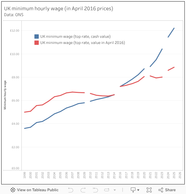
Over a period where wages more generally have largely stagnated in real terms this is a remarkable uplift – and it is to the credit of governments of all stripes that this policy of direct and tangible improvements to low pay has continued through multiple economic downturns.
But is it possible that a large increase in the earnings of the lowest decile will have an impact on the way we understand the earnings benefits that a degree could bring?
Certainly if we plot the minimum wage against income percentiles (these are gross figures, at 2016 prices) it is notable how close its value has crept to the tenth percentile of income, suggesting that earnings at the lower end of the spectrum are now bunching at a higher real-terms level.
The question has to be what, if any, impact this has on the graduate earnings premium and thus repayments.
Low earners and graduates
Currently around 10 per cent of those in employment are paid an hourly wage equivalent to the national minimum wage. If this rate of pay was linked to a full time role (eight hours a day for each of the 253 annual working days in England) it would make for annual earnings of around £24,700.
However, workers on a low hourly wage are more likely to be on part-time hours, while we also know that the likelihood of you holding a full time job increases in line with the highest qualification you hold.
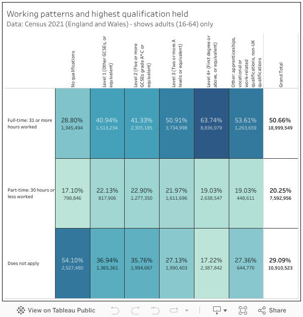
The jobs involved are more likely to be elementary roles. In the main, jobs like this are primarily held by those with lower level qualifications, or no qualifications at all.
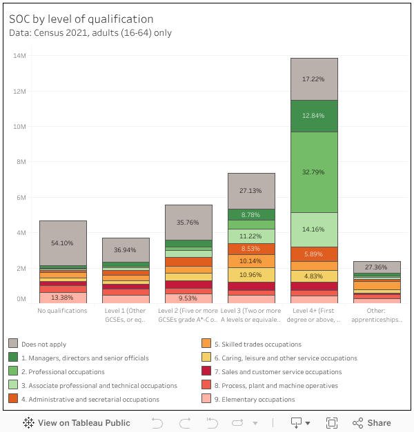
Conversely, jobs done by graduates are far more likely to be full time, and are more likely to be managerial, professional, and associated professional roles – what the Office for Students calls “graduate jobs” than those with other levels of qualification. Around 60 per cent of graduates are in these roles, compared with around 27 per cent of those with level 3 qualifications (two A levels, so enough to have the option to attend some kind of higher education).
Strikingly, the number (not the proportion) of graduates in “non-graduate” jobs is broadly similar to the number of those qualified to level 3 with “non-graduate” jobs.
LEO and the minimum wage
Instinctually, you’d expect a graduate to be earning comfortably above what is set at a national minimum for reasons of avoiding worker poverty. For this reason, it is fair to assume that gross earnings below the minimum wage relate to part-time work. The canonical failing of LEO is that it doesn’t differentiate between part-time and full-time work, but from the Census (so, 2020–21 issues apply to a certain extent) we know that graduates are less likely to be in part-time work (and more likely to be working at all) than all other groups.
However, there are industry-based differences, and it is reasonable to assume that subject-based differences between earnings are derived from these. To give one obvious example, part-time work is a huge deal in creative and performing arts – so a lower than expected graduate salary in subjects like these would suggest that graduates are participating (at low/no pay) in the industry they have trained for and supporting this with part-time work.
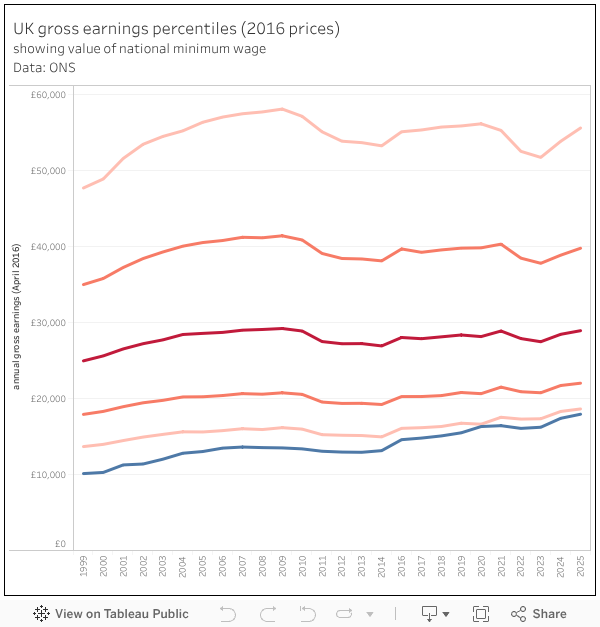
With this caveat in mind, I have plotted LEO earnings against income percentiles for the whole working population and the value of the national minimum wage, all indexed to 2016 prices. The available LEO data extends from 2016 through to 2022, and in the latter year salaries across the economy experienced a real-terms downturn – something which (as we see from the chart above) has been cancelled out over the past few years.
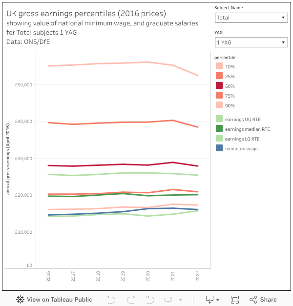
The two filters allow you to choose a subject area of interest, and to look at graduate gross earnings 1,3,5, and 10 years after graduation for each tax year.
The median gross earnings of graduates is slightly above the median gross earnings of all earners (all ages, all levels of qualification) after ten years – though there is substantial industry-driven variation by subject. After one year (so comparing the gross earnings of 21-22 year olds with national averages) graduate earnings are around the lower quartile – and the intervening years see the difference between the two gradually bridged.
Recall here that graduates are included within the percentile values – we are not looking here at a premium over non-graduates but a premium when compared to all earners. At the end of the day graduates are probably more concerned with the buying power of their own earnings than whether they are doing better than non-graduates.
And, given how close the minimum wage is to the repayment threshold, looking at the premium over the minimum wage (in cash term) is probably a more reasonable thing to do than I would have thought back at the birth of LEO.
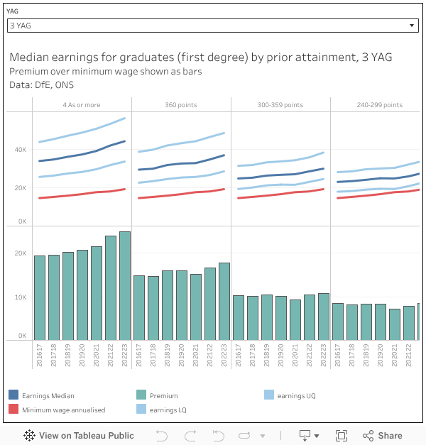
We know prior attainment is one indicator of future salary (mostly as an indicator of deprivation more generally) so hear is a visualisation that plots LEO by prior attainment against the annualised minimum wage.
How earnings are annualised in LEO
The temptation with LEO is to read the figures as salaries, and to be fair the presentation of the data does everything it possibly can to encourage that reading. But inside the sausage machine, things are very different.
The medians and quartiles familiar to us are based on individual graduate tax records for pay as you earn (PAYE, usually used by people in employment) and self assessment (SA, usually used by freelancers and the self-employed).
With PAYE, earnings for a given tax year are divided by the number of days of employment recorded, to give an average daily wage. This is then multiplied by the number of working days in a tax year (which would appear to be different across the UK due to differing numbers of bank holidays: so 253 in England, 252 in Scotland, and 251 in Northern Ireland) to give annualised earnings.
Because SA doesn’t offer dates of employment, LEO just uses the raw earnings. Annualised PAYE and raw SA income are then added together to give the final figure for each graduate, which are then used to produce the median and quartile data that is published.
Another way
I chanced upon some Labour Force Statistics data which neatly cuts across this issue by using gross hourly pay (and as luck would have it, broken down by NUTS3 regions over a number of years) as a measure of earnings. Big thanks to the ONS team for answering my questions on this one, and offering me information on the numbers in each group and an extra year of data.
Now, LFS isn’t half as good as administrative data – it is a large, representative, survey of UK residents which has been dogged by low response rates in recent years – but it was, at the time, official statistics and thus is worth taking reasonably seriously. We do get two big benefits – the first is with hourly earnings we can confirm like with like, rather than needing to compensate for differing patterns of work; while the second is we get some regional data.
A note of caution on that latter one – I’d be looking at the UK wide figures more closely as the NUTS3 regions (roughly equivalent to a top level local authority) may have quite low numbers of workers in each group (see the tooltips).
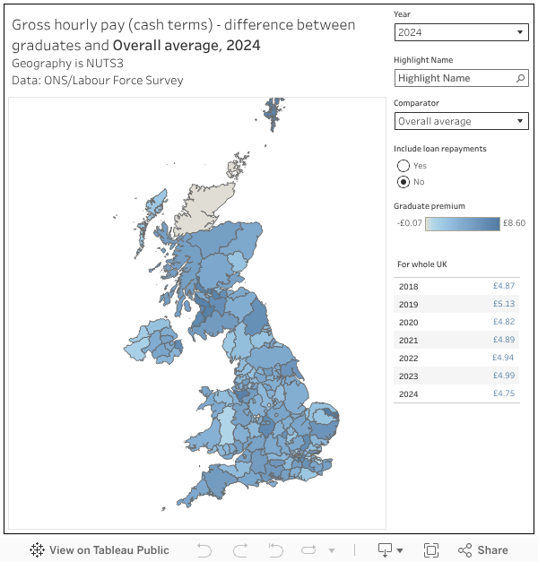
What jumps out at me here is a clear and substantial wage premium for being a graduate, both nationally and in pretty much any area of the country. This largely holds against any qualification group of comparators, against average hourly earnings for everyone, and (very much) against the national minimum wage for the year in question. If you include loan repayments (take nine per cent off the hourly gross) there are a handful of areas of the UK where graduates are paid less than those with level three qualifications – and these largely map to other measures of deprivation.
You would expect a result like that given what we know about the impact of place on income and the tendency among graduates to move to maximise opportunities and earnings. But even so, national premiums do hold up and appear to be broadly stable or growing since 2018. You can see the impact of the pandemic here – where graduate earnings overall remained stronger during 2020 and 2021.
I should note here again that if you compare graduates with all earners, you are including the graduates themselves on both sides of the equation.
Reasons to be GLMS
Now you are probably ahead of me here, but the government used to do a graduate focused look at labour force survey data – imaginatively enough, called “graduate labour market statistics” (GLMS). I say “used to” because the 2024 iteration (released in summer 2025) is to be the last one ever. There’s an open consultation (follow the link) if you have thoughts on that – but you need to hurry, as responses are requested by the start of next month.
The ostensible reason for discontinuing GLMS is the problems faced by LFS – the falling number of responses leading to issues with sample variability. Since 2024 it has been badged as “official statistics in development” (meaning that testing of quality, volatility, and an ability to meet user needs is underway), while improvements have been made that affect data throughout 2023 and 2024. From 2025 these improvements are fully in effect, and from 2026 a new “transformed labour force survey” (TLFS) will be the means by which ONS generates its whole suite of employment data.
GLMS has clearly had some recent issues (although to be clear, these issues have not had a meaningful impact on the published national level data) but the data above suggests that it does have the potential (with appropriate caveats) to provide a more nuanced look at qualification level and regional data. Certainly, comparing the graduate population with those who hold at least the two A levels or equivalent that could get them into higher education feels like a simple and meaningful comparison we could learn from.
A transformed LEO?
If we are interested in graduate earnings premiums, the most useful thing that could be included in future LEO releases is hourly earnings. This would neatly address the part-time work issue, and focus directly on earning power rather than working patterns (which may vary for a number of reasons).
Of course, earnings are only one part of the benefit of being a graduate – and for some (I’m looking at my creative peers here) the ability to make enough money to live on by doing the thing they love is probably going to be a bigger incentive than the ability to earn more than their neighbour. That’s not to say the salary data isn’t important for them to see, but telling me that I won’t earn much as a musician is not going to stop me from wanting to study music.
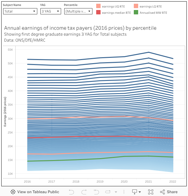
That said, it does appear that (over the last few years at least) median graduate earnings have remained stable (or grown slightly) in real terms when compared to a given percentile of income tax payers. This isn’t a fair comparison – in that LEO data includes non-taxpayers and this particular HMRC data does not, but as a benchmarking tool it is interesting. By default I’m showing all but the top 10 percentiles of taxpayer income, alongside LEO by subject, and the minimum wage (all at 2016 prices).
We know in LEO that a number of factors influence earnings: provider and subject (yes), but also prior disadvantage (of which prior attainment is one visible metric), sex, industry of employment (an economist will earn more in a bank than in a university), and region of employment. And if you control for all of these factors you are not going to get big enough groups to make statistically valid observations.
All of which is a rather maths-heavy way of saying that past performance does not tell us a great deal about the future career prospects and earnings of a single applicant chosen at random. Looking at very broad, national, figures suggests to me that a boost in earning power (which grows throughout your career) is available for three years of study – but I would caveat that by saying if your sole interest in higher study is to increase your earning power then there are other metrics available that could help you maximise this particular benefit.


I completely agree that statistics won’t ever satisfactorily answer the complex issue of trying to define and work out the graduate premium given the complex causal web (that I have attempted to explain in my most recent report available at Universitywatch.org and explained in my recent blog at the Intergenerational foundation – https://www.if.org.uk/2025/11/20/graduate-outcome-statistics-will-never-show-where-he-opportunity-ends-and-fleecing-begins/). It is a shame though that this article finishes with a statement that effectively says “The pay of graduates is clearly higher, so that of course we are safe to assume that this is due to the extra three years of study, so what’s the problem?”.
This is precisely the opposite to the correct conclusion which should be that “The pay of graduates is always going to be higher on average, so this tells us next to nothing about whether the genuine causal effects of an extra three years of study is the reason for the extra pay, and that given that our current system is producing hundreds of thousands of graduates a year who are getting no career pay boost but just a loathsome life-sapping debt to show for their time at Uni, then we definitely do have a problem with HE% participation being too high”
“The canonical failing of LEO is that it doesn’t differentiate between part-time and full-time work”
and it doesn’t do self-employment, which, again, is hugely important to the arts.
The issue is more that lifetime earnings are incalculable with the information that we have. We have no real idea about the future career pathways of new education leavers who will be working for longer and in very different working environments than those on whom this data is modelled.
And we know very little really about the career paths of people past the ages of about 35 and almost nothing about those past 50, even though at 35 you’re less than half way through your working life and at 50 you still have nearly two decades to go assuming you’re fit to work (which you might not be, but we don’t know enough about what that actually means).
“Of course, earnings are only one part of the benefit of being a graduate – and for some (I’m looking at my creative peers here) the ability to make enough money to live on by doing the thing they love is probably going to be a bigger incentive than the ability to earn more than their neighbour.”
I know we’ve had this conversation before, and obviously I agree with this point – what the degree does is give you more options and make it easier to make career decisions that are not solely financial. Not that many people are actually solely interested in maximising their earnings, we know this from research, which is why we have labour market specialists and WonkHE writers and creatives at all, and that’s a good thing (he said, contentiously).
“All of which is a rather maths-heavy way of saying that past performance does not tell us a great deal about the future career prospects and earnings of a single applicant chosen at random. ” I thought that was the government justification for raising tuition fees, that there was a lifetime graduate earnings premium regardless of provider, subject, prior attainment, sex, industry of employment, and region of employment. The plain fact is, generally the highest graduate earners are those who choose the professions regulated by codes of practice and those occupations which require high levels of mathematical ability, an exception are digital or information technologies which require a high level of logical reasoning.
Yes – and the questions that no amount of granular statistical data will ever be able to answer is : – To what extent (if any) did the highest earning graduates become better performing career wise because they spent an extra three years in academic study, or was it more simply due to their inherent ability combined with ambition & work ethic? And if the career path had been open to them at age 18 by starting as a trainee and learning on the job, then would they have got on just as well in their career or even better without the extra 3 years study? That’s why the DfE has to come clean and much more clearly caveat any graduate statistics with a statement saying that they only show correlation – not causation.
If only there was a time in the not so recent past, where access to HE was restricted, and yet all school students went into appropriate jobs according to their academic ability and merit, and it definitely wasn’t simply a filter so that the wealthier could access higher paid professions. Alas, I guess we will never know, and we will need to continue to flog horses.