

Data driven university application guide, 2025
David Kernohan is Deputy Editor of Wonkhe
Tags
Results day is stressful and horrible in and of itself. In a sane and rational world we wouldn’t make judgements about the life chances of young people based on their performance on a single, sweaty, afternoon in the school gym. But this is England, and your level 3 (A level, T level, BTEC, etcetera) results feel totemic.
There’s any number of commentators and professional opinion-havers that will happily explain how less-than-stellar academic performance didn’t hold them back from whatever it is they did and do , and I could easily do similar if I had that level of self-regard. But instead I wanted to offer something useful.
There are all kinds of students currently on courses you’d love to be on that got results just like yours. It’s testament to how flexible, personal, and human university admissions can be – a far way from the notion that your tariff score is digitally tattooed on your forehead as you enter clearing.
How did they get there? – the foundation year (an extra year before your standard first year) is the main one. There are less of these about currently (universities are struggling to afford to run them), but the good news for you this year is that they are cheaper than a regular year at university in non-lab based subjects.
There are also sub-degree courses – foundation degrees (not the same as foundation years) and higher technical qualifications are two year courses (year one and two of the traditional course, usually) with the option to “top up” to the full undergraduate degree. These tend to be in quite vocational subjects, so if you are keen to get working that is an option – another is a degree apprenticeship (though there are not many and they can be very competitive)
There are alternatives if your heart is set on a particular course or university – do not discount the idea of resits if you genuinely think the exam let you down. Yes, you are stuck in your hometown for another year while your mates are off having new experiences – this does give you another year to save up some money – but there is no shame in resits (or new qualifications, adding to your tariff points), and it is a lot cheaper.
Otherwise, you would be wise to consider clearing – this was almost a dirty word in the 90s but is now a perfectly respectable way to get on to a course if your results aren’t what you expected. This year a lot of universities are in clearing, so the odds are good that you could find something you like. I would urge you to apply somewhere you know and like (maybe one you went to an open day for) above somewhere superficially impressive that you have no experience off – three years is a long time to be somewhere that you don’t enjoy.
The tool I’ve built for you helps you see what courses in your preferred subject area have people on that got results like yours. There are some caveats that I will get to.
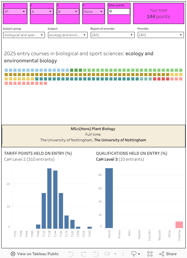
Start by entering your results in the pink boxes at the top. There is space for up to four A levels – if you have other qualifications (anything from a BTEC to grade 8 piano – yes really – you can look up the tariff and add the value under “other points”. The box at the right calculates your total tariff points that feed into the rest of the dashboard.
You can choose your subject group and individual subject using the filters immediately below the pink boxes – this controls a series of squares that appear in the large white box. If you mouse over these you can see each one represents a course at a university – part-time and full-time routes show differently. If there are too many to deal with you can filter by region (maybe you want to study in the South West) or provider (maybe you are set on UWE).
The courses that are shown depend on your total tariff points – you will see all the courses that have students on with (approximately) your tariff points or below. When you mouse over you can see (on the bottom left) the proportion of students on the course or in the subject area (in each case, “aggregate” means this is two years of entrant data rather than one) by which “bucket” of tariff points they are in – and (on the bottom right) the proportion of students entering with different kinds of qualification.
What do I mean by “buckets” – well, the data I am using is from the best available public data source: a government website called “Discover Uni” (don’t worry if you haven’t heard of it). Rather than show an average tariff (which would be what you might expect) we get the proportion of students with tariff points between two boundaries – and the upper boundary is what is shown on the graph. So, if – say – 10 per cent of students are in T144, this means that 10 per cent have between 128 and 144 tariff points.
I’ve only shown courses that have tariff data (some don’t) and that were on Discover Uni when I downloaded the data a couple of weeks ago.
Should we have better, course level, public data to build things like this – yes, we should.
I think this is a great resource but I can’t seem to find any results for Lancaster University, despite them showing on Discover Uni. Is this an error?