What’s hiding in OfS’ data dashboards?
Jim is an Associate Editor (SUs) at Wonkhe
Tags
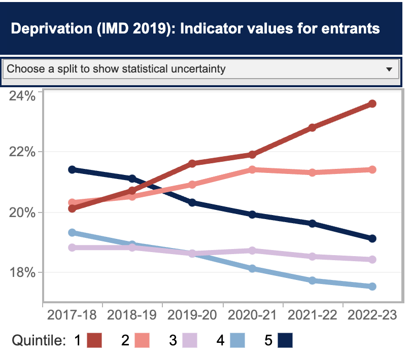
At the headline level, deprivation quintiles have moved in a remarkably positive direction – with quintile 1 moving from just over 20 per cent of the undergraduate entrants to 25 per cent. Well done everyone.
In gap terms, the improvement in performance is even more astonishing. We’ve gone from the gap between Q5 and Q1 being at about 2 per cent to almost minus 5 per cent. Trebles all round!
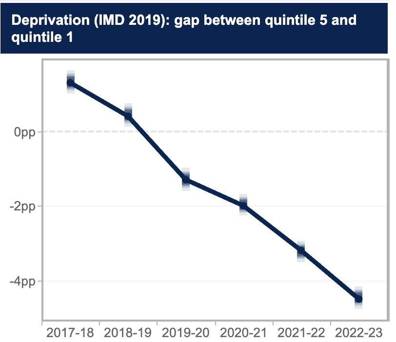
But something feels off.
If we look just at the Russell Group, for example, the story is nothing like as positive, with eleven of its members now moving in the wrong direction:
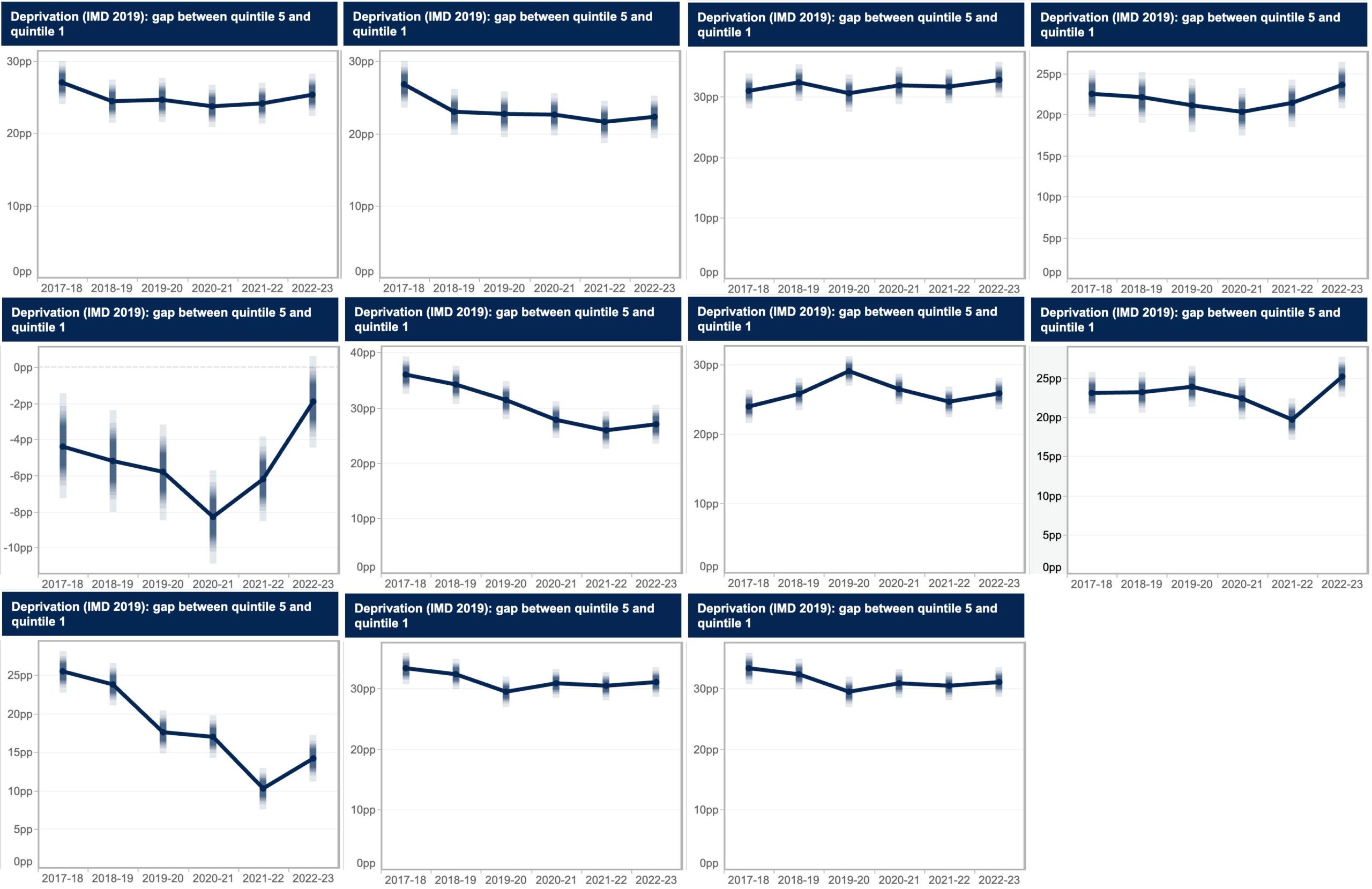
So the big progress must surely be elsewhere in the sector. And for some providers, the turnaround has been astonishing. Here’s one university that has completely reversed the dominance of IMD Quintile 5 students:
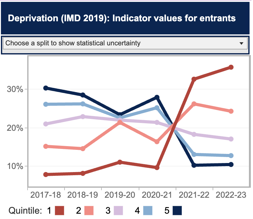
Here’s another university that’s gone from fairly equal percentages to a tale of social justice:
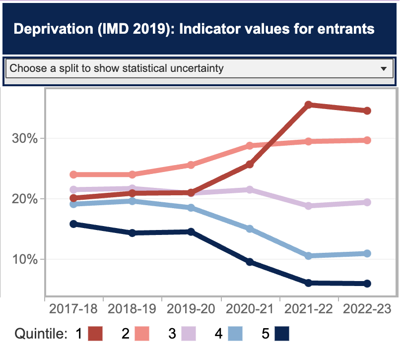
And here’s another university with a similar tale:
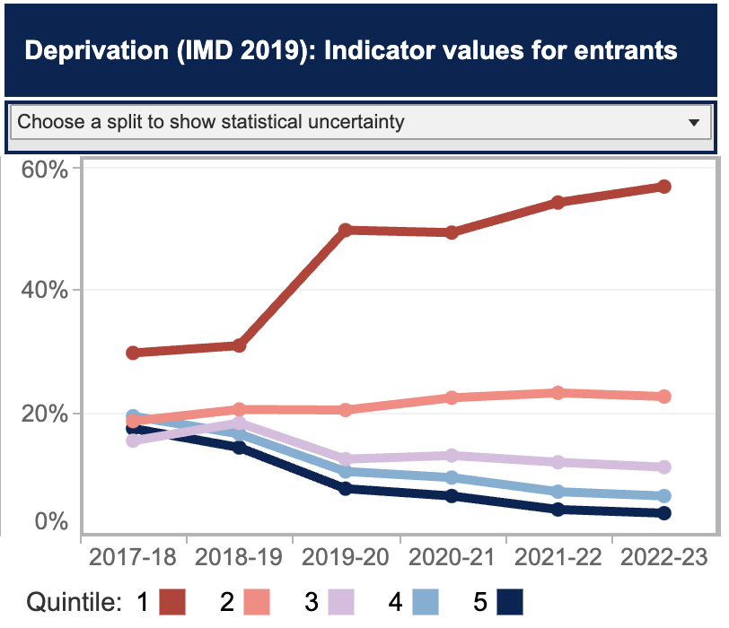
All of that also feels good – at least for those universities. But again, something feels off here.
If we look at that complete reversal example and now turn to the outcomes dashboard (also updated this week), we see something very interesting indeed.
If we just look at its continuation denominator, we can see that it has very rapidly expanded – the years here indicate year of entry so 2021-22 is the year they started, and 2022-23 is the year they were supposed to continue:
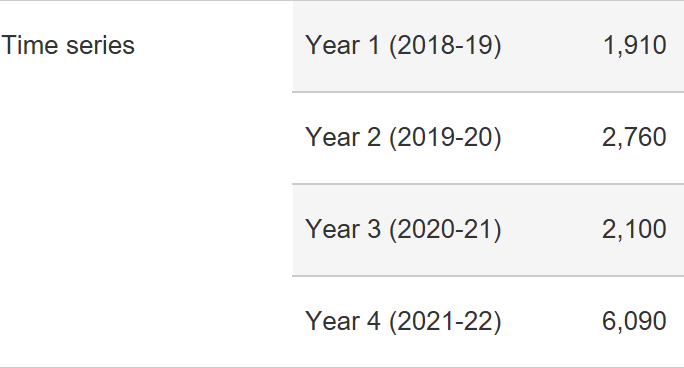
Nothing inherently wrong with that – they’ve started to generate some HE fairness by taking on more students in the lower quintiles.
But have they? Here’s the same table if we just look at the “taught” population:
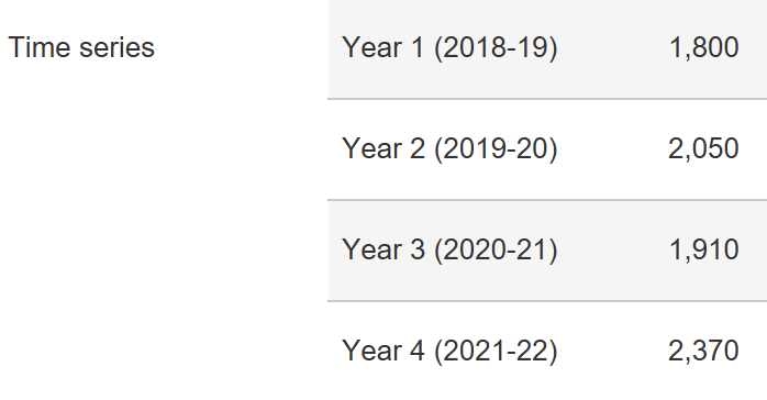
So where did all the extra students come from? Franchise partnerships:
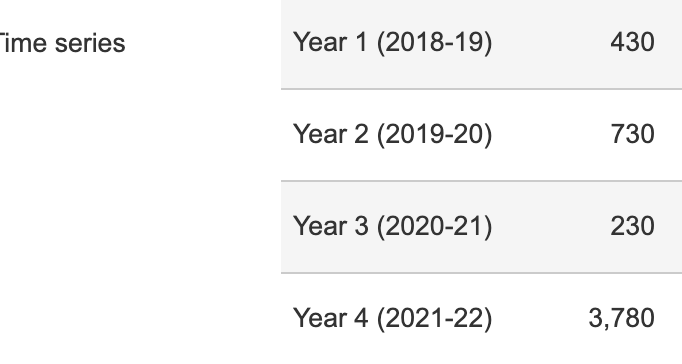
And just look at what happened to its continuation rates:

We see a similar picture in the other two examples. Here’s whole provider for the two of them:


And here’s what they look like if we isolate franchised students:


We should probably also be concerned with what they’re studying. Here’s the huge turnaround provider’s raw numbers in scope over the four aggregate years:
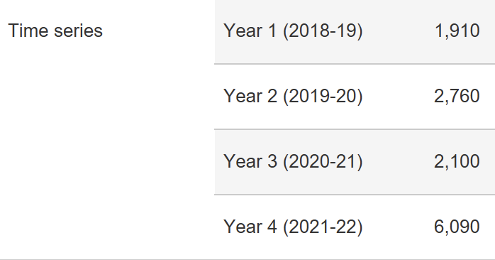
And here’s the Business and Management numbers:

Now that doesn’t quite fully suggest that the increase has all been in B&M. But if we just look at partner numbers, it becomes a much better bet. Here’s the four years:

And here’s the total over those four years for B&M:

It starts to look like this provider has a group of students and a group of courses in a particular location whose outcomes haven’t changed much at all. Here’s its directly taught population 4 year aggregate:

Meanwhile, for those rapidly expanding partner college students – largely in a different bit of the country studying largely different subjects, here’s the four year aggregate:

As a classic wicked problem, access and participation is notoriously hard to measure progress on. But if it was the case that a significant number of providers are going in the wrong direction – especially if said providers are used to claiming the top spots on later employment outcomes – we need to know.
We especially need to know what students are studying at those providers, and if the deterioration of performance is in the subjects that we know lead to the professions – not just because of salary differentials, but because we need to know if our future lawyers, doctors and so on are becoming more reflective of wider society.
Similarly, if a significant number of providers are only going in the right direction because they’ve expanded by adding students in a different part of the country studying different subjects, we ought to know that too.
The point is that the “provider” as the object of performance measurement is getting increasingly unfit for purpose. That’s partly because what goes on within providers can vary hugely, as can what goes on across providers by subject area.
But it’s also because what we mean by provider can change very rapidly – and lead us to conclude that something is getting better when it isn’t, really.
There’s a reason why the OfS outcomes and TEF dashboards include subject splits, even if we only get four year totals by subject and raw numbers for all subjects for each of the four years. It’s also good that we can see whether students are taught by or only registered by the provider in those dashboards.
It’s hugely frustrating that we can’t see the unregistered “franchised to” providers by provider. If a number of universities are growing their numbers by each franchising to the London Churchill Bridge College of Boilerplate Business and Management, we can’t currently see the APP, outcomes or TEF stats just for LCBCBBM as a whole. And only companies house can tell us how much that LCBCBBM is making out of those students.
We need to be able to see all of this, because it’s starting to look like many of those sorts of providers – many of which operate on a for-profit basis, and which usually deliver business or health degrees – are delivering outcomes at significantly below where anyone might reasonably expect them to be while their owners trouser huge profits.
That, in the past week, we discover that OfS officials have been busying themselves with a visit to the Norland Nannies but not to unregistered (but franchised-to) providers like LCBCBBM really is preposterous.
But we also need to see APP dashboards – both nationally and locally – by subject and by partnership. This isn’t about extra burden – this is data that OfS has – but it is about allowing the rest of us to see where the real progress and problems are.


And that sums up the whole failure of the regulatory regime – as everyone in the sector has known that this has been happening for years. It will take more than a new chair for the OfS to restore its credibility, more change is needed at the top
100%
Really interesting. Thanks for showing the detail.