

The poverty gap between students and the universities they attend is getting wider
Jim is an Associate Editor (SUs) at Wonkhe
Tags
It’s notable that the story in The Times would suggest that income for universities would rise by a defined amount, while there’s no confirmation at all that that would be the case for students.
After all, the figures underpinning the Corbyn proposal suggested that poorer students would have only been able to swap some loan for grant to reduce debt on exit. That was Phillip Augar’s proposal too.
But let’s imagine that the Times story is merely a soundbite summary of what might be being proposed to the Treasury. It’s hard for anyone to slip “let maintenance loans rise by inflation” into the soundbite, because that’s in theory what’s been happening already.
But that isn’t what’s been happening.
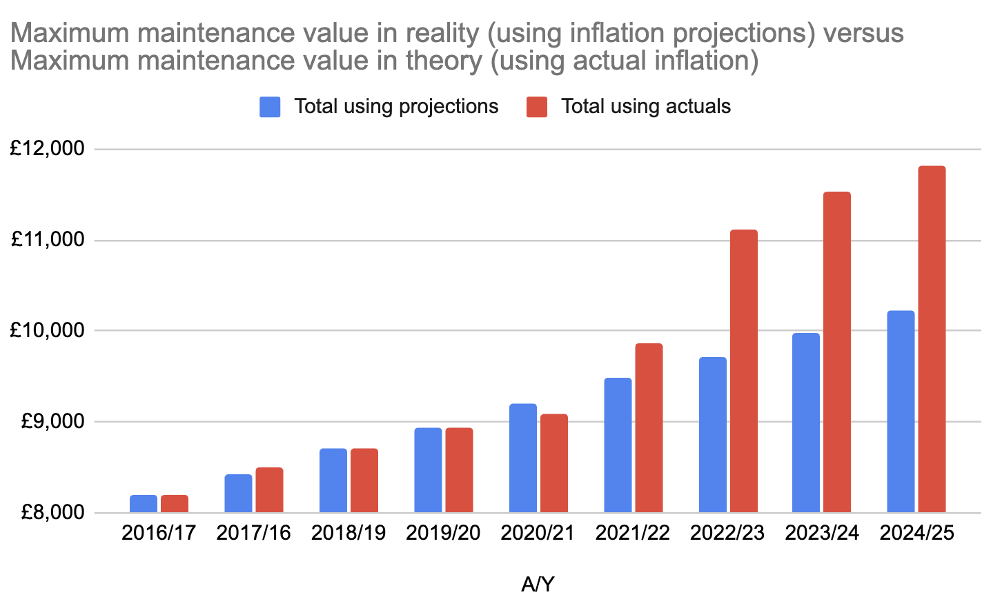
The first reason is that the OBR projections for inflation that the Department for Education has been applying to the rates have been consistently wrong for the last few years.
The chart shows the difference between the projection and the reality for home undergraduates away from home and outside London – an error for which there is no mechanism to correct. I’ve taken the first year of the “no grants” system as the baseline.
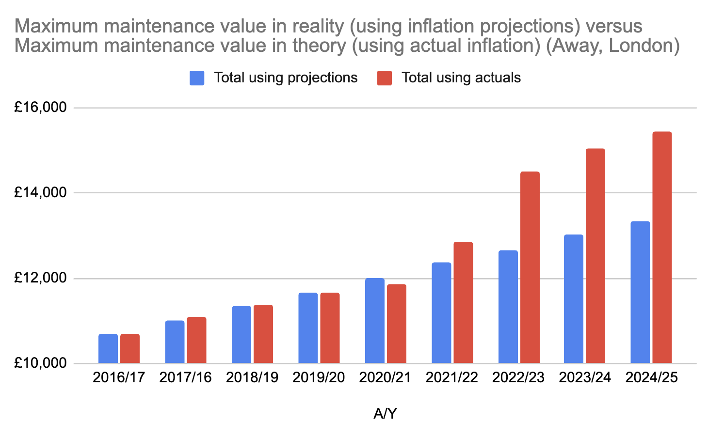
Here’s the same chart for students studying in London:
And here it is for those at home:
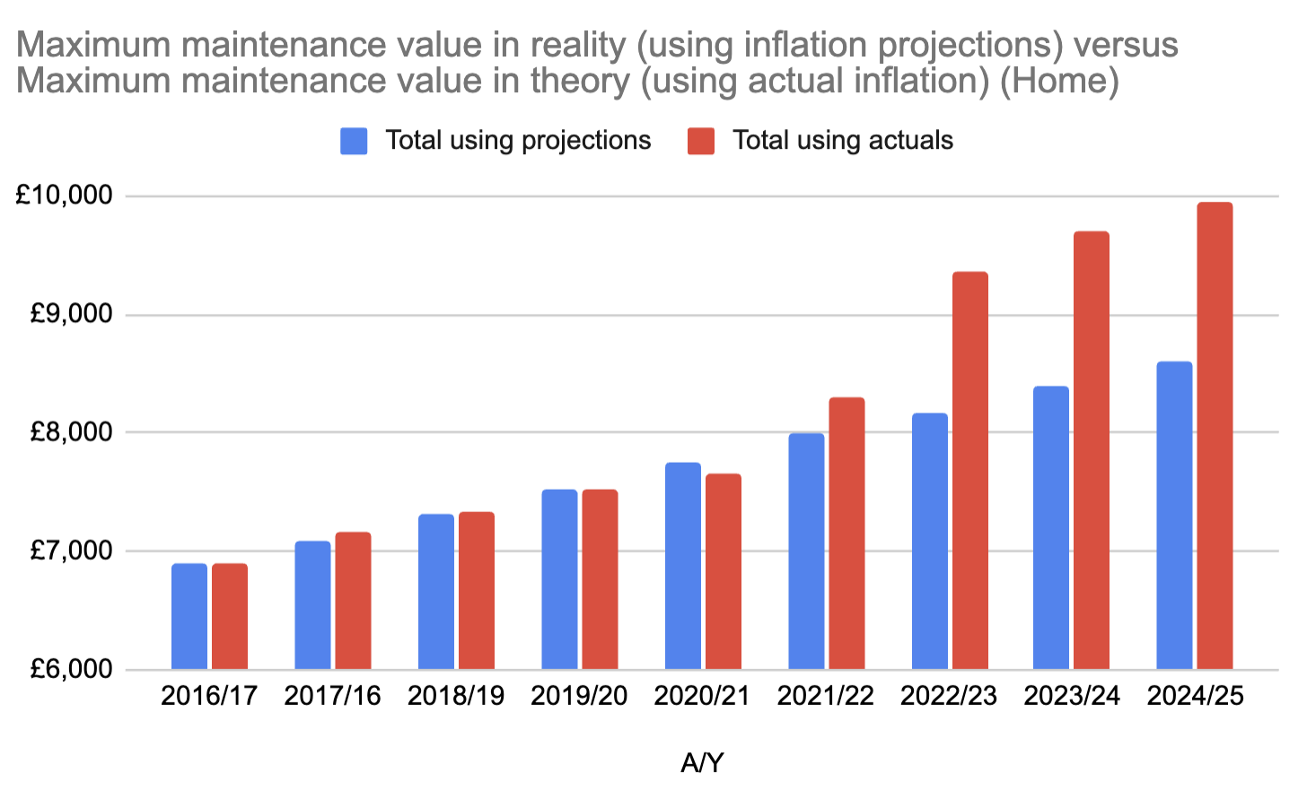
The compound impact over three years can be quite significant. For those who entered HE in 2022 – already those who are likely to pay the most over their lifetime (repayment threshold held down but interest rates still at RPI+3%) – the three year total shortfall comes to £4,551 (away, outside London), £3,833 (at home) or a whopping £5,941 for students away from home in London.
But all of the above assumes that the student gets the maximum amount. Core tuition fee income to universities is topped up for disadvantage – whereas core maintenance entitlement for students is cut for advantage, what we used to think of as the “parental contribution”.
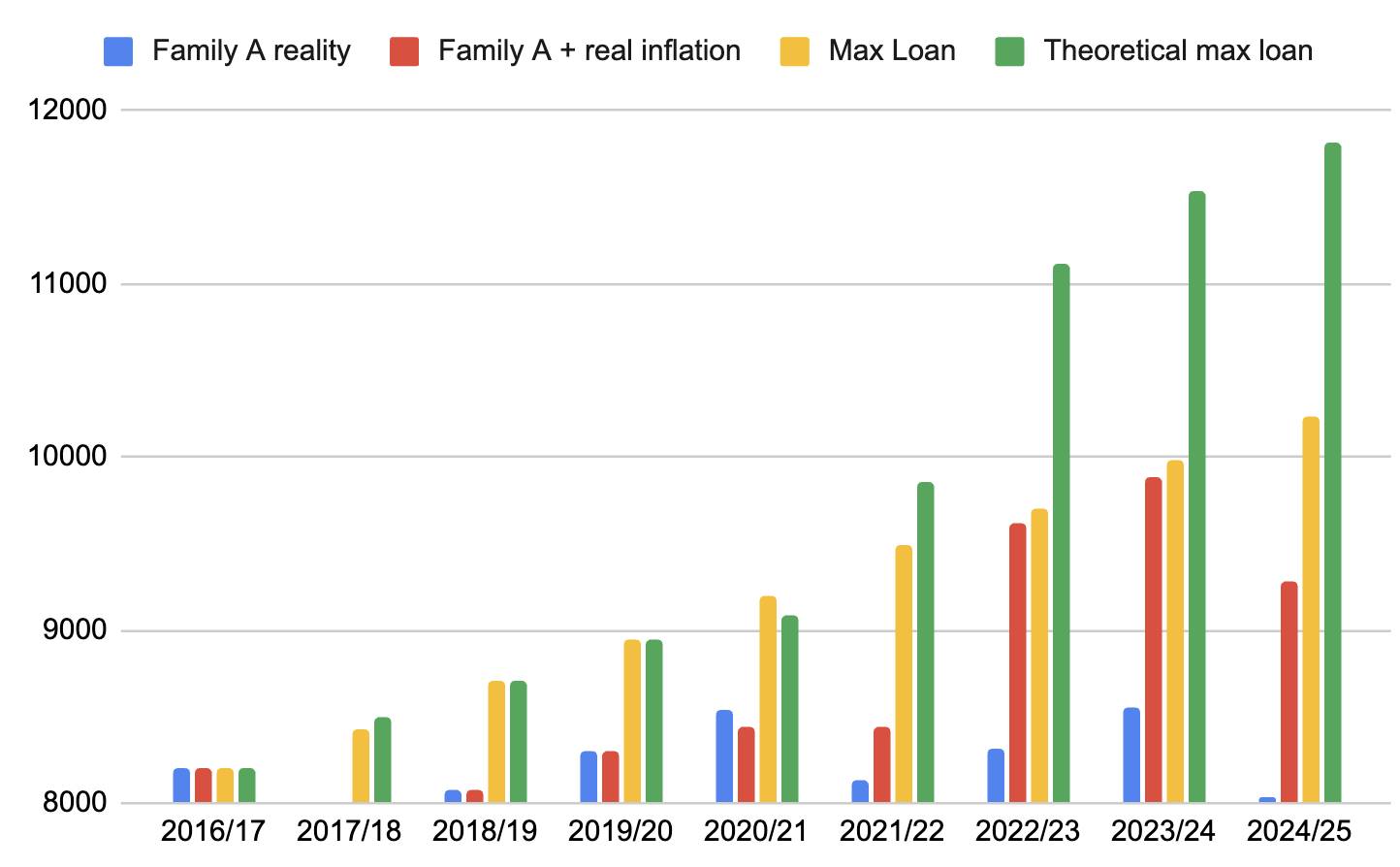
The threshold for parental contribution hasn’t been uprated for earnings since 2007 – and so if we take three theoretical family backgrounds and adjust for it, we can see what that does to annual entitlements too.
- If someone’s family income was £25,000 in 2007, if we adjusted for average UK wages growth since, that wage would be £40,075. Let’s call them Family A.
- If someone’s family income was £25,000 in 2016, they’d now be earning £37,030. Let’s call them Family B.
- And if someone’s family income is £25,000 today, they would have been earning £17,625 in 2016. Let’s call them Family C.
For the core “away from home, outside London” rate, here’s how the shortfalls shake out.
- Blue bars are what a family has been entitled to in each of the years.
- Red bars are what they would have been entitled to if inflation had applied to their loan properly.
- Yellow bars are what the maximum loan was that year for that family.
- Green bars are what the maximum loan was should have been that year for that family if inflation had applied to their loan properly.
For Family A, you’ll see how the bands cause regular drops in those blue bars over time – but add in the impact of inflation, and the shortfall this coming year is huge:
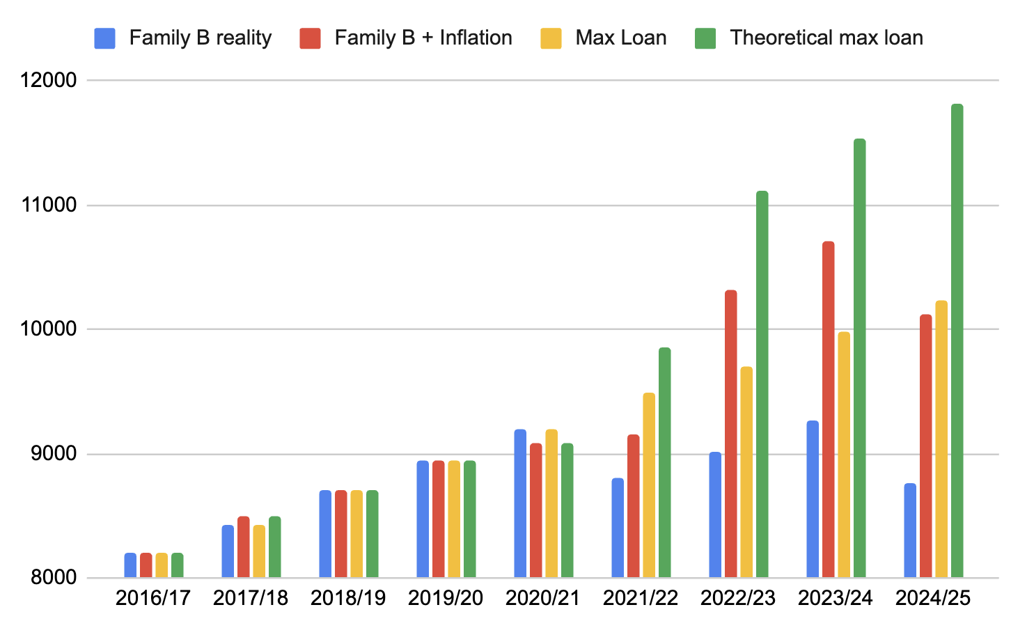
For Family B, we again see that band dip in 2021 and again in 2024 – and when we add in the inflation gaps, again the shortfall is significant:
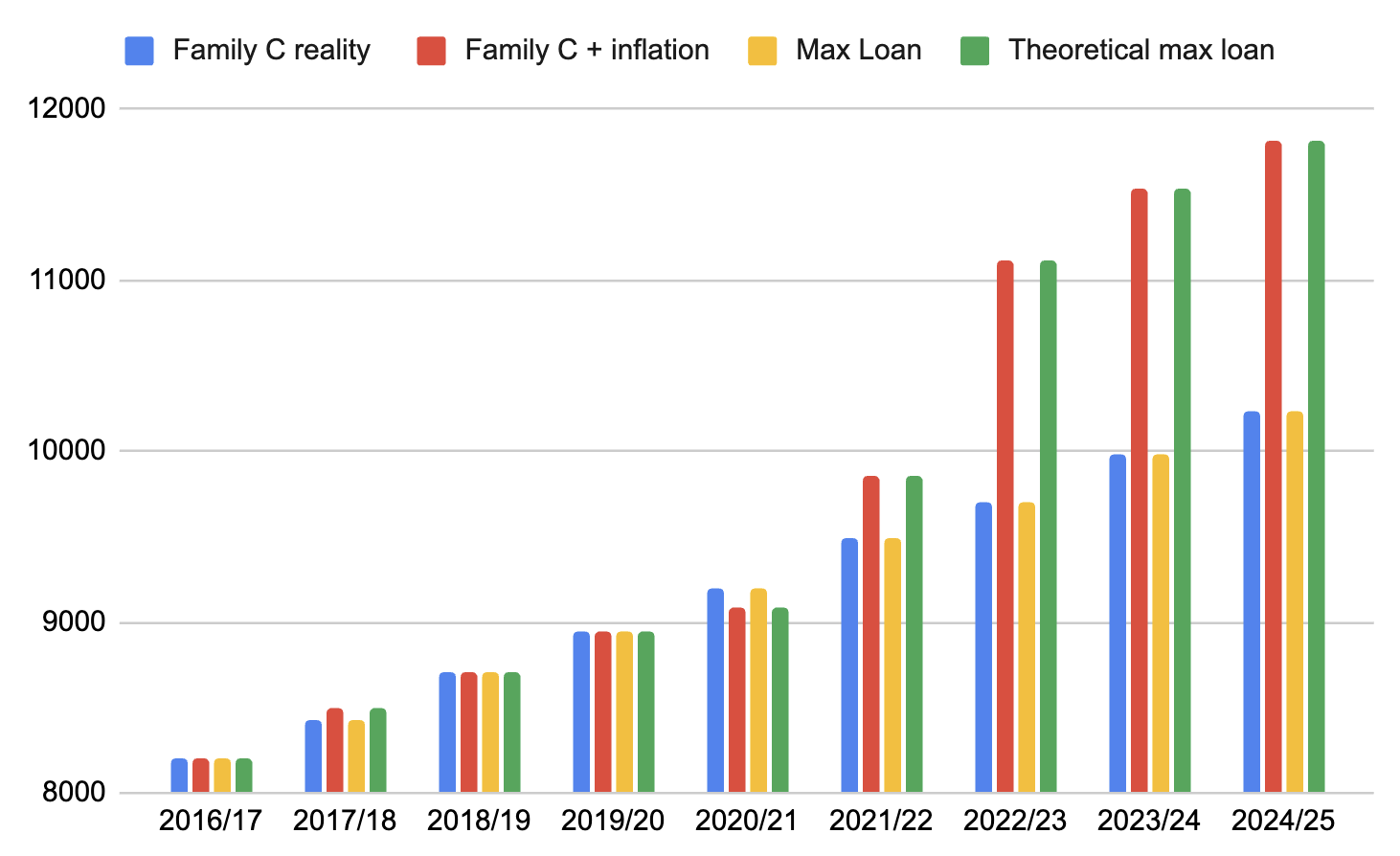
For Family C, the impact of growing salary isn’t as choppy – they have always been at £25,000 or under – although the impact of the inflation problem is still large:
That then allows us to produce this chart – the estimated cash value of the parental contribution expected for each of the three families in a given year, if we assumed the max loan in 2016 was enough to live on:
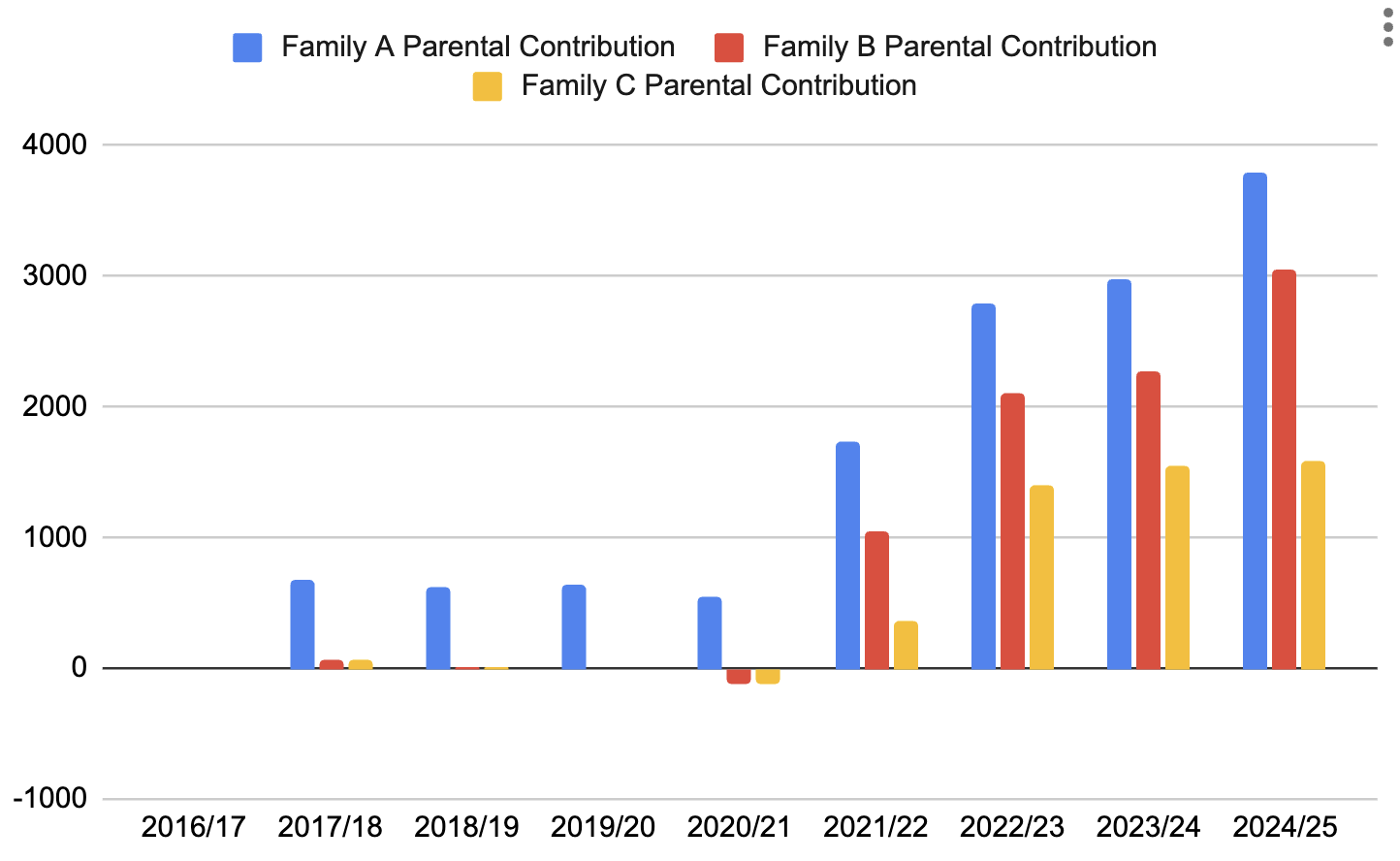
Not only are we squeezing a middle very hard (to the tune of just under £4k a year), even for the poorest families (or those without family support) the idea that there’s £1,500 a year knocking around is for the birds.
And those last three charts are worse for those in London, of course.
Of course none of the above figures take other things into account – the fact that prices inflation is almost always higher for those on low incomes (once you hit the bottom, you can’t trade down in brands) and the reality that student rent inflation is almost always above the general housing inflation rates – and is a higher proportion of the student income basket to start with.
But add it all up, and I think it’s fairly clear to see that even if the total maintenance rates were to go up by inflation, unless that parental income threshold goes up with it, the gap between institutional poverty and the poverty of those trying to experience what those universities will offer will only get wider.
There’s no point building it if they can’t afford to come.