


When it comes to horse racing, nothing captures the heart – or the few pounds’ flutter – of the Grand National. It’s a democratic affair, reaching not just the elite in the members’ enclosure but also Joe Punter putting a few quid each way on a no hoper. What would be the odds if each university entered into the Grand National for Widening Participation? Let’s assess the runners and riders.
In horse racing, there’s a mechanism for trying to level out the chance that any given horse will win: the handicapping process means adding more weight to the saddles of the horses with the best past performance. This year, we’ve seen the appointment of a new “handicapper” with the Office for Students (OfS) taking over from the Office for Fair Access which has been put out to pasture along with HEFCE. The noise coming from the handicapper’s room has the look of new conditions being imposed on the runners, but the commentators are still deliberating on whether this is tough pre-race talk to keep everybody honest, or a serious effort to make a fair race.
As the potential institutional runners were preparing their entry forms (registering with OfS), they are asked to consider their eligibility and performance record, as they await the handicapper’s judgement of a piece of their pre-race submission, the Access & Participation Plan. The question at the forefront of connections when speaking to the “trainer”, often called a deputy vice chancellor, the person with the job preparing the team, are as follows:
- “How have we been going?”
- “How do we know if that is good?”
- “How are the others in the race looking?”
- “What do we have to do to win?”
The DVC goes straight to the race entry requirements and says, “Hey G’vnor! Listen to this! Regulation Guidance No. 6 in the new Regulatory Framework says:
“12 …conduct a robust assessment of your performance, … understand your performance trends. … consider data across several years and comment on past trends and your future trajectory. …to understand where … progress is accelerating or slowing. …[and] include an up-to-date assessment of your performance in access, success and progression for the groups, or sub-groups, identified in your initial analysis of data.”
And
“15. Once you have analysed your absolute performance you should demonstrate that you understand how this relates to your own context. You should consider how your past trends and future trajectories compare with those of the wider sector, for example through sector-wide data or benchmarks.”
VC: “Who made that up?”
DVC: “Apparently the handicapper’s boss, Sir Michael Barber created this “Deliverology” philosophy and it’s all about data, measuring, performance, milestones, trends and trajectories in driving performance outcomes.”
VC: “So, how are we going?”
DVC: “We [note collective sharing of responsibility, just in case], have looked at our institutional stats and looked at latest available HESA data on performance. For example, in access we looked at the number of target entrants and the percentage of enrolment relative to our total enrolment, particularly students from Low Participation Neighbourhoods (LPNs) as one of the dominant measures.”
VC: “.. and how do we look?”
This is where the conversation starts to diverge as each institution tells its own performance story reflecting the where they appear in the rankings.
DVC: “Well boss, we did great. High numbers, high percentages.” Or “… we did pretty well. High numbers, but not so well on percentages.” Or “… numbers are down, but percentage is holding steady.” Or “… numbers are down and percentage is not much good, BUT… [insert excuses here, rubbish measures, then advocate for shifting the goalposts to make performance look better than it really is].”
The vice chancellor should ask
“Given who we are [note the obscure reference to an expectation that perhaps institutions have different obligations], and our position relative to our Location Adjusted Benchmark, how are we performing? Isn’t this what the OfS-handicapper is looking at, or could be?”
Going straight to the form guide (Applied Inspiration’s WP Optimisation Performance Dashboard [note: gratuitous self-promotion]) they retrieve the measure and ranking of their performance and its difference to the Location Adjusted Benchmark (LAB), plotted over a time series. This can explain how performance changed from the last measured performance period to the latest. The Location Adjusted Benchmark is one of the measures to set the “handicap” for institutions. A shift in the difference to LAB is a rough indicator of the fact they may have been doing something effective in the previous years as reflected in a shift in enrolments.
DVC: “We are [up/down] against ourselves.”
VC: “How do we know if that is good performance?”
The variation to the Location Adjusted Benchmark can only have resonance against an institution’s own performance and really is more effective when viewed over time but it isn’t an effective measure for comparing performance relative to other “institutional runners” as each has different contexts or handicaps. Back to the form guide and go to the Weighted Performance Score. This is a ranked score for each institutional-runner which assess performance relative to their Location Adjusted Benchmark and their “room to move” or size of available market, which is the proximity of their performance to 100% of the target. This provides a ranking for each runner on how well they perform given their marketplace. This is a more genuine measure of how well their outcomes are relative to others when their respective handicaps are taken into account. All institutions are thus measured carrying their “handicap weight”, to continue the metaphor.
To demonstrate the point, institutions recruiting WP students from State Schools and Colleges which are achieving at +/- 98% of available cohort against a Location Adjusted Benchmark in a similar vicinity, have less room for achieving demonstrable performance improvement to those working in the 70% to 80% band. There needs to be recognition of their good work, and a simple variation to benchmark won’t demonstrate this, nor will a first-past-the-post model.
We have also used a z-score calculation (z = (x – μ) / σ, where μ is the mean and σ the standard deviation) to enable comparison with different datasets. This is useful when comparing performance of say, recruitment from State Schools against performance in recruitment from LPNs. We have also averaged the z-score for both datasets and ranked the order of performance.
VC: “How are the others in the race looking?”
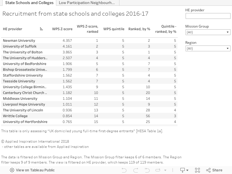
Looking through the form guide one finds the comparative table by group, geography and sector and can compare past performance based on their ranking against the other 119 runners that have been considered.
And with all this information the real question from the form guide are which are the “top” institutions in the field:
[Note: The actual Performance Dashboard has a range of features, including charts, graphs indexing and groups comparisons, with subscribers getting access to even more dynamic features online.]
So with all the form considered the next questions is straightforward:
VC: “What do we have to do to win?”
Sean is standing ready trackside for anyone interested in training tips or an explanation of the Applied Inspiration WP form guide.


Are there any criteria, anywhere, for defining students who haven’t come straight from school as WP? Every definition and every intervention seems to be based on the assumption that all students come to university directly from school. Many of our students have had other careers or studied for other degrees previously; some come through Access to HE programmes. Most of these would be classified as WP by any rational criteria (household income, caring responsibilities, parental HE, etc.) but don’t count when everything is based on POLAR4 quintile and blank school performance data fields.