


It’s not a hard-and-fast rule, but in general commuter students (whatever definition you are using) tend to be those who lived locally before they became students.
It’s an intersection – if you are recruiting locally (upskilling your local area) you are most likely to be recruiting students who are already living in the local area and will choose something other than the traditional on campus experience.
As institutional recruitment strategies change over the years, so will the makeup of your student body. Policy pressures, and – frankly – the need to reach underserved groups for more pragmatic financial reasons mean that more people are able to consider higher education in some form.
This is going to include stuff like sub-degree qualifications, provision aimed at mature students who want to upskill or re-skill mid-career, and more vocational qualifications that link in to the needs of particular local employers.
State of the data
There’s been various research reports (most notably from the Sutton Trust) that have used custom slices of HESA or UCAS data to identify commuter students. Until now it’s been quite difficult to replicate these analyses with public data, but the invention of HESA student table 62 and some nifty spatial updates from the good people at Tableau allows us to get fairly sophisticated with public data.
Here I’ve allowed you to make your own determination of what constitutes a local student based on the number of miles from your university’s main campus – you can select a provider of interest with the filter at the top, and then zero in on modes and levels of study of interest.
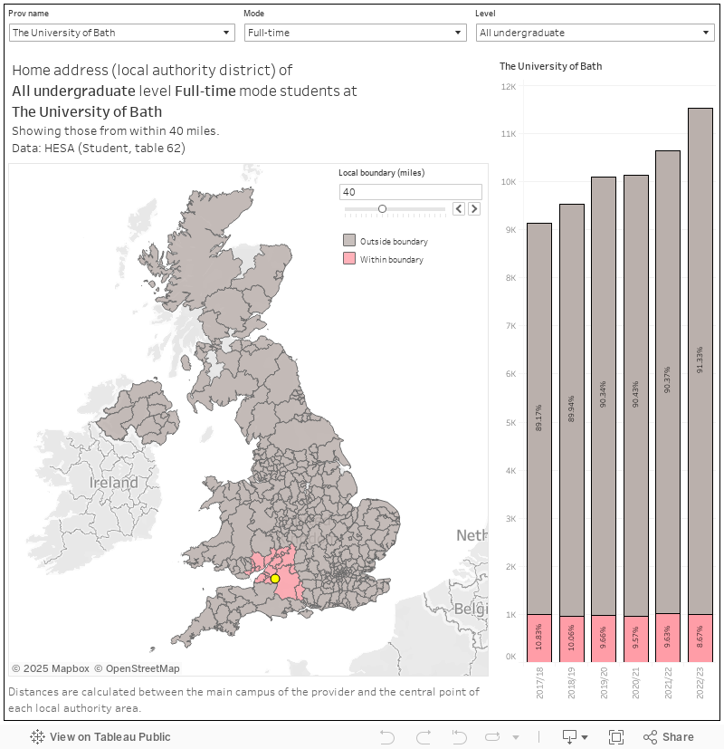
The map will show you which local authorities are in scope (marked in pink) – the students that hail from those pink areas are shown in the bar chart at the side for each year, and the proportion of all students (at that provider with the level and mode as selected) is marked on the bars.
It’s far from perfect – one particular issue comes with the use of local authorities (as of late 2023, local democracy fans) as the unit of analysis. Because I can’t tell you where in, say, Somerset, a particular student lives we have to use the distance from the central point of the local authority in question. This is fine for your smaller council areas, but for big rural districts it causes problems.
Another issue will be the population of each area. There’s loads of potential students in Birmingham or London, perhaps less in Northumberland or Devon. If your main campus is nearer the former than the latter, your figures are going to be flattered.
If not you then who?
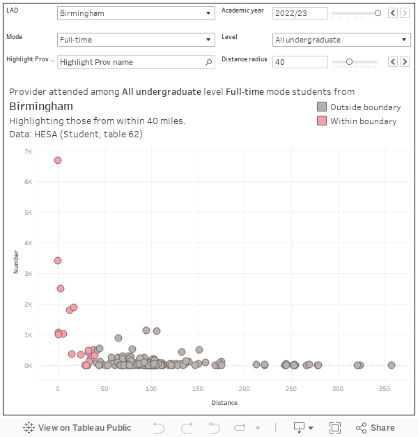
If local students aren’t going to your provider, where are they going? I have a chart for that too – select your local authority district at the top, and the rest of the controls work as normal. In general local students do study locally – but there are exceptions.
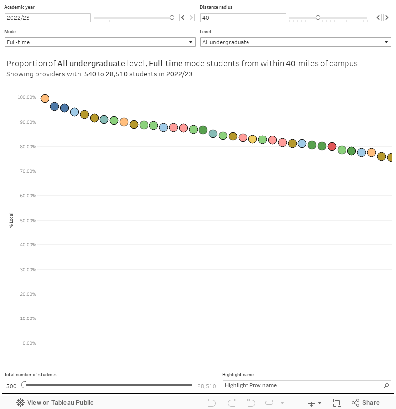
The inevitable ranking
So – which providers have a low proportion of students from their local area? If you look at full time undergraduate recruitments the winners tend to (as above) be London-based or northern civic universities with strong links to the local area. Bath (especially, with two providers represented at the bottom end) and the wider south west are more likely to see students leave the area to study, and specialist providers are less likely to recruit locally than larger providers offering more courses in more areas.
Though a first thought might see commuter students (and local recruitment) as an issue that doesn’t figure in the plans of our more prestigious providers, the reality is complex and pays no heed to your REF results. There are areas of the country where people tend to study locally – there are providers that are particularly good at recruiting what are likely to be their own recently qualified undergraduates on to masters courses. And large cities like London and Birmingham have their own specific gravity. In other words you almost certainly have students who commute – and thus have a very different experience of higher education to their peers – at your provider. And you need to offer them support.
This blog is part of our series on commuter students. Click here to see the other articles in the series.
Excellent – we need more geography of higher education.
There’s another challenge to our understanding – the rise and rise of branch campuses. If you look at Arden (and it really is worth noticing their rise in student numbers) they don’t actually teach their blended students at their main site. Their nearest ‘campus’ (I still object to floors of a building being described as a campus) is 20 miles away in Birmingham. They have 27% ‘local’ students – but that would be much higher if we could have data on their actual teaching locations.
I beg to differ on Table 62 being the best source of data although it’s arguably the easiest to put on a map. The OfS size and shape dashboard https://www.officeforstudents.org.uk/data-and-analysis/size-and-shape-of-provision-data-dashboard/data-dashboard/ gives you local students defined by travel to work areas which at least have a certain relationship to commutable distance than arbitrary local authority districts as the University of Bath map so elegantly demonstrates with the main campus sitting at the edge of an area and not within 40 miles of a close neighbour. I believe OfS also deal with multiple “campuses” using actual study locations
Thanks Richard. Though the Size and Shape dashboard (which I am a fan of, of course) allows you to see which how many “local” students are going to a given provider, it does not allow you to answer the inverse: which providers do students in a given locality attend. Clearly in terms of public data HESA was my only way to answer that question – and to split by level and mode of study.
We’ve had conversations about TTWAs before – I like the idea, but in practice you very rarely see data presented by TTWA (not even ONS Census data, which even lets you look at LEP areas and sub-integrated care board locations among other curiosities). That’s not a reason to avoid TTWA where they make sense, but a case to also publish data by more usual areas to allow for comparisons.
Great data. There’s a fairly big difference for my university between the stats here and the % of students ‘local prior to entry’ in the Size and Shape dashboard Richard points us to. It’d be really helpful if anyone could explain the difference between the two!
David they are quite different measures. The OfS measure looks at students studying in the same travel to work area as their home address, a primer on TTWA is on Wikipedia https://en.wikipedia.org/wiki/Travel_to_work_area#:~:text=A%20travel%20to%20work%20area,for%20the%20purposes%20of%20employment. If I have understood correctly what DK has done is look at where each university is and then look at which Local authority districts are nearby based on the centre of each one so a very different measure as using a different geography. Also because of the data David can get for free his data doesn’t account for different campus’. For me the big weakness with DK’s analysis is that a student may live very close to their University campus but happen to be in an adjacent local authority which is large so doesn’t count as close .
Thanks so much for taking the time to reply Richard, that’s really helpful
Great data. The results for my institution in Yorkshire differ significantly between this HESA Table 62 data and the OfS Size and Shape data for ‘students from local area prior to entry that Richard refers to. Are any of my more learned colleagues able to explain the difference? I assume it’s because the HESA 62 data seems to be pulling on the whole of Yorkshire, whereas OfS have a tighter definition of ‘local’, but I can’t find OfS’ definition.
Ignore this, I thought my post earlier hadn’t loaded!
I ended up down a bit of rabbit hole trying to find a definition of ‘local to address’ from the OfS – alas, I didn’t have any luck either!
I think it’s worth noting that some students don’t get into their local university even if they’ve applied there. Or don’t bother applying because they know they have no chance of getting in. So I’m not sure a “ranking” is relevant.
…and universities in areas like Bath, Bristol and Exeter have competitive entry requirements. So it might be more to do with entry requirements rather than locality.