


The headlines from the 2023-24 annual financial returns were already pretty well known back in January.
Even if you didn’t see Wonkhe’s analysis at the time (or the very similar Telegraph analysis in early May), you’d have been well aware that things have not been looking great for the UK’s universities and other higher education providers for a while now, and that a disquieting number of these are running deficits and/or making swingeing cuts.
What the release of the full HESA Finance open data allows us to do is to peer even deeper into what was going on last academic year, and start making sense of the way in which providers are responding to these ongoing and worsening pressures. In particular, I want to focus in on expenditure in this analysis – it has become more expensive to do just about everything in higher education, and although the point around the inadequacy of fee and research income has been well and frequently made there has been less focus on just how much more money it costs to do anything.
Not all universities
The analysis is necessarily incomplete. The May release deals with providers who have a conventional (for higher education) financial year – one that matches the traditional academic year and runs through to the end of July. As the sector has become more diverse the variety of financial years in operation have grown. Traditional large universities have stayed with the status quo – but the variation means that we can’t talk about the entire sector in the same way as we used to, and you should bear this in mind when looking at aggregate 2023-24 data.
A large number of providers did not manage to make a submission on time. Delays in getting auditor sign off (either because there was an audit capacity problem due to large numbers of local authorities having complex financial problems, or because universities themselves were having said complex financial problems) mean that we are down 18 sets of accounts. A glance down the list shows a few names known to be struggling (including one that has closed and one that has very publicly received a state bailout).
So full data for the Dartington Hall Trust, PHBS-UK, Coventry University, Leeds Trinity University, Middlesex University, Spurgeon’s College, the University of West London, The University of Kent, University of Sussex, the Royal Central School of Speech and Drama, The Salvation Army, The London School of Jewish Studies, Plymouth Marjon University, the British Academy of Jewellery Limited, Multiverse Group Limited, the London School of Architecture, The Engineering and Design Institute London (TEDI) and the University of Dundee will be following some time in autumn 2025.
Bad and basic
HESA’s Key Financial Indicators (KFIs) are familiar and well-documented, and would usually be the first place you would go to get a sense of the overall financial health of a particular university.
I’m a fan of net liquidity days (a measure showing the number of days a university could run for in the absence of any further income). Anything below a month (31 days) makes me sit up and take notice – when you exclude the pension adjustment (basically money that a university never had and would never need to find – it’s an actuarial nicety linked to to the unique way USS is configured) there’s 10 large-ish universities in that boat including some fairly well known names.
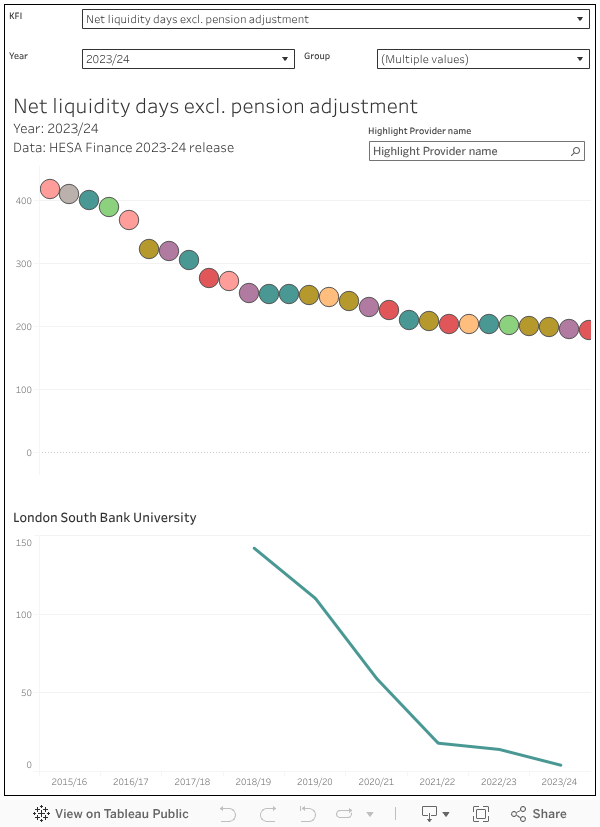
Just choose your indicator of interest in the KFI box and mouse over a mark in the chart to see a time series for the provider of your choice. You can find a provider using the highlighter – and if you want to look at an earlier year on the top chart there’s a filter to let you do that. I’ve filtered out some smaller providers by default as the KFIs are less applicable there, but you can add them back in using the “group” filter.
I’d also recommend a look at external borrowing as a percentage of total (annual) income – there are some providers in the sector that are very highly leveraged who would both struggle to borrow additional funds at a reasonable rate and are likely to have substantial repayments and stringent covenants that severely constrain the strategic choices they can make.
Balance board
This next chart lets you see the fundamentals of your university’s balance sheet – with a ranking by overall surplus and deficit at the top. There are 29 largeish providers who reported a deficit (excluding the pension adjustments again) in 2023-24, with the majority being the kind of smaller modern providers that train large parts of our public sector workforce. These are the kind of universities who are unlikely to have substantial initial income beyond tuition fees, but will still have a significant cost base to sustain (usually staffing costs and the wider estates and overheads that make the university work).
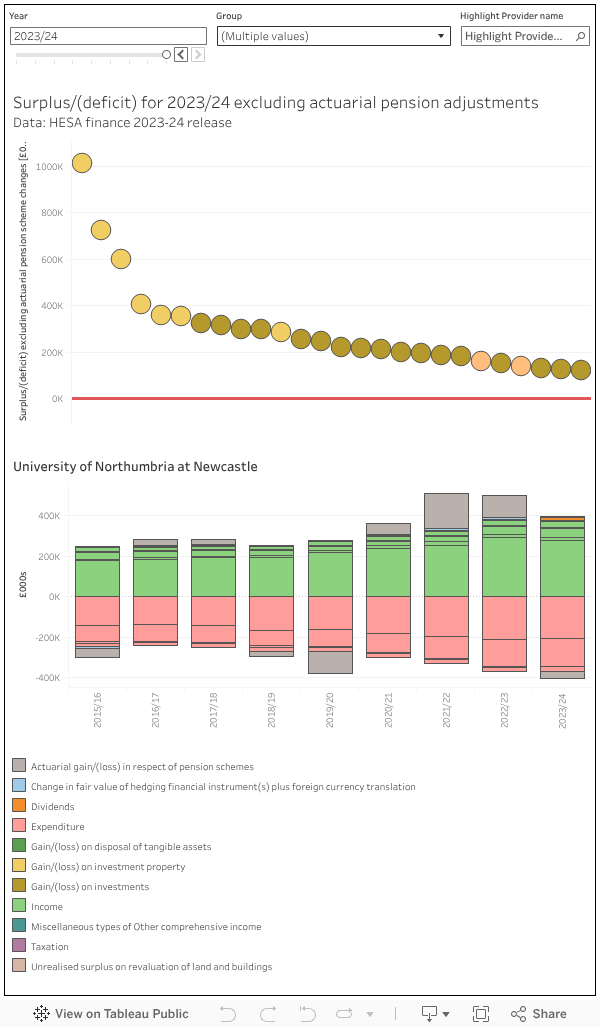
This one works in a pretty similar way to the chart above – mousing over a provider mark on the main surplus/deficit ranking lets you see a simplified balance sheet. The colours show the headline categories, but these are split into more useful indications of what income or expenditure relates to. Again, by default and for ease of reading I have filtered out smaller providers but you could add them in using the “group” filter. For definitions of the terms used HESA has a very useful set of notes below table 1 (from which this visualisation is derived)
There’s very little discretionary spend within the year – everything pretty much relates to actually paying staff, actually staying in regulatory compliance, and actually keeping the lights on and the campus standing: all things with a direct link to the student experience. For this reason, universities have in the past been more keen to maximise income than bear down on costs although the severity and scope of the current pressure means that cuts that students will notice are becoming a lot more common.
What universities spend money on
As a rule of thumb, about half of university expenditure is on staff costs (salaries, pensions, overheads). These costs rise slowly but relatively predictably over time, which is why the increase in National Insurance contributions (which we will see reflected in next year’s accounts) came as such an unwelcome surprise.
But the real pressure so far has been on the non-staff non-finance costs – which have risen from below 40 per cent a decade ago to rapidly approach 50 per cent this year (note that these figures are not directly comparable, but the year to date includes most larger providers, and the addition of the smaller providers in the regular totals for other years will not change things much).
What are “other costs”? Put all thoughts of shiny new buildings from your mind (as we will see these are paid for with capital, and only show up in recurrent budgets as finance costs) – once again, we are talking about the niceties of there being power, sewage, wifi, printer paper, and properly maintained buildings and equipment. The combination of inflationary increases and a rise in the cost of raw materials and logistics as a result of the absolute state of the world right now.
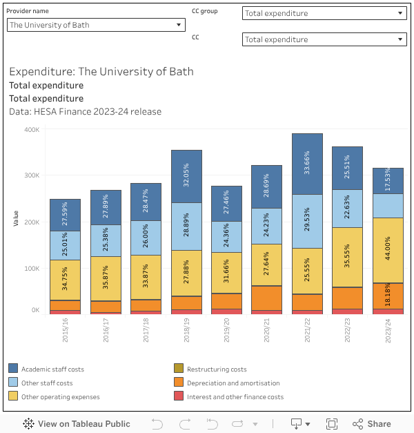
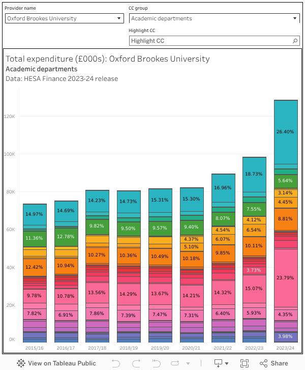
Though this first chart defaults to overall expenditure you can use it to drill down as far as individual academic cost centres using the “cc group” and “cc filters”. Select your provider of interest (“All providers” shows the entire sector up to 2022-23, “All providers (year to date)” shows everything we know about for 2023-24. It’s worth being aware that these are original not restated accounts so there may be some minor discrepancies with the balance sheets (which are based on restated numbers).
The other thing we can learn from table 8 is how university spending is and has been split proportionally between cost centres. Among academic subject areas, one big story has been the rise in spending in business and management – these don’t map cleanly to departments on the ground, but the intention to ready your business school for the hoped-for boom in MBA provision is very apparent.
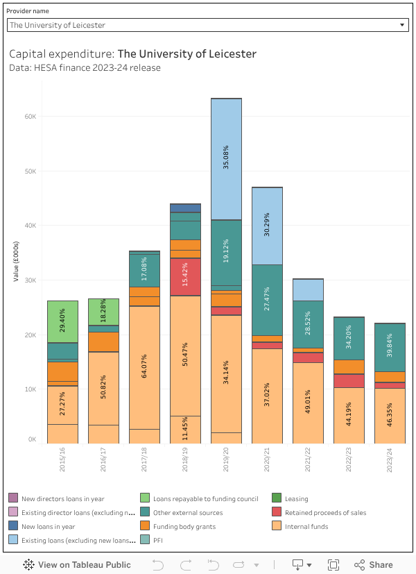
That’s capital
I promised I’d get back to new builds (and large refurbishment/maintenance projects) and here we are. Spending is categorised as capital expenditure when it contributes to the development of an asset that will realise value over multiple financial years. In the world of universities spend is generally either on buildings (the estate more generally) or equipment (all the fancy kit you need to do teaching and research).
What’s interesting about the HESA data here is that we can learn a lot about the source of this capital – it’s fairly clear for instance that the big boom in borrowing when OfS deregulated everything in 2019-20 has long since passed. “Other external sources” (which includes things like donations and bequests) are playing an increasingly big part in some university capital programmes, but the main source remains “internal funds” drawn from surpluses realised in the recurrent budget. These now constitute more than 60 per cent of all capital spend – by contrast external borrowing is less than ten per cent (a record low in the OfS era)
What’s next?
As my colleague Debbie McVitty has already outlined on the site, the Office for Students chose the same day to publish their own analysis of this crop of financial statements plus an interim update giving a clearer picture of the current year alongside projections for the next few.
Rather than sharing any real attempt to understand what is going on around the campuses of England, the OfS generally uses these occasions to complain that actors within a complex and competitive market are unable to spontaneously generate a plausible aggregate recruitment prediction. It’s almost as if everyone believes that the expansion plans they have very carefully made using the best available data and committed money to will actually work.
The pattern with these tends to be that next year (the one people know most about) will be terrible, but future years will gradually improve as awesome plans (see above) start to pay off. And this iteration, even with the extra in year data which contributes to a particularly bad 2025-26 picture, is no exception to this.
While the HESA data allows for an analysis of individual provider circumstances, the release from OfS covers large groups of providers – mixing in both successful and struggling versions of a “large research intensive” or “medium” provider in a generally unhelpful way.
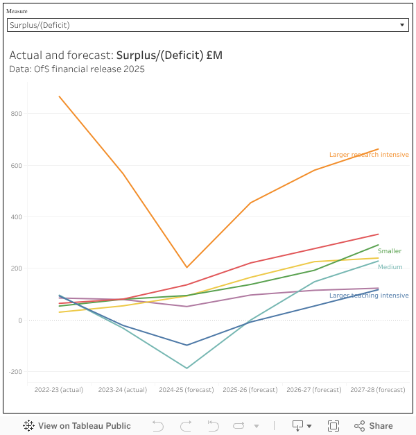
To be clear, the regulator understands that different providers (though outwardly similar) may have different financial pressures. It just doesn’t want to talk in public about which problems are where, and how it intends to help.


Doesn’t the traditional financial year run to 31st Jul, not the end of August?
Yes! an unfortunate typo, which I have now fixed
Also worth looking at the ratio of current assets (cash, debtors, stock) to current liabilities (creditors due within the next year). A ratio of less than 1.0 indicates potential technical insolvency. This part of the balance sheet is probably the only one that matters in a perpetual entity such as a University because it’s the engine room of University finances. A falling ratio indicates the engine is burning oil (cash) to keep going.
There are several providers in the second chart with data that has not been adjusted for the actuarial pension adjustments. Just picking the first five I can see where there is no adjustment recorded for several years: UCL, Kings College London, Imperial College, LSE and the OU. I’m sure there will be more if you keep going down the list and the 2023/24 adjustments look too small to be for USS for many of the others
I’ve plotted the data as provided by HESA – this one represents the data in DT031 Table 1 (“Consolidated statement of comprehensive income and expenditure”). The HESA table does indeed show 0 for an actuarial gain/loss on pension schemes, so I will check in with them to see what is going on.
They seem like different numbers for the actuarial gain/loss on pension schemes than in DT031 Table 12 https://www.hesa.ac.uk/data-and-analysis/finances/table-12
Thanks. This issue now fixed – numbers should be displaying correctly in all cases.
It’s still not showing e.g. Oxford is recorded in the chart as having £760m of staff costs and a pensions adjustment of minus £10m whereas HESA Table 12 records it as £1,288m of staff costs and a pensions adjustment of minus £527m i.e. its pension-adjusted surplus is (I think) £517m lower than indicated.
The numbers still don’t look correct.
I believe “Other Operating Expenses” also includes payments to agents for international student acquisition or payments to other partners. You can see this trend if you look at those universities that have significantly increased their international student recruitment or partnerships over the last few years (especially if they need to pay agents to get students in) in comparison to those that have not.
This is very helpful and confirms what we know: the current problems are problems of teaching, rising teaching costs (including buildings) and lagging teaching income. The higher-ranked will swipe up more and more students. The lower-ranked won’t have a credible proposition for students, especially as the link between education and employment becomes less and less direct. The paradox is that while society needs more and more quality university education, the system we have perversely produces less and less of it. HE and housing resemble each other in the UK. This is the general will of the population & therefore hard to change.
Why does society ‘need more and more quality university education’ – ?
That is a question that hangs heavy.
I’m not sure about ‘university education’ but the argument has often been that society needs educated people for informed participation in the democratic process. A cynic might offer up current US politics as an example of this breaking down.
Durham and St Andrews seem in a rather bleak situation, worse than most.