There’s any number of stories that can be told from UCAS’ sector level end of cycle data release.
UCAS itself, for instance, focuses on the new data on student residence intentions – 31 per cent of 18 year old applicants in 2025 intend to live at home (rising to 46 per cent in Scotland).
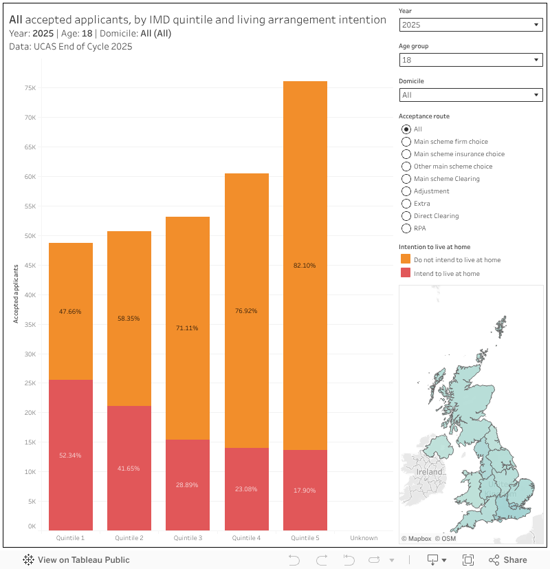
If we add in information on deprivation (IMD) and acceptance route, we learn that 50 per cent of the less advantaged quintile of students aged 18 intend to live at home while studying, compared to just 18 per cent of their peers in quintile 5.
And there are interesting regional variations – two thirds of the least advantaged 18 year old accepted applicants in Scotland intend to live at home (mouse over the map to see the regional breakdowns – and of course UK wide IMD isn’t a thing so treat that as indicative only).
Likewise, 75 per cent of the least advantaged group applying via main scheme Clearing will be living at home.
Tariff wars
But you know and I know there has only been one recruitment story this year, and it is one that is best described via a very familiar chart:
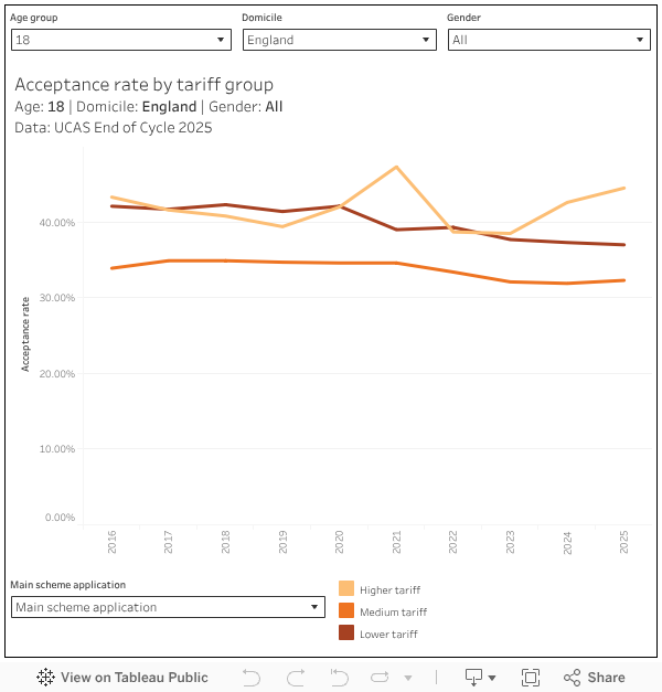
Higher tariff (what we once called “selective”) providers are recruiting more 18 year old students than ever before, a trend that has become more prominent since the end of pandemic restrictions. The chart above shows acceptance rates, demonstrating that – simply put – as an 18 year old you are now substantially more likely to end up at a high tariff provider if you apply there.
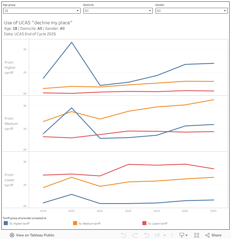
One of the commonly proposed explanations for this phenomenon is the way in which applicants are using the “decline my place” functionality (on the UCAS platform since 2019) to trade up to a more prestigious provider. But the data neatly disproves this – movement tends to be within rather than between tariff bands:
So what else might be going on?
We also get data by tariff group and acceptance route in this release – and from that we can see some very interesting underlying trends. Here the thick bars are the proportions and the thin ones the raw numbers, with the colours showing acceptance routes.
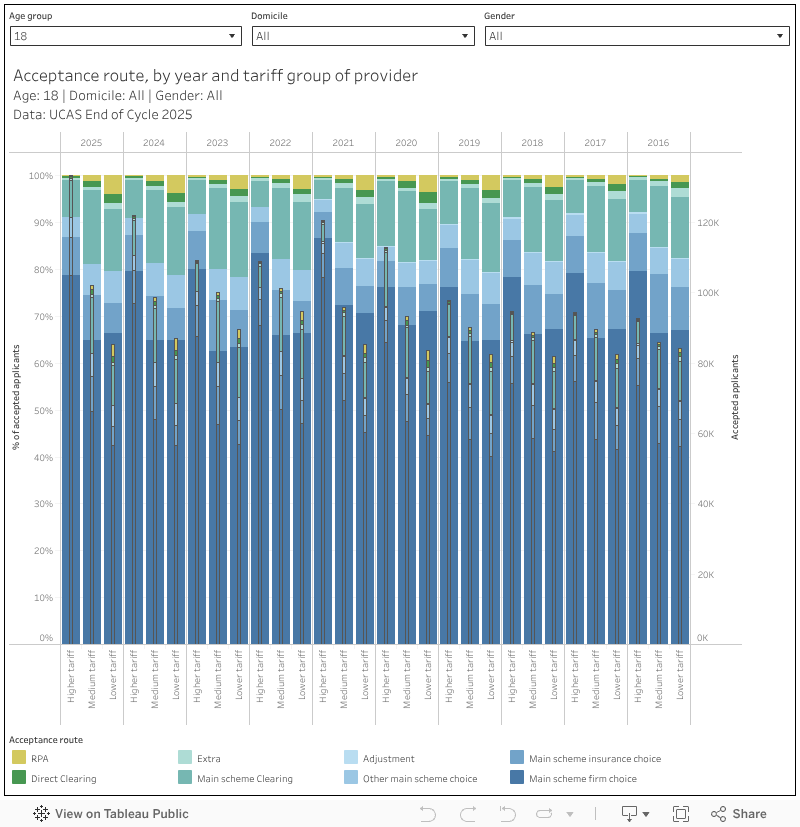
Gradually higher tariff providers have been taking a lower proportion of their 18 year old students via firm acceptances, and a higher proportion from other main scheme choices (including clearing). But this shift needs to be set against enormous expansion in numbers across the board – high tariff providers took more 18 year olds overall this year than their entire 2019 intake, and more firm or insurance 18 year old applicants this year than their entire 2023 intake.
In contrast, proportions of 18 year olds by route have stayed broadly similar by proportion in medium and low providers, with medium tariff numbers staying steady and low tariff numbers slowly falling.
More data please?
So, even though high tariff providers have been slightly more active in clearing than in recent years (and even then, it is not outside of historic proportions) the growth comes simply from making offers to more applicants who apply to them, and then accepting them.
What I really wanted to know is on what terms. There’s already a fair amount of circumstantial evidence that high-tariff providers are making low tariff offers – and I was hoping that this release would give us the data we needed to be sure.
But UCAS has always been very coy about the association between tariff groups and the actual grades they accept. I can kind of understand the commercial in confidence arguments about detailed data at provider level (but the more I think about it the less I do…) – I cannot see any reason why we are not allowed to see grades by tariff group.
So I am taking a roundabout route using the data we have got, and we start by looking at the relationship between achieved A level points and POLAR4 quintiles. I’ve generally held the opinion that A levels are a fantastic way of telling how middle class an 18 year old applicant is so there are no surprises that people from better off background are more likely to apply, more likely to be accepted if they apply, and more likely to have better grades than their peers when they do – here’s that in graphical form.
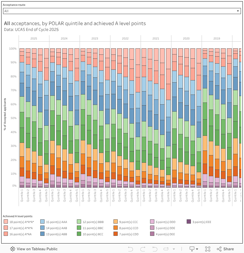
Outside of the years of the examnishambles proportions remain pretty stable, even though numbers have increased in all cases. Roughly a third of POLAR quintile 5 (most advantaged) accepted applicants get AAA or above, roughly three in ten of POLAR quintile 1 (least advantaged) accepted applicants get CCC or below.
We run into another wrinkle in the UCAS data here: we don’t get tariff group acceptances by POLAR, though we do get it by IMD (and we don’t get A level points by IMD, but we do by POLAR). I’m pretty sure UCAS invented the multiple equality measure (MEMS) for precisely that reason, but we don’t appear to get that at all these days.
So here is a plot of acceptance applicants by IMD quintile (note that you can only really look at one home nation at a time due to differences in methodologies). And what is apparent is the familiar slow steady growth in less advantaged 18 year accepted applicants attributed to widening access initiatives.
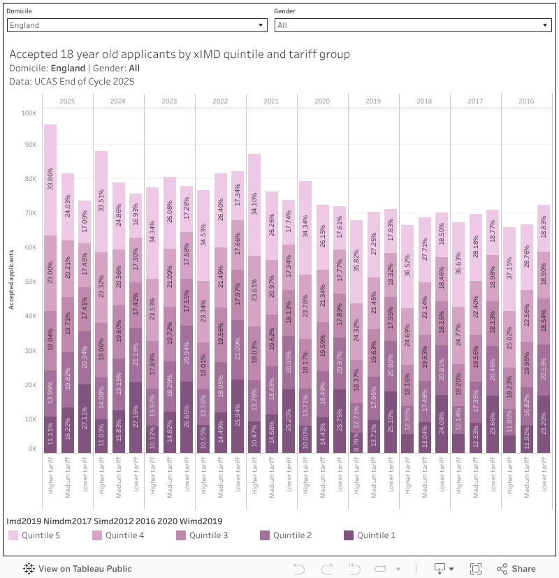
Unfortunately this is a case of what we don’t see. There’s a potential happy ending where we learn that high tariff providers are massively expanding their recruitment of applicants from disadvantaged backgrounds, and that this explains both the rise in numbers and any decline in average offermaking. The growth in high tariff recruitment from low advantage quintiles is welcome, but not anything like huge enough to explain the growth in numbers.
We are left to conclude that the expansion is in all groups equally – and given that most of the best A level scores tend to go to the top of the league tables anyway, it is hard to dismiss the idea that tariffs are falling. Perhaps January’s provider level release will offer us more oblique ways to examine what should be a very straightforward question – and one (that given the influx of less academically experienced students into providers that have not historically supported students like that) may well attract regulatory interest.
Bonus charts
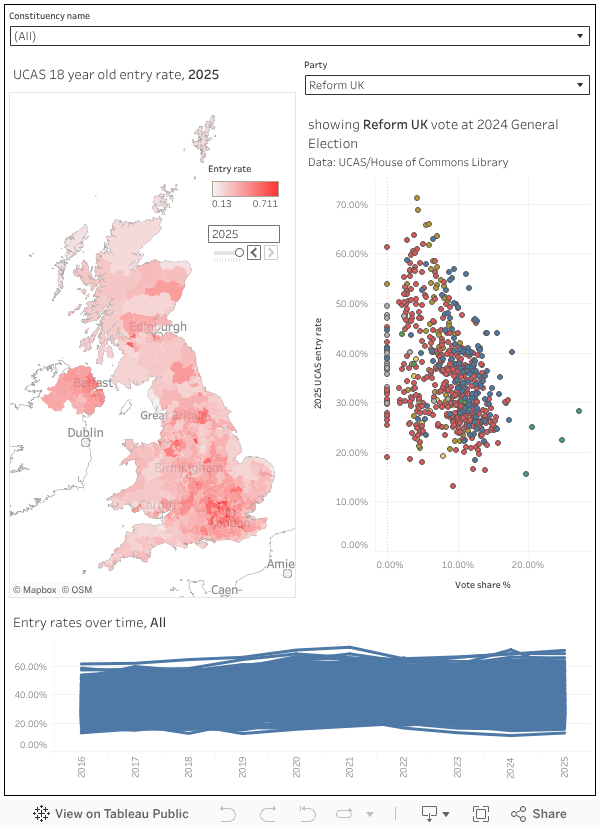
We randomly got a really lovely dataset showing entry rates by Westminster constituency – and I could hardly resist plotting it alongside the 2024 election results. There is a mild correspondence between a lower entry rate and a higher Reform UK vote.