


If you think about longitudinal educational outcomes data, chances are that you think at the provider and subject area, with numerous doomed attempts to identify “low quality courses” going before you.
At this stage, eight years on, you are probably also aware that LEO is really bad at making these distinctions – the inability to discriminate between part time and low paid work being just the most notable, a series of confounding factors (background, region, industry…) causing the kinds of troubles with medians that you may expect.
There are things that LEO is quite good at, and the “other” LEO release (the one without all the provider names in) is – whisper it – the best one.
Regional movement
Of relevance to the current fashion for regional and local skills planning is the phenomenon of graduates from providers in one place moving to another in order to work. It may be that a particular skillset is needed by employers somewhere, but a university putting on a course is not a solution to that problem if the graduates all head to London and the south east.
This LEO dashboard allows you to set the region of your institution and see where the graduates end up a given number of years after graduation. You can set subject of study along with the industry that graduates work in.
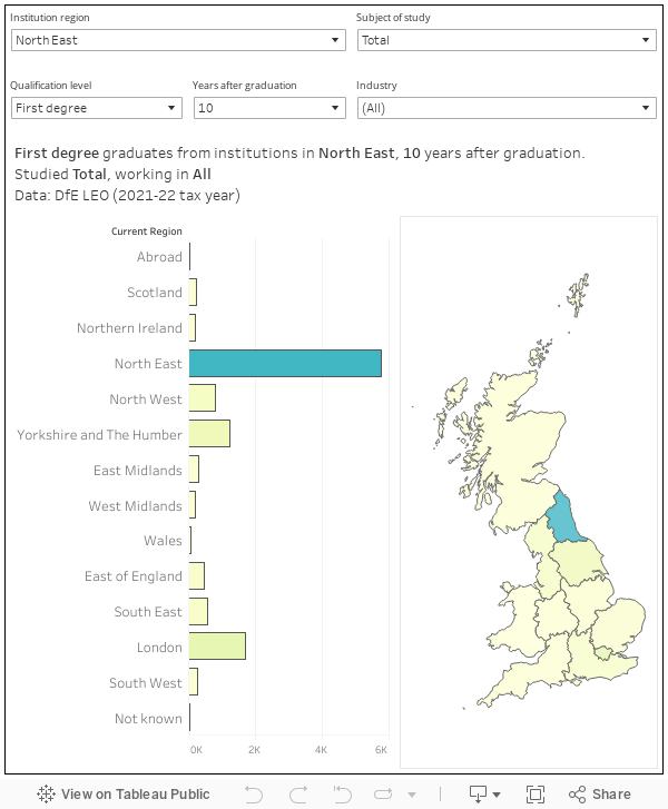
At first sight, this looks encouraging. The majority of students, 10 years after graduation from their first degree in the north east, are still in the area. However, most of those who studied economics (use the filter) have gone to London to work, as have the plurality who work in the financial sector. For every graduate in the north east that has stayed to work in the north east in a professional or scientific role, another has moved elsewhere in the country.
Regional earnings
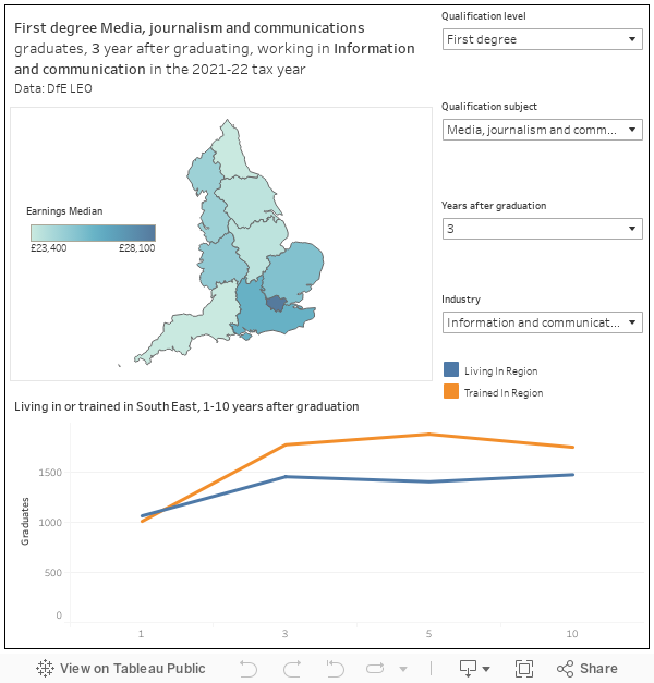
Why would they do that? I mean, the north east is lovely. One reason may well be the ability to earn more elsewhere. LEO also lets us see what graduates, by years after graduation, subject, and industry, earn a number of years (1,3,5, or 10) years after graduation.
To give an example, journalism graduates working in the information and communications industry earn more in London (median salary £28,100 after three years) than anywhere else in the country. It may be for this reason that bottom chart below (mouse over the region in question) shows more graduates working in the region than were trained there.
On the salary end of things you do need to bear in mind the part-time earnings problem (basically the dataset sees these as very low paid full time jobs – something that particularly affects arts graduates who may be practising as artists while covering day-to-day expenses with part-time work). But the correlation between graduates moving towards an area and the prevailing rates of pay in that area is a strong one.
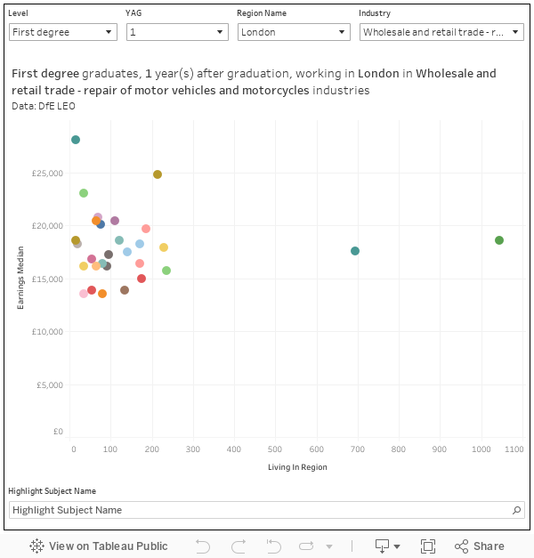
Incidentally, there is a subject difference in earnings (and popularity) within industries and regions by subject and studies. The default view here shows that if you are in, broadly speaking, sales in London, there are a lot of subjects other than business studies that would see you get a better salary a year out from graduation. And the same holds true 10 years out – though an MBA would help a lot.
Long term equality impacts
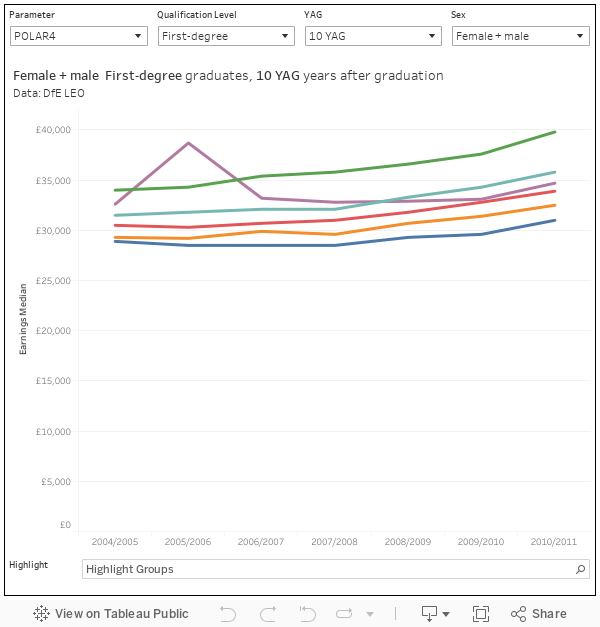
In all the excitement about finding “mickey mouse” courses, the real story – that disadvantaged or “non-traditional” graduates earn less than their peers, tends to get lost. This dashboard eloquently demonstrates that where you came from (your POLAR4 quintile), has a big impact on your salary even 10 years on.
Ten years out, graduates (first degree, female and male) from POLAR4 quintile 5 earn a median £39,800. Their less advantaged (POLAR4 quintile 1) peers earn £31,000 – just 77 per cent of what those from a more traditional graduate background earn. And this gap has grown – for those who graduated 7 years earlier, POLAR4 quintile 1 earned 85 per cent of what their quintile 5 peers got.
You can’t look at free school meals eligibility data 10 years after graduates, but there’s a similarly sized gap between those who were eligible and those whose status is “not known” (which is basically a euphemism for “privately educated” in this context). There’s a smaller, but still striking, difference against non-eligible graduates. The visualisation also lets you investigate ethnicity, age, mode of study, prior attainment, mode of study, and mode of residence as a student – in each case the differentials are depressingly close to what you would probably expect.
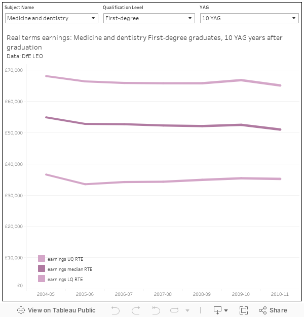
Real terms salary data
Because we are looking at salaries over a long period, inflation becomes an issue. Again, it’s little used, but you do get a time series showing real term earnings by subject of degree. In the main it is striking how stable things are – I’ve included tax-years (the year the data refers to) in the tool tops so you can spot the varying impact of the pandemic, which was larger for those closer to graduation.
One striking feature is the falling value of medical and dental salaries in real terms, across the board – and exploring the chart will show you that this drop off is more acute the closer to graduation you are. Which rather suggests that junior doctors contemplating industrial action may have a point.
There is a general pattern of declining real terms earnings a year after graduation – which is why I never look at graduate outcomes salary data – but it was heartening to see creative and performing artists bounce back after the pandemic year. Though salaries in these fields remain low (remember the part time thing!), it seems they are – at least – resilient.