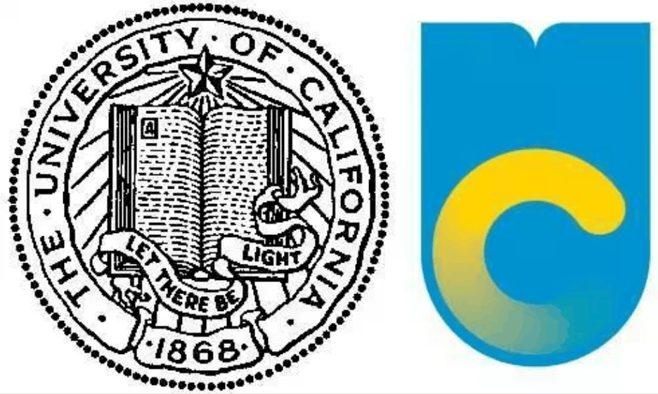
University rebrands are always challenging. Any changes to university logos even more so.
An earlier piece on Wonkhe covered the changing university logo and noted particular challenges at the University of California and the University of Warwick. California rowed back on its change but Warwick rode the storm and has now firmly established the new identity and we’ve all moved on.
The California one was particularly entertaining with many suggesting the proposed new logo was rather reminiscent of a toilet flushing…

More recently, Emerson College has joined in the fun:
A new logo for Emerson College is receiving widespread criticism from students and alumni. “This new logo does not represent the dedication, hard work and creativity of the students, alumni, teachers and faculty of Emerson College. It is not a clear signifier of our school and is being compared to ‘the breast cancer ribbon,’ ‘the cup from the ’90s’ and looking like a ‘laser hair removal’ logo,” says a petition against the new logo. An editorial in the student newspaper, The Berkeley Beacon, called the new logo “little more than an errant pen mark” and “worse than ugly and worse than trivializing.”
So, tread very carefully when rebranding would seem to be the key learning point here. Since then it appears Emerson have ditched this new logo although there are clearly instances of it still around

And the new logo is now pretty straightforward (or a bit dull, depending on your perspective):

But you can still find plenty of examples of this one too:

So, all a bit messy still over at Emerson.
Simply irresistable
But the urge to rebrand is irresistible and the latest example is the University of South Florida which has a bullish new logo which is rather reminiscent of the financial company Merrill Lynch:

On Facebook, one user named Jason Litt commented, “I would like to speak with one of your brokers to set up a Roth IRA. As the market is trending up, I’d be interested in funding a significant amount to be invested towards my retirement …”
Another called the new design “TERRIBLE,” adding, “Can’t wait for Merrill Lynch to send a cease and desist use of this logo.”
For the moment, USF has no plans to abandon the bull, saying officials are listening to the crowd.
“We’re continuing to take feedback from our alumni and our students, which is what you need to do,” said chief marketing director Joe Hice. “We’re taking it seriously because it represents the academic success of the university over the last 63 years.”
Hice told Inside Higher Ed that they settled on the bull logo in the absence of any iconic building such as a clock tower. They did though seem to have rather a large number of bulls…
Designers pulled ideas from bull statues on the all of its campuses, borrowing as well from USF’s “Bull U” athletic logo, a stylized U that looks like bull’s horns. Then they compared preliminary designs to those of other bull logos. “We found about 250 different bulls in use somewhere,” Hice said. The green USF bull made it through trademark comparisons “without any problems.”
I like it!
Whilst many may mock, there is at least one designer who thinks all is just great:
Michael Morrow, a Portland, Ore., designer whose firm has created logos for colleges that include Bowdoin College’s polar bear, took one look at the new USF bull and said it’s worth fighting for. “Ya know what, I like it!” he wrote via email.
He also liked the green-and-yellow color scheme of the new design.
“It’s not perfect,” Morrow said. “Obviously it is similar to the iconic Merrill Lynch bull, which I love. But for a college brand I like the progressive attitude. Way better than the previous logo, which looks the same as every other university in the world.”
USF clearly took a risk, he said, knowing it would be criticized — Morrow said “whining” accompanies any brand redesign.
“Everyone thinks they’re a designer these days, so a thick skin is required of university stakeholders who get behind something different,” he said. “I also appreciate the effort to connect the bull icon to the existing athletic icon. Smart.”
So, the message to everyone at USF seems to be to stop the whining and get on board with the new bull.
Are there any other rebrand challenges going on?


