


The Office for Students’ release of data relating to Condition of Registration B3 is the centerpiece of England’s regulator’s quality assurance approach.
There’s information on three key indicators: continuation (broadly, the proportion of students who move from year one to year two), completion (pretty much the proportion who complete the course they sign up for), and progression (the proportion who end up in a “good” destination – generally high skilled employment or further study).
Why B3 data is important
The power comes from the ability to view these indicators for particular populations of students – everything from those studying a particular subject and those with a given personal characteristic, through to how a course is delivered. The thinking goes that this level of resolution allows OfS to focus in on particular problems – for example a dodgy business school (or franchise delivery operation) in an otherwise reasonable quality provider.
The theory goes that OfS uses these B3 indicators – along with other information such as notifications from the public, Reportable Event notifications from the provider itself, or (seemingly) comment pieces in the Telegraph to decide when and where to intervene in the interests of students. Most interventions are informal, and are based around discussions between the provider and OfS about the identified problem and what is being done to address it. There have been some more formal investigations too.
Of course, providers themselves will be using similar approaches to identify problems in their own provision – in larger universities this will be built into a sophisticated data-driven learner analytics approach, while some smaller providers primarily what is in use this release (and this is partly why I take the time to build interactives that I feel are more approachable and readable than the OfS versions).
Exploring B3 using Wonkhe’s interactive charts
These charts are complicated because the data itself is complicated, so I’ll go into a bit of detail about how to work them. Let’s start with the sector as a whole:
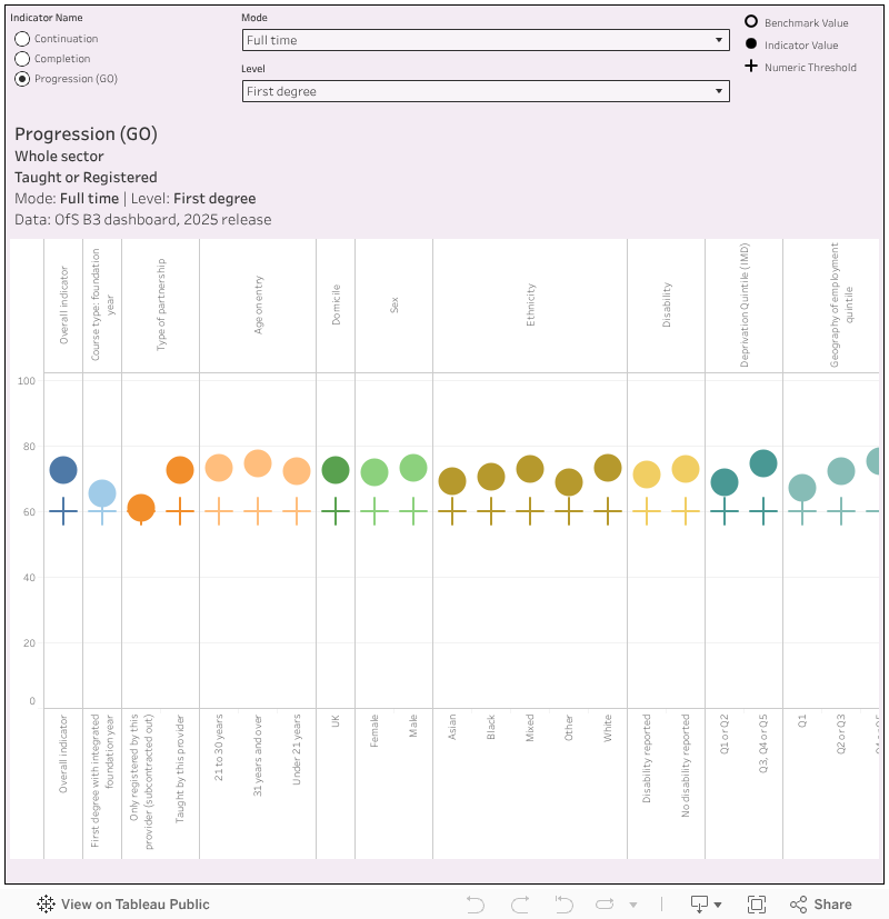
First choose your indicator: Continuation, completion, and progression.
Mode (whether students are studying full time, part time, or on an apprenticeship) and level (whether students are undergraduate, postgraduate, and so on) are linked: there are more options for full and part time study (including first degree, taught postgraduate, and PhD) and less for apprenticeships (where you can see either all undergraduates or all postgraduates).
The chart shows various splits of the student population in question – the round marks show the actual value of the indicator, the crosses show the current numeric threshold (which is what OfS has told us is the point below which it would start getting stuck in to regulating).
Some of the splits are self-explanatory, others need a little unpacking. The Index of Multiple Deprivation (IMD) is a standard national measure of how socio-economically deprived a small area is – quintile 1 is the most deprived, quintile 5 is the least deprived. Associations Between Characteristics of Students (ABCs) is a proprietary measure developed by OfS which is a whole world of complexity: here all you need to know is that quintile five is more likely to have good outcomes on average, and quintile 1 are least likely to have good outcomes.
If you mouse over any of the marks you will get some more information: the year(s) of data involved in producing the indicator (by definition most of this data refers to a number of years ago and shouldn’t really be taken as an indication of a problem that is happening right now), and the proportion of the sample that is above or below the threshold. The denominator is simply the number of students involved in each split of the population.
There’s also a version of this chart that allows you to look at an individual provider: choose that via the drop down in the middle of the top row.
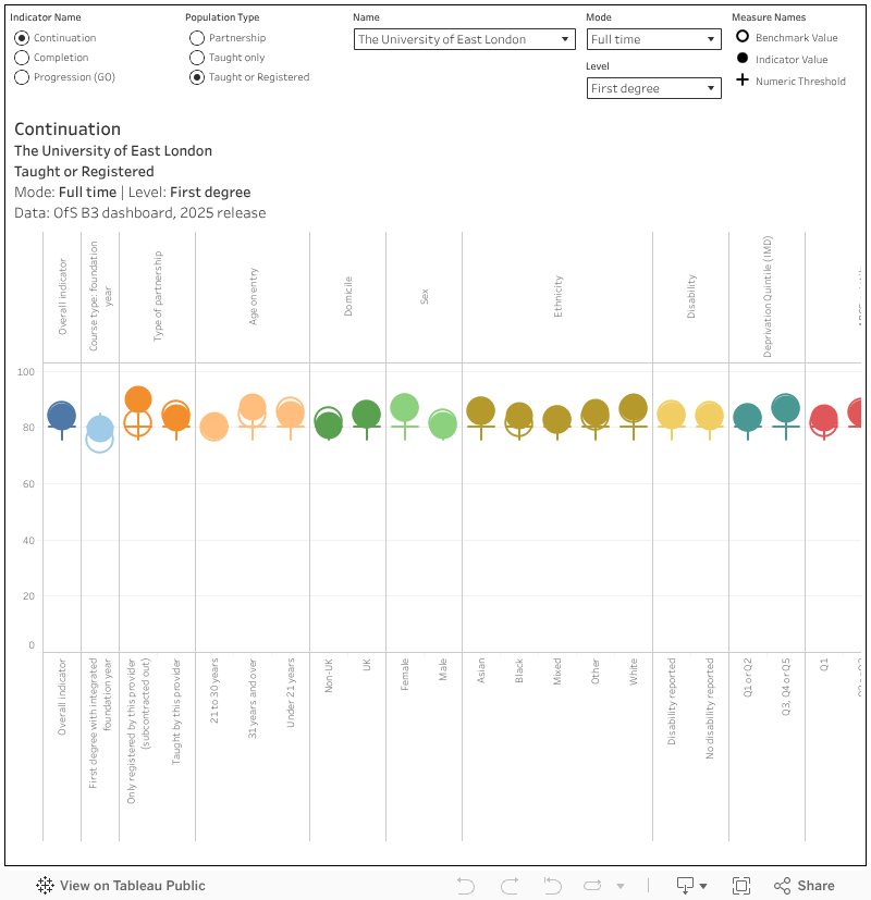
You’ll note you can select your population: Taught or registered includes students taught by the provider and students who are registered with a provider but taught elsewhere (subcontracted out), taught only is just those students taught by a provider (so, no subcontractual stuff), partnership includes only students where teaching is contracted out or validated (the student is both registered and taught elsewhere, but the qualification is validated by this provider)
On the chart itself, you’ll see a benchmark marked with an empty circle: this is what OfS has calculated (based on the characteristics of the students in question) the value of the indicator should be – the implications being that the difference from the benchmark is entirely the fault of the provider. In the mouse-over I’ve also added the proportion of students in the sample above and below the benchmark.
OfS take great pains to ensure that B3 measures can’t be seen as a league table, as this would make their quality assurance methodology look simplistic and context-free. Of course, I have built a league table anyway just to annoy them: the providers are sorted by the value of the indicator, with the other marks shown as above (note that not all options have a benchmark value). Here you can select a split indicator type (the group of characteristics you are interested in) and then the split indicator (specific characteristic) you want to explore using the menus in the middle of the top row – the two interact and you will need to set them both.
You can find a provider of interest using the highlighter at the bottom, or just mouse over a mark of interest to get the details on the pop-up.
With so much data going on there is bound to be something odd somewhere – I’ve tried to spot everything but if there’s something I’ve missed please let me know via an email or a comment. A couple of things you may stumble on – OfS has suppressed data relating to very small numbers of students, and if you ever see a “null” value for providers it refers to the averages for the sector as a whole.
Yes, but does it regulate?
It is still clear that white and Asian students have generally better outcomes than those from other ethnicities, that a disadvantaged background makes you less likely to do well in higher education, and that students who studied business are less likely to have a positive progression outcome than those who studied the performing arts.
You might have seen The Times running with the idea that the government is contemplating restrictions on international student visas linked to the completion rates of international students. It’s not the best idea for a number of reasons, but should it be implemented a quick look at the ranking chart (domicile; non-uk) will let you know which providers would be at risk in that situation: for first degree it’s tending towards the Million Plus end of things, for taught Masters provision we are looking at smaller non-traditional providers.
Likewise, the signs are clear that a crackdown on poorly performing validated provision is incoming – using the ranking chart again (population type: partnership, splits: type of partnerships – only validated) shows us a few places that might have completion problems when it comes to first degree provision.
If you are exploring these (and I bet you are!) you might note some surprisingly low denominator figures – surely there has been an explosion in this type of provision recently? This demonstrates the achillies heel of the B3 data: completion data relates to pre-pandemic years (2016-2019), continuation to 2019-2022. Using four years of data to find an average is useful when provision isn’t changing much – but given the growth of validation arrangements in recent years, what we see here tells us next to nothing about the sector as it currently is.
Almost to illustrate this point, the Office for Students today announced an investigation into the sub-contractual arrangement between Buckinghamshire New University and the London School of Science and Technology. You can examine these providers in B3 and if you look at the appropriate splits you can see plenty of others that might have a larger problem – but it is what is happening in 2025 that has an impact on current students.
Comment pieces in the Telegraph will tell you that analysing Progression data in this way is problematic as it assumes that attending University is the main causation factor in the graduates future career – as opposed to the pre-existing attributes of innate academic ability, ambition, work ethic, social skills, and opportunities due to social situation & background. So that it can’t be assumed that the process of studying for the degree is the main causation factor in Progression outcomes, as these pre-existing attributes of the graduates will also be a significant causation effect, and perhaps the dominant effect. Ironically, it… Read more »
I agree a lot of of this. Pre-existing advantage (parental income, a “good” school, a good house) is by far the best predictor of academic success and success in the job market. The goal of a truly equitable society – where success is based entirely on individual work, individual interest, and individual potential – is a noble one, but it is not a goal universities or any other educational setting can reach without wider societal change.
It is perhaps disappointing that DK decided to plot raw scores rather than difference to benchmark which attempts to strip out some of those underlying factors affecting all of the indicators. Of course you can debate which factors should be accounted for and which shouldn’t but they have at least attempted to isolate the provider effect from all of the other effects (usual caveats about my previous role apply)
Not as disappointing as all those years that OfS refused to countenance benchmarking in regulatory data analysis, Richard!
Most of this is simply fallacious. That studying in HE has a significant effect on graduate outcomes and earning potential is demonstrated by that ‘old’ method of comparing these outcomes between groups of similar people, by characteristic and background, who did and didn’t go to HE. Someone from a disadvantaged background is significantly more likely to get a graduate job if they did go to HE than if they didn’t. Likewise when we compare their earning potential. None of this is about making statistical inference related mistakes in the part of the OfS, but rather making inferential mistakes on the… Read more »
I am sure that both of us haven’t got time or space in this comment section to argue out causation vs correlation in Graduate stats presentation in infinite detail, so I’ll leave it there and won’t respond further. The ideology bias I stand accused of though is a false accusation. The ideological bias to worry about is coming from those who insist on sending 500k students marching off to Uni each year , despite the clear evidence the around 200k of them will get no increased pay benefit, and just be burdened with a debt for life. And that even… Read more »
Nothing to add, just wanted to thank DK for taking the time to present the data in this helpful way. It’s getting to the point where I rely on WonkHE to know when the OfS does anything with data, and DK’s Tableau workbooks are better than the official ones.
Thanks for these vizs DK. They’re so much faster than the OfS version, and the comparisons are super helpful in setting out the context too.
Thanks for this analysis DK. Super helpful and – as others have commented – a far better presentation of the data than the ‘official’ version.
…progression (the proportion who end up in a “good” destination – generally high skilled employment or further study). I feel we should * every time Progression is mentioned as follows: *The proportion of those who actually completed the (declining) GO survey and excluding further study data HESA already has (but won’t include). And for good measure add in a reminder that progression to a L1 food hygiene course over the census week, taking a gap year (sorry Gap Yah), and working as clown is deemed positive by the OfS but having completed a masters degree or professional level employment before… Read more »
Another thanks and note that the OfS could probably learn some reporting basics from you DK. Amazing what can be achieved if there’s an interest in providing meaningful information rather than just ticking a ‘yes we published this’ box.