


Another summer sees another Longitudinal Educational Outcomes release from DfE.
At this stage it feels like the last gasp of a long dead civilisation – none of the data has anything to do with where we are now with graduate earnings or destinations, or where we will be in future. LEO is archaeology.
With that in mind, you may (rightly) ask why we should care about this latest release. The days of earnest ministerial statements and hand-wringing regulator commentary alongside LEO have passed – indeed, Williamson spoke at a HEPI event yesterday almost entirely about “graduate employment” without salary getting a mention. It would never have happened in Jo Johnson’s day.
The trouble is, somewhere in Nicholson House the TEF lies embedded in the carefully carved stone grasp of the Pearce Review – waiting patiently for the chosen one to wield it once again (you’re too late now to apply for the role of TEF Manager, but don’t worry, if the last year or so is anything to go by it’ll be advertised again).
The Subject TEF pilots used LEO data, and it seems very likely it will appear in the new version. Even Shirley Pearce thought so.
So – if you want the general league table stuff for whatever reason you can find it at the end of this article. Otherwise, we’re going to go over the reasons why LEO isn’t a great tool for TEF. Again.
Part time work
I find myself repeating this because it is such a glaring problem – LEO makes no distinction between full time and part time graduates, and I’ve never seen any attempt to compensate for this – even though there are known and quantifiable tendencies towards part-time that could be controlled for by sex, subject of study, and industry.
Here – for instance – is a look at the proportion of all graduates in employment that reported to Graduate Outcomes that they were in part time employment, by broad subject of study.
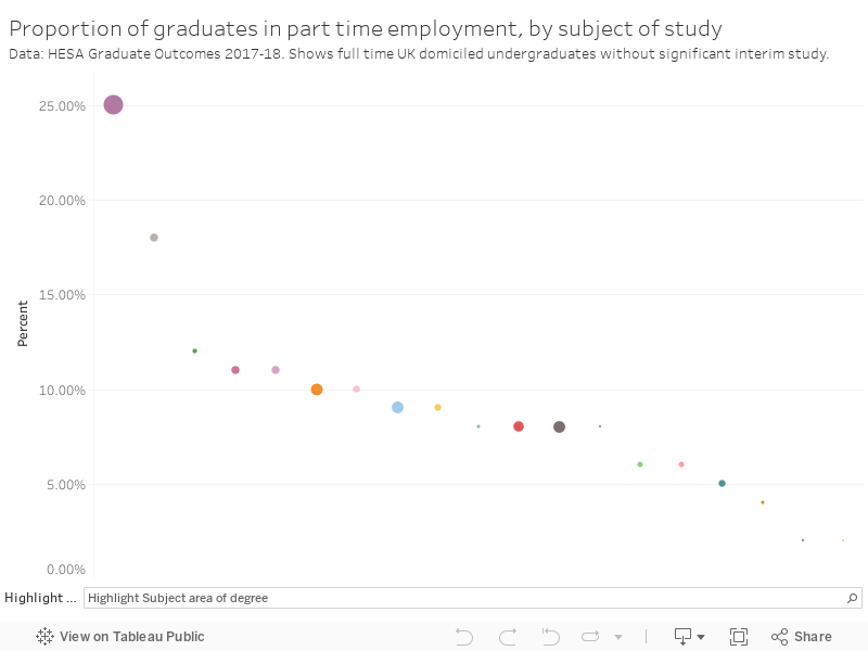
Twenty five per cent of creative arts graduates work part time. This means that salaries reported in LEO would be half as high again for a quarter of all graduates in these subjects – with obvious repercussions for median salaries after one year in LEO. A fair few other subjects get as high as one in ten.
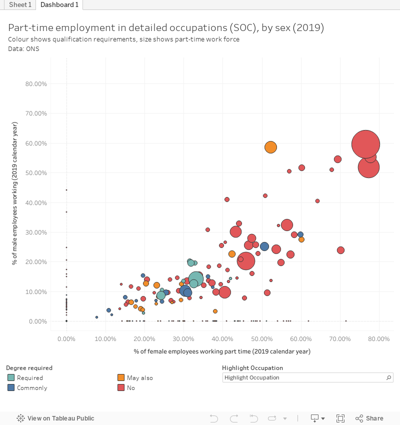
There are sex and occupation factors too. Women in the economy overall are more likely to work part time than men (teaching is an interesting exception). This chart shows occupations at the unit level of standard occupational codes (SOCs) for the whole economy- the proportion of female workers who work part time is on the bottom, the proportion of male employees along the side. The size of each blob shows the number of part time employees in that job, the colour shows whether or not a degree is required (or commonly held, a possible path to employment, or not needed).
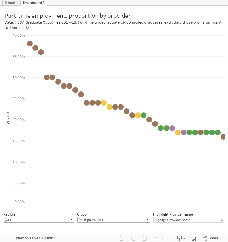
We know the proportion of graduates from each provider that work part time. As you’d expect, specialist arts providers are at the top.
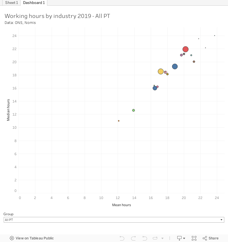
As we know what industry graduates in particular subjects work in from Graduate Outcomes, there’s even scope to do something very subtle with approximations of actual working hours from census data.
None of these charts are from LEO data – DfE hasn’t used any of these things. There’s never been any attempt to account for, or even control for, likely part time employment among graduates. I have no idea why. But it makes the data – especially for looking at the somehow now controversial existence of creative arts graduates – almost useless.
Prior attainment
How you did in your pre-university education has a great impact on how much you might earn afterwards. And to make proper use of LEO, you need to take account of prior attainment.
Here DfE takes the long way round, ranking providers into three bands (band 1 is the top 25 per cent, band 3 is the bottom 25 per cent and the rest is in band 2) based on median UCAS points for the top three A level grades. This doesn’t include providers in Scotland and Wales.
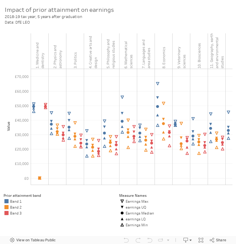
As you can see, other than for medicine and nursing – where graduate destinations are usually identical and pay scales are national – there is quite a difference in earnings five years. Because we are looking at averages between multiple providers we can’t see whether it is the teaching at a particular provider that has this impact, indeed the repetition of the pattern makes me think we are looking at a cohort effect based on social sorting, disadvantage or quality of compulsory provision. I’ve not yet seen all this controlled for within LEO – this new presentation of data suggests that it may not be possible.
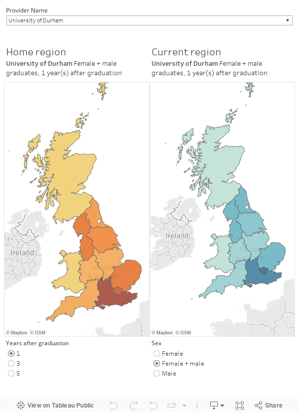
Graduate domicile
We’ve not seen detailed full cycle domicile data by provider before, so this is something of a treat. First up, this dashboard shows the full “Cotton Eye Joe” (where they come from – left map, where they go – right map) for graduates from each provider one, three, and five years out from graduation. I’ve also marked on the location of each provider (as a white circle) for reference.
DfE does have a model to take account of graduate domicile via a simple regional weighting. It’s not particularly sophisticated (it tends to give most figures an uplift), but it does have a visible impact on the median figures for each provider. This visualisation shows the difference between the original (unweighted) median, and the revised (weighted) median for each provider by broad subject – quartiles and details are in the tooltip. You can look at figures for 1, 3, and 5 years after graduation and as always there is a difference by sex.

The methodology gives Wales, Scotland, and Northern Ireland based graduate salaries a particular boost – Cardiff economists do better after five years than Cambridge economists using this weighting for instance. Much better for comparing providers, less good for giving applicants actually salary information. It’s far from perfect but neither is the graduate job market.
The main tables
All subjects in a provider on one tab, all providers for a subject on the other. Note that there are two levels of subject – for some reason the old JACS “Principal Subjects” are embedded in CAH2 subject groups so there’s two levels of subject filter. Have fun.

I hope it isn’t just me, but the 5-year data for law and a couple of other subjects isn’t coming up on the last table! I wonder if there’s some kind of glitch?