You may well have never heard of Watton.
It’s a small market town in the Breckland district of Norfolk. Early last week it had the dubious distinction of having the one of the highest Covid-19 case rates in England. An outbreak centred around the Cranswick Food factory resulted in mass testing and the discovery of 140 cases on 26 October.
There’s no indication that there is a rise in cases in wider Breckland. Watton is an example of what is supposed to be happening everywhere – an outbreak (defined as more than one case in a single setting) is reported, and local public health teams carry out mass testing to identify other cases before establishing safety measures that could range from physical changes to the work environment to temporarily closing the setting (in this case the factory remains open, though it has temporarily ceased exporting to China).
There are always a handful of stories like this – they make the local news or get drawn into wider arguments about working conditions. But the majority of Covid-19 cases in the UK are not linked to outbreaks.
How outbreaks work
University halls of residence are probably the best reported instances of multiple outbreaks – we saw numbers of cases rise quickly and dwarf those reported in other areas. We’ve read so much about Covid on campus, and the numbers looks so terrifying, that you would be forgiven for assuming that they represent a significant impact on the total number of cases in England.
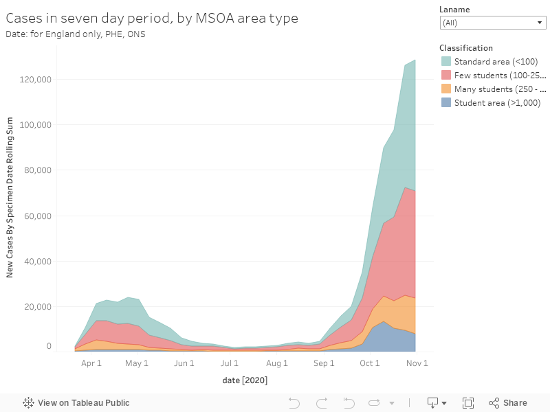
Here I’ve plotted the historic seven day rolling rates of cases for every MSOA (small area) in England. This is the best data we have on how much Covid was in circulation in a given area at a given time. And you can see where both the volume and rate of second wave cases has come from – and at a national level it is not the areas full of students in halls of residence. The overall growth comes from a steady rise in places with few or no students. I’ve used the colours to show areas with lots of students in term-time residence (over 1,000 – so likely to have one or more halls of residence in the area) in dark blue and those with a still substantial number of students (250 to 1000) in orange.
Outbreaks – be they in a chilled food factory or a hall of residence – always work in the same way. Two or more cases are reported based on the Public Health England “action cards”, local public health moves in, mass (asymptomatic) testing of potential contacts happens. Everyone with a positive test, or who lives with someone who has a positive test, has to isolate. Others in the locality, perhaps spooked by the high headline rate, may take extra precautions. A week or two passes, and the numbers go down.
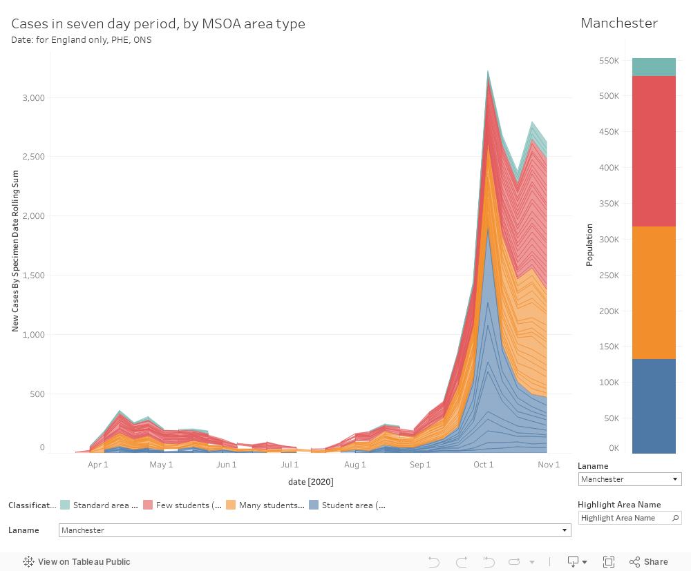
We’re see these patterns for student areas in the small area data, and an adaption of the graph above makes these more visible on a local area level. I’ve included the population of the selected local authority split by small area classification, for reference.
The outbreak management plans actually appear to be working. They’re not perfect – but the very large numbers of cases in Week 40 would (at the prevailing reproduction rates) otherwise have been expected to grow into enormous numbers. The residual slightly higher levels than expected stem from a much smaller number of outbreaks – I would contend that outbreaks are more easily identified and managed in a university-related setting than almost anywhere else. There have been new mass outbreaks, but these are linked to different providers in different areas and it is surely fair to predict that others will play out in the same way. Certainly the ONS is reporting an ongoing fall in cases among university-aged young people.
The blame game
There’s been some commentary that situates the “blame” for the second wave of Covid-19 with either students or “university managers”. Mere Covid cannot stop the culture wars, and for some any chance to attack the higher education system is one worth exploiting. If students were responsible for the continuing national growth in cases we would see a continuing growth of cases among students or in student areas. We do not – case numbers are dropping after peaks in student areas, as they continue to rise steadily elsewhere.
In Week 40 – the peak of the hall of residence outbreaks – 2.4 per cent of all cases involved people who reported living in a “residential institution” (which includes halls of residence, alongside residential schools). A further 1.6 per cent involved people confirmed as living in a house of multiple occupancy. Fully 78 per cent of cases involved people in standard residential dwellings. In Week 43 figuresfor both student linked residential settings are back under a percentage point.
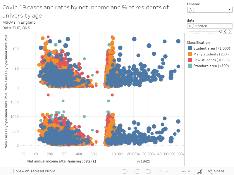
This is doubly surprising when we consider the prevalence of Covid-19 among young adults in the early autumn. Chris Whitty’s “heatmaps” now show case numbers rising in older adults. This plot shows the 7 day number and rate of Covid cases in every area of the UK against net annual income (you can see a very mild relationship between low income areas and Covid cases currently) and the percentage of the population between the ages of 18 and 21. You can scroll through week by week using the date filter.
Late September and early October looked scary, as university terms started across the country. But as we move out of October the peaks (primarily around halls of residence) drop while the background rate continues to rise – and in cities in the south of England the same pattern will become apparent. And as we’ve seen, it is the background that drives the rise in overall volume – there may still be peaks around some universities, but these will also fall away quickly.
Alternate reality
What would have happened if students had not returned to campus this autumn? Clearly the peaks in student areas would not have happened – cases around individuals who arrived on campus carrying the infection would have been scattered around the many areas where young people are domiciled. Others would still have been infected, but outbreaks would not have been identified, and the many asymptomatic cases that drive the hall of residence peaks would not have been detected. The wider rise in cases from early September would have still happened – perhaps, with less rigorous testing and isolation among the young, at a faster rates.
The longer term impacts of Covid-19 on young people is still largely unknown. We don’t know the prevalence of “long Covid” or the risk factors associated with it. It is a risk to young people and young people should not have been exposed to it in the way that the mass migration at the start of term led to. As things look currently, the risk in students returning home is probably lower than the risk of moving about a million other people around the country. Still not something you’d do lightly, but a lot better than it would have been running another mass migration even four weeks ago. January may well be another matter, of course.
It could be argued that the early student peaks offered an early warning of the wider second wave. The government did not spot this, but neither did anyone else.
Bonus data
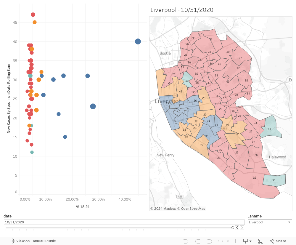
I’ve put together a location based dashboard for you to explore this data further. The colours of areas relates to numbers of students in an area, the text on the map to the number of cases. The filters control both graphs, and you can click on a mark of interest on the graph to see the location of a small area, and use the date slider to track changes over time.