It’s the moment all wonks (with a little spare time on their hands) have been anxiously waiting for. Three weeks ago we launched our open competition to find a logo for the Office for Students.
We were inundated with submissions, ranging from the great, to the good, to the catastrophic. Most carried the theme of satirical scepticism, but they also reflected the sector’s hopes and fears for our future quango overlords.
The Winner
The winner is the below entry from Jonathan Dempsey of Kingston University. We felt the design aptly reflects the OfS’s duties to facilitate the market, and we look forward to Boxing Day, Spring, Summer and Autumn sales.

Jonathan wins one of our highly sought after #WonkLife mugs.
Runners Up
Two entries merited a runner-up acknowledgement. The first from Ben Verinder, perhaps will give some inspiration for the first OfS Chief Executive:

The second, from Mike Strong, points to concerns about outsourcing and privatisation in higher education:
Honorable Mentions
Rob Griffiths of NUS suggested that continuity should prevail over change:
A less complimentary anonymous entry:
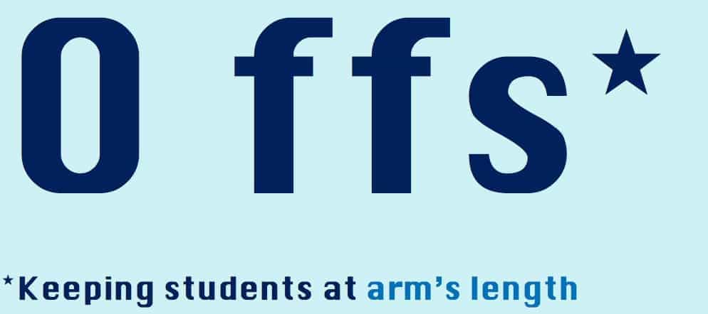
One reader suggested a uniform for the regulator’s new search and entry team:

Our ideas
When we announced the competition we suggested our own ideas, including repurposing a current education regulator’s branding, an unlikely brand partnership, and the (sadly) probable and rather bland choice:








Doesn’t the winner look similar to….. Think Sofas, think DFS?