The university logo – always ubiquitous across campus, sometimes reviled, sometimes fading into obscurity.
They can also invoke real passion and changing logos can cause real controversy as the University of California found out recently when last year they announced plans to scrap their historic crest in favour of the blue and yellow ‘smudge’ or ‘toilet bowl’. The strong reaction to the new logo forced managers to abandon the redesign and return to the historic crest that they had used since the institution’s founding.

University of California logos – old (left) and proposed new (right)
UK universities spent much of the zany 1980’s and 1990’s dumping the use of their crest in main logo and replacing it with more modern icons. Although few of these newer designs have stood the test of time.
I’ve heard from more than one university marketeer that the crest is likely to make a serious comeback as universities increasingly attempt to send signals about prestige – something that is hard to communicate through funkier or overly complicated designs.
Have a look below at the University of Lincoln’s new more serious logo featuring the university crest. This replaced their previous, which for more than ten years was a representation of Minerva, the Roman goddess of wisdom and knowledge.
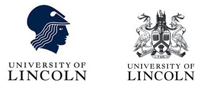
University of Lincoln logos old (left) and new (right)
 The University of West London has an interesting Logo history. Originally Thames Valley University, the institution’s logo was based on Da Vinci’s ‘Vitruvian man’. This was replaced with a simple logo where the TVU letters were shapes on a background of water, representing the Thames, which runs through Reading, via Slough into London. In 2011,
  TVU became the University of West London and a new logo was introduced which incorporates a westward-pointing wing of a griffin, a figure associated with west London, on a modernised U (for university) shield.
Others have taken a more subtle approach to their logo evolution. De Montfort University changed theirs in 2008 by altering the shade of red on their griffin from brighter red (on top) to the more ‘confident’ darker red. Of course, small changes have just as wide and expensive implications as the bigger revamps, as signage etc. all need to be updated – and the design job alone that resulted in the deeper red was reported to cost in the region of £250,000.
 The University of Warwick recently came under fire from students over it’s £80,000 (cost so far) rebrand. Hiran Adhia, a student at the institution, recently opened a petition asking for the university to reopen their consultation process which, so far, has received over five thousand signatures.
The new logo’s minimalist design is a stark contrast to the institution’s previous. A document released by the university names the colour of the new logo as ‘Warwick aubergine’. In a YouTube video posted in an article on the student website, The Boar, the logo is called ‘ugly, ‘disgusting’ and ‘bizarre’. A second year Economics and Politics student, Alex Shaw, said “It looks like a child has designed it. I fail to see how this represents Warwick at all.”
 On the other hand, an article, from Jack Hilton, on The Boar defends the logo giving a voice students at Warwick who haven’t signed the petition “who, by my calculations, are 18,000 strong.” Hilton points out that this is ore of a ‘branding’ than a re-branding saying that ‘University of Warwick’ with the ‘flicky’ R was merely a title. He argues that in an increasingly commercialised world a business needs a strong brand. In Hilton’s words “If McDonald’s can be known by its golden arches, then why can’t Warwick be known by its multicoloured upside-down triangles?”
We’re collecting a gallery of university logos – the more unusual the better. So far, former polytechnic institutions have proved the best source which is unsurprising given many of them were founded during a more ‘interesting’ period for British design.
But we’re particularly interested in older logos from the ghosts of HE marketing past. Please send them in to us and we’ll put it in the gallery below which we’ll frequently update with the most interesting examples that we find.









Ah, you’d have enjoyed the whole Trinity College/Trinity Dublin/Ryanair (blue) debacle over on this other island. http://www.universitytimes.ie/?p=32152 https://brianmlucey.wordpress.com/2014/04/02/further-thoughts-on-tcd-rebranding/