

Where do graduates live (Census 2021 edition)
David Kernohan is Deputy Editor of Wonkhe
Tags
So there’s a chunk of Southwark, just over Tower Bridge, where nearly 85 per cent of the population have a higher education level (level 4 and above) qualification.
Meanwhile, an area just north of Bridgewater in Somerset has just 6.73 per cent of the population with a qualification at that level. These – clearly – are the extremes of what is a very uneven distribution of graduates across England and Wales – as described in new data out from the 2021 Census.
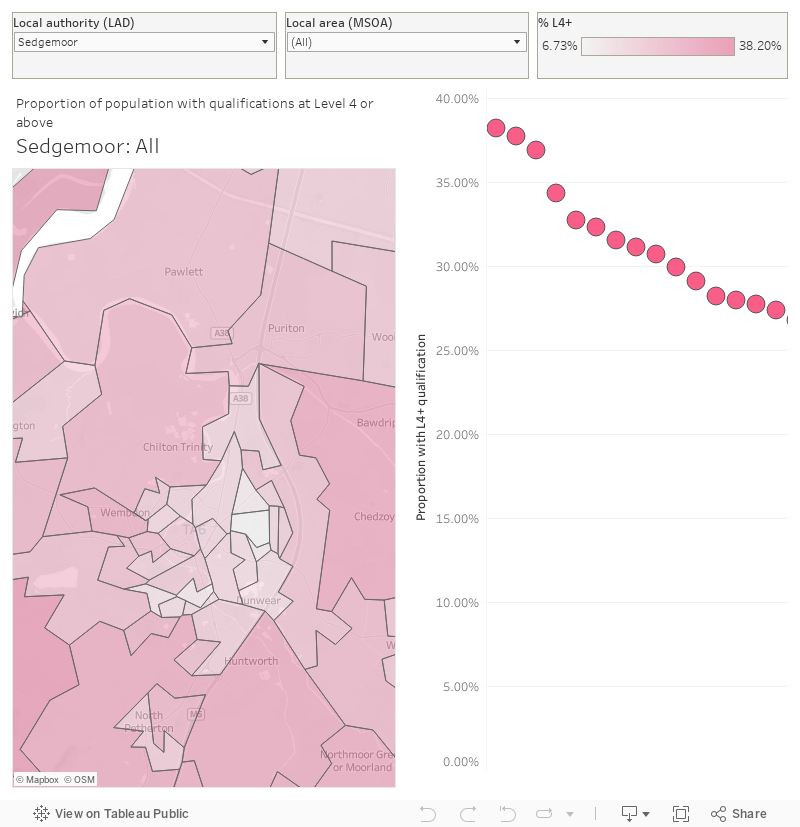
You can select local authority (LAD) and then small area (MSOA) using the filters on the top – the resolution of the data is LSOA. The chart on the right ranks LSOAs by the proportion of people reporting a Level 4 or above qualification as their highest level of education, if you mouse over the mark you can see that area highlighted on the map over on the left. The map controls allow you to zoom in and out as required.
There’s two parts to the release – information on where full time students over 16 live has already been released as part of the work dataset (I’ve plotted this for you already), with this new version unhelpfully including school children over 5.
So I’ve focused on the highest qualification data here – with the point of comparison being that 33.8 per cent of people over 16 in England and Wales have a level 4 or above qualification. This has risen by around 5 percentage points (equivalent to about 4 million people) since 2011, though we need to be careful in making that comparison as the structure of the question has changed since then.
Though ONS is shying away from multivariate analysis at this point, I’ve done a little comparison of the proportion of students in a small area with the population of graduates in each area as a scatter plot.
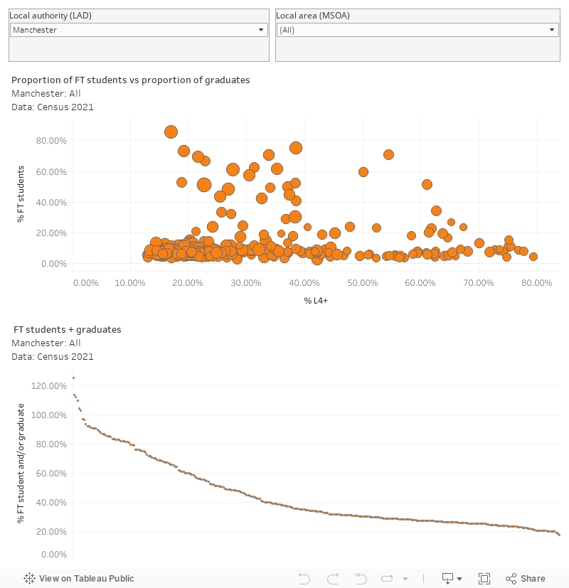
Again – select the local authority and (if you wish) small area of interest using the filters at the top. The proportion of students is on the left axis, the proportion of graduates along the bottom, and the size of the dots shows the population of the area.
Here, we need to bear in mind that undergraduate students are not going to have a level 4 qualification at that point (though, of course post graduates will). So there are a bunch of areas (for example in Manchester around the University and Piccadilly areas) which have pretty much everyone either a student or a graduate. It’s a rough and ready indicator of where “higher education areas” are going to be in a city, so I’ve added this as the bottom chart on this dashboard.