

What happens if you plot social mobility data against Proceed?
David Kernohan is Deputy Editor of Wonkhe
Tags
There’s a lot of very good reasons not to plot the Sutton Trust/IFS course level mobility data against the Office for Students’ Proceed data. The former is based on decades-old LEO and recruitment data, the latter on comparatively recent HESA stats (Graduate Outcomes and Continuation). The former is multi-cohort, the latter looks at the most recently available data for both measures – not the same cohort of course, that would be far too elegant. Many providers, including some particularly famous ones, don’t feature at subject level in the Sutton Trust IFS data at all.
On the face of it what a provider – and what a subject area within a provider – was like fifteen plus years ago has very little bearing on the quality of provision in more recent years. Not that this stops Discover Uni presenting LEO data like it meant anything, but in serious research and regulation we do need to separate off historic performance from current output quality.
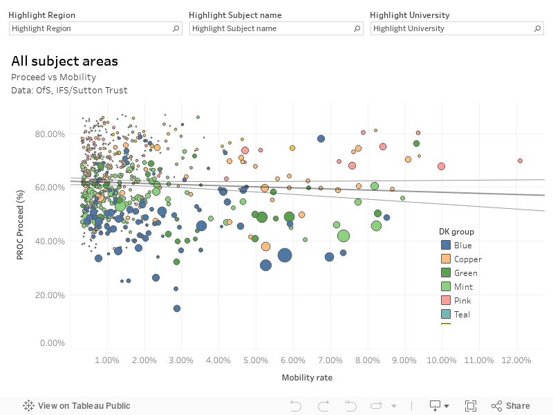
Finally, compound measures are unwieldy to think about and not consistent as to what they tell us about provision. I usually plot them as scatter graphs because high x, low y is very different from low x, high y – a different problem, a different story. Here I’m plotting a compound measure against a compound measure, which makes me unhappy.
That said, there are some interesting effects visible with this plot:
- There is clearly no correlation between social mobility performance (access, salary for access students) and proceed performance (continuation, graduate job or similar). This is a finding diluted by the extreme cohort mismatch, but is enough to suggest that a strength in social mobility does not always lead to weaknesses in continuation or graduate job access.
- I’ve plotted the raw number of FSM experienced graduates (from the Sutton Trust/IFS data) as the size of the blob – there does seem to be a link between larger blobs – more FSM students – and poorer Proceed scores. The blobs that score well on proceed and mobility tend to be large-ish but not massive, so we could be looking at a cohort composition effect.
- Highlighting a particular provider shows that there does not appear to be many instances of a particular subject area doing the access heavy lifting – for many larger civic-focus providers the areas that do better on social mobility also do better on proceed.
- Particular subject areas seem to be quite tightly clustered – suggesting that opportunities in particular parts of the job market these courses generally lead to are more important than someone’s choice of provider in finding good graduate outcomes – though provider choice (and not on the metrics many would expect) does look to be more important for applicants with FSM experience.
There’s probably a load more of interest in here – but for now have fun and please don’t draw conclusions too sharply if you are a regulator or minister… the data doesn’t support that kind of use.
Bonus charts
[Success (IFS) vs Progression (Proceed), and Access (IFS) vs Continuation (Proceed)]