

NSS2020 first look at data
David Kernohan is Deputy Editor of Wonkhe
Tags
I thought I’d share these graphs as soon as I could
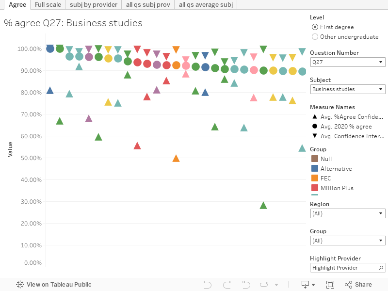
Six views of the data for students studying both full time and part time. I’ve used the most detailed (CAH3) subject split, and the “Teaching provider” data. In each case I’ve tried to present data in the way I feel it should be seen.
Tab 1 (Agree) shows percentage agree (% answering 4 or 5), including confidence intervals. You can filter to look at particular subjects and questions.
Tab 2 (Full scale) works in the same way as tab one, but shows the full scale of responses
Tab 3 (Subj by provider) lets you look at all subjects at a given provider. You can use the filter to see particular questions.
Tab 4 (all qs subject provider) looks at one subject at a provider, and shows responses to all questions.
Tab 5 (all qs average subject) lets you look at average responses for each question. You can filter by subject or view “all” subjects.