


Public Health England (PHE) is now releasing a rolling 7 day case total for every Medium Super Output Area (MSOA) in the country.
Here it is plotted against the term time residence data for 2018-19, an extract of HESA data from the Jisc Tailored Data Service.
MSOA daily dashboard (England)
This visualization was last updated on 23 March 2022.
Due to changes to the presentation of case data at this geographic level by Public Health England the old map-based presentation isn’t really working any more (but you can still see it here). Instead I’ve developed a regional visualisation allowing you to see MSOAs (the dots/circles) in a region by case rates (position in the column) and student term time residence (2018-19 data, the size of the dots/circles). As we return once again to rising case numbers across the country I’ll be updating these a little more often.

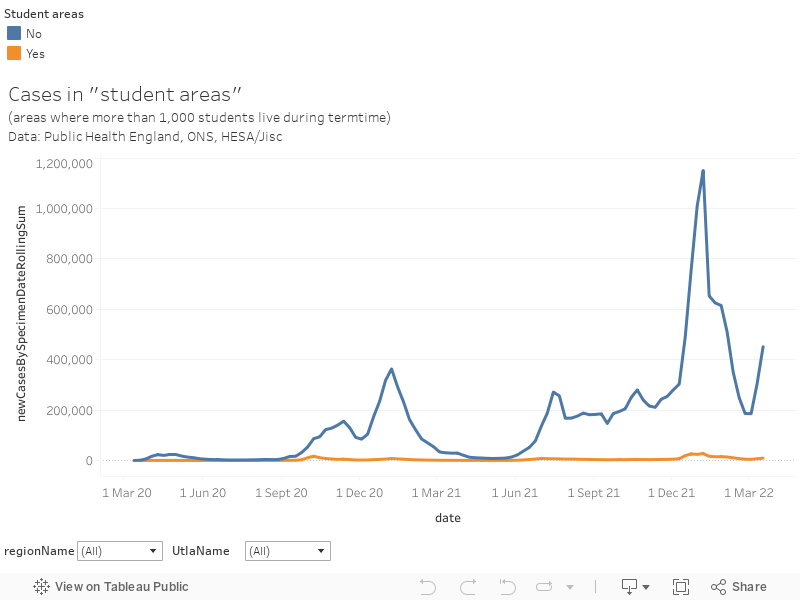
I’ve also added a visualisation tracking the change in case numbers throughout the course of the pandemic. The red shaded (MSOA) areas are those where more than 1,000 students live during term time.

And here is a detailed look at case rates in “student areas” – which I define as MSOAs with more than 1,000 students in term-time residence.
On 16 November the data was refined by reassigning cases to the address given while testing (as opposed to the NHS registration address, which previously meant some student cases were counted at their home domicile). You can read more about what this meant here.
If you are interested in the stories behind the data, or term time residence data for Scotland, do have a look at my earlier article.
MSOA daily dashboard (Wales)

Last updated 23 March 2022, based on the most recent available data for the last 7 days of cases. Public Health Wales seem to be updating these figures less often, so check the dates in the data at the top of the graph.
This visualisation is based on data from Public Health Wales (PHW), available via its own tableau visualisation. As with the dashboard for England I have added the HESA/Jisc student residence data for 2018-19 and locations for campuses where higher education is available.
(Historic) LSOA weekly dashboard
This is the same graph as previously. It shows much smaller areas, but the data is a week old – and updates every week.
I last updated this on 8 October 2020, for Week 40. As of the following week we are told that the government is “no longer publishing data at LSOA level on advice from the Statistical Disclosure Control unit at the Office for National Statistics.”

Keen readers will spot a new feature – I’ve included data on the estimated overall population of each LSOA in the tool tip, and the population density (number of people in residence per square kilometre) is shown as the size of the dots in the graph on the left. This means that we can do an estimated proportion of residents in each area who are students, and that’s also on the tooltip.
You can look at term time residence data on the the default tab, and you also have the option of looking at (not especially accurate, but interesting) data on student home domiciles on the other one. The functionality is exactly the same as the daily graph. Visualisation nerds will be delighted to learn that I have applied a jitter to make the graph on the left slightly more pleasing to the eye, but the values shown on the tooltip are accurate.
Interesting numbers, we’re shown as having 5 cases, I know end of previous week we had 9, and now we have 47 confirmed in Hall’s, GOK’s how many in HMO’s. Staff who live locally report house parties, and total ignorance from s-TOO-DENSE whilst shopping in local supermarkets, not just ignoring social distancing but barging and reaching round older shoppers to get stuff off shelves. Local COMMUNITY spread is now inevitable, and Universities will be squarely and rightly in the frame for being the source.