


This year’s National Student Survey carries a lot of extra weight – however the Department for Education feels about the exercise it remains the gold standard for understanding how students experience higher education.
The headlines are not good. The sector wide “agree” rate on the overall satisfaction rate is 75 per cent, the lowest on record (it got down to a hair over 80 per cent in 2006, as Wonkhe readers will be aware). On every question scale, and for every question, satisfaction has declined – as would be expected.
Despite the bizarre suggestion that providers should not promote the survey to their students, 69 per cent of eligible students responded – up from 68.6 per cent last year. This is very slightly lower than the historic trend, but not notably so.
Covid-19 questions
It’s reasonable, therefore, to see the pandemic and sector responses to it as the source of student dissatisfaction. We’re aided in this by an additional bank of six questions that address these issues. Sadly, the decision was taken to offer these optionally only to those who took the survey online here – the response rate here was just 38.6 per cent of eligible students (if you’re thinking non-response bias we are assured that there is not any).
So we get data only at a sector level – with some student characteristics and nation of provider splits.
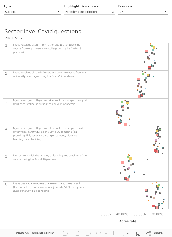
As you might expect, the clear problems appear to be with mental health support and the delivery of learning and teaching. Information provision, physical (covid) safety, and learning resources are all up at around 80 percent – though there are some subject area differences:
- Creative arts, media, and history students are the most concerned about the availability of resources – all subjects likely to be using multimedia and primary source material that may not be available digitally
- Medicine and veterinary medicine students are significantly more likely to be happier with teaching and learning – again media and creative arts sit at the other end of the scale. We should note that at the time the survey was launched, medical and some other health related subjects were receiving in-person teaching
- Social sciences students – including geography, history, law, media, and languages students – were more likely to feel that providers had not taken sufficient steps to support mental health.
It is also notable that Black students appeared to be more satisfied than average on most of these six axes, although white students were more satisfied on physical safety. Physical safety is also the only area in which full-time students were more satisfied than part time students – most likely because part-time students were less likely to be on campus.
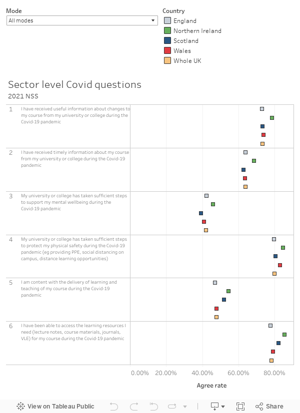
Students in Scotland and Northern Ireland reported being more satisfied with learning and learning resource provision – the latter group were more satisfied on most axes, but students in Scotland were less satisfied with information provision and mental health support.
The main survey
Although response rates and the number of providers and subjects represented are broadly comparable to previous years it is still right to be nervous about including 2021 in a time series. So quite what the OfS’ “experimental” three year average release (parts of which are familiar to many as a part of TEF data) is all about I’m not sure.
For me it makes sense to look at differences between actual and benchmarked agreement at provider level – the benchmark is constructed from this years’ data and thus takes account of novel impacts on groups of students with characteristics as a result of the pandemic. The percentage point difference between the actual and benchmarked agreement can therefore be attributed purely to provider differences rather than differences in the makeup of the student body.
This is an adaptation of last year’s visualisation which shows differences from benchmark by question – you can find a provider of interest with the “highlight provider” function, so you can see a dot representing it among the spread of the sector’s performance. Clicking on a dot shows the full data for that provider in the panel on the left. Green colouration shows statistically significant positive differences in performance, red shows negative. And there’s a filter allowing you to switch between this year and last year.
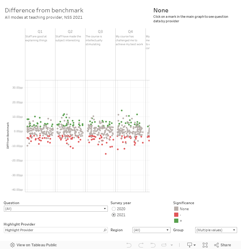
It’s worth filtering out smaller providers with the group filter (I’ve done this for FECs and Alternative providers as well) – and if you just look at a single group you can see that here performance below the benchmark is much more common than last year on all questions.
I’ve also done a ranking looking just at larger providers (omitting alternative providers and FECs, though you can add these back in via the filter).
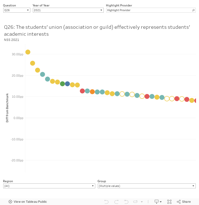
Students’ unions are interested, to say the least, in Q26 on the way unions and guilds represent students’ academic interest. Sheffield tops the pile of large conventional providers this year, performing over 16 percentage points above their benchmark.
Subject splits
Whereas press coverage usually focuses at provider level, the NSS is used within providers primarily at subject area level. We’ll start at sector level and CAH level 1.
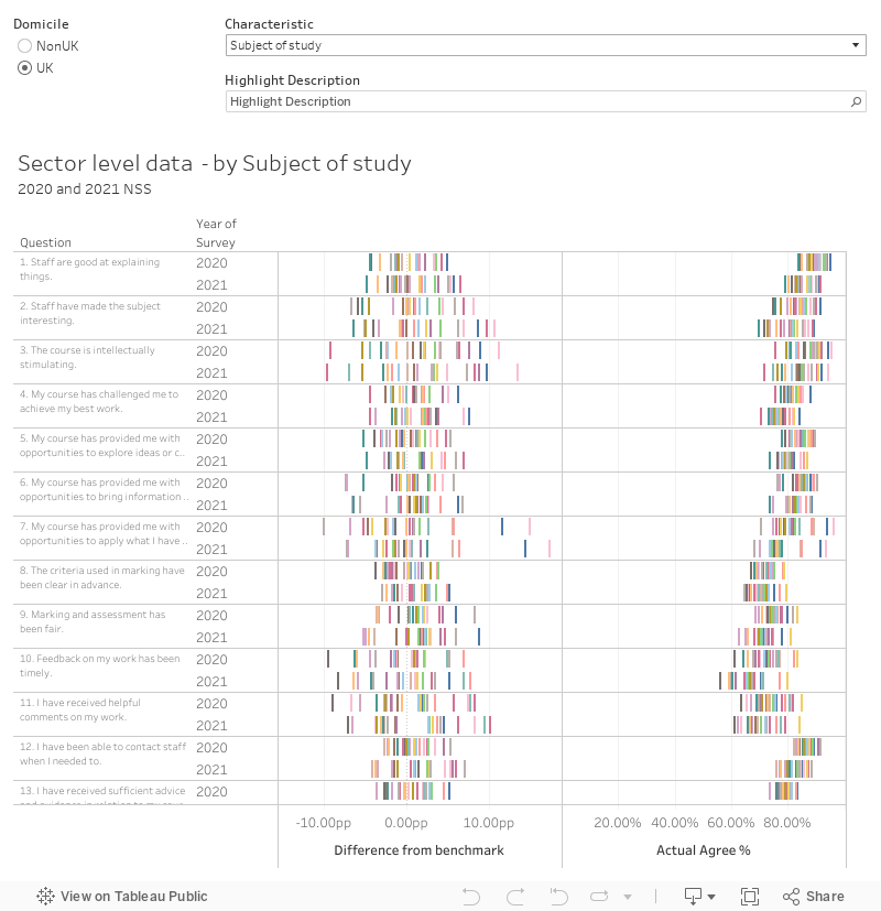
Using the description highlighter we can see – for example, that creative arts students tend to be more satisfied than peers on assessment and feedback (scale 3) and academic support (scale 4). Indeed, creative arts students reported being more satisfied in these areas this year than last.
History students were more likely to report that their course was interesting (Q2) and intellectually stimulating (Q3) this year than last – and are generally more satisfied with every aspect of their course apart from learning resources (scale 6). Law students generally report feeling less like part of a community (Q20), and having had less chance to work with other students than their peers (Q21) – this trend has worsened in 2021, as has a poor score on student voice (scale 8).
We don’t get benchmarks at provider and subject level – instead I’ve plotted raw percentages for each of the five possible numerical responses. There is a body of opinion that suggests the proportion of disagree (1 and 2) responses is of more concern than the proportion of that agree (4 and 5) so I’ve ranked the list in this way for each question. Firstly here’s a plot by provider for a chosen CAH level 1 subject, as above:
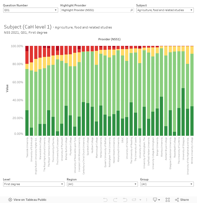
And the same for CAH level 3:
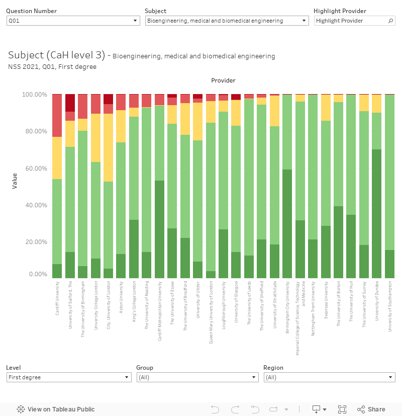
For each, you need to select a question number or scale and a subject using the filters at the top. There is also a highlighter to help you find providers of interest. You can flip between first degree and other undergraduate subjects, and filter by region and group, at the bottom.
These graphs should very much be used alongside an understanding of the subject area provision in question, especially at CaH level 3. Any number of local and specific issues could show a larger level of disagreement on a given question. It’s also worth bearing in mind that smaller groups of students are more likely to show outlying results – some subject areas at some providers are very small, and just one unhappy student could have a disproportionate effect.
Do you do a breakdown by Cathedrals Group?
I don’t – some cathedrals group members are also in larger groups so I focus on those. Because mission groups are self-selecting, I like to have each provider in no more than one group.
There seem to be some alignment issues with the page – I can’t click on the drop-down menu (or the buttons) towards the right side of the vizzes.
This is an issue on smaller screens and is just a part of the “charm” of Tableau. If you use the full screen links it should work.
Thanks for your report. I wondered how do determine which providers to include – is there a list of these institutions I can access?
I don’t know of a single list – but it is all registered providers in England, Wales, Scotland, and Northern Ireland plus anyone else delivering HE who wants to.
Interesting work David, thank you for the effort. We have a (slightly biased) question as to why LAMDA (Lamda Limited) is included in the Alternative group rather than Small/Specialist? We participate in the main HESA Student record rather than Student Alternative, and have recently been granted Degree Awarding Powers (if that has any impact)
The way I group providers is something that I’m hoping to take a serious look at over the summer.