


In university financial terms, 2021-22, was another anomalous year in what is fast becoming a decade of them.
HESA’s finance data is a treasure trove for those seeking to understand how the sector weathered these and other storms. There’s so much in there – in fact – that we need to be quite selective about what we cover.
As large businesses exposed to international market conditions, to the policy “weather”, and to the court of public opinion, universities are subject to a range of potential financial pressures. It has already become a cliche to say that the sector faces a perfect storm.
The release of this latest data shows parts of the sector in rude health, while others are clearly beginning to struggle. Whereas you could argue that this is the market working properly, it is difficult to feel anything but sympathy for students facing a decline in the quality of their experience on a course that was truly world class when they started it, and for staff increasingly required to take on more work without the commensurate rise in pay or resources – especially as this financial strife is a policy decision rather than a natural disaster.
2021-22 in review
September 2021 saw Covid restrictions ease, and further issues with logistics as we embraced the sunlit uplands of Brexit. It saw further polarisation in recruitment, with selective providers beginning to limit intakes and others attempting to grow them. The end of the academic year was dominated by concerns about energy prices and rising inflation – these, along with further pressures on logistics, being an early legacy of the illegal invasion of Ukraine by Russia.
UK politics was also far from settled – with the summer of 2022 given over to a long and painful conservative leadership election following multiple cabinet resignations forcing out Boris Johnson, leading to the very real (though, as we would find out, short term) risk of Liz Truss as prime minister. Fee limits remained frozen (and the maintenance system fell further behind living costs) basically by default – the summers’ universities minister Andrea Jenkyns was more interested in culture wars sallies than policy.
We saw industrial action over pay and pensions, and concerns around student hardship as a sharp rise in the cost of living showed up the current maintenance arrangements as being unfit for purpose. We saw a larger than expected cohort of students push up against the limits of campus and local infrastructure – pressure on accommodation saw some bussed in from halls in neighbouring cities and others priced out of most rental properties entirely, and pressure on the campus saw lectures replaced with online provision (much to the chagrin of ministers) and spaces to work and socialise become harder to access.
Overall financial health
We turn first to the customary key financial measures – composite indicators that offer a simple test of the resilience and strategic planning of a university.
And immediately we need to bring in a caveat: a record 21 providers were unable to submit data by the deadline. Everything you see from this point will not include information from (to name just some larger providers) the University of Buckingham, Heriot-Watt University, Coventry University, Rose Bruford College of Theatre and Performance, Spurgeon’s College, University of Northampton, the University of Keele, The Royal Central School of Speech and Drama, University of Chester, Leeds Conservatoire, The University of Law. Even Euan Blair’s apprenticeship provider (Multiverse Group) hasn’t managed it.
Key Financial Indicators (KFIs) this year arrive in two flavours – one including the effects of yet another set of pension adjustments and one that does not. On net liquidity days you may recall that during the pandemic restrictions anything below 30 days (basically the provider would not be able to meet obligations if it lost a single month of income) was grounds to drop a note to OfS. At the end of the pandemic I can spot two well-known providers sitting below that, and a further nine at or below what would usually be an acceptable floor of 60 days.
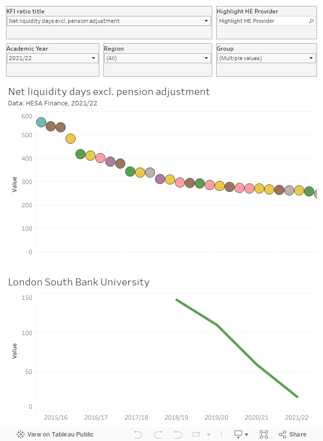
There is a KFI for everyone (there’s a full list of definitions for these available from HESA) but the bad news does tend to come in bunches.
Income: home fees and international fees
Even in 2021-22, the value of the home fee cap in England, Wales, and Northern Ireland was falling fast – and there appeared to be little government interest in increasing direct funding to deal with rising costs in any part of the UK. Universities turned to two uncapped sources of income that have rapidly become central to most providers – taught postgraduate courses and international recruitment.
Because both are in finite supply, increased competition – on price, and on being the first to a particular market opportunity – means that income is particularly volatile, with different experiences in different parts of the sector. This first chart shows the proportion of income derived from tuition fees in 2021-22 alongside the way this has changed over time (mouse over a provider of interest at the top to see the appropriate chart at the bottom).
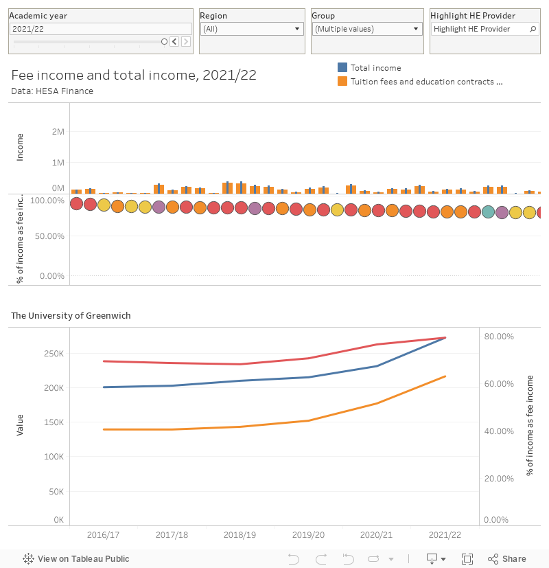
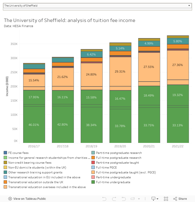
It’s notable that Russell Group providers are a group apart in terms of a low reliance on fee income – and this chart includes international and postgraduate fee income too. This second chart shows amounts and proportions within that overall bucket of fees, showing that full time UK undergraduate income still plays an important role although postgraduate fee income is fast catching up.
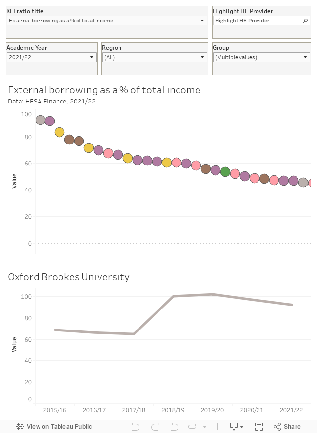
Income: borrowing (and cost of finance)
Very few parts of the sector are borrowing large sums of money directly linked to current interest rates – for substantial investment rates are usually fixed, but so are financial covenants. Should a university be looking to roll over a loan in the current climate it is likely that cost will rise unless more stringent covenants (or better environmental, sustainability, and governance commitments) are offered.
Such borrowing is generally linked to a particular project – a new building or a new campus – rather than general finances. With construction projects in particular facing rising costs and delays, borrowing linked to these is harder to manage and milestones or commitments may be missed. I’ve heard of several instances where contractors have ceased trading (due to an inability to access raw materials, reliable logistics, or skilled labour) throwing plans linked to borrowing already agreed into doubt.
There are some providers that make regular use of overdrafts and revolving credit. These are designed to deal with shorter term issues, but are less protected from wider increases in the cost of finance. Providers using services like this to sustain liquidity are likely to be facing significant additional expenses.
This chart shows external borrowing as a percentage of total income, demonstrating that large parts of the sector are very highly leveraged – and you can see when these loans may have been taken by looking at the line below. If you’ve been following campus (re)developments you won’t see many surprises here – but there’s no real pattern by provider type.
Expenditure: staff costs
Staff costs are a primary, if not the primary, area of spending in most universities. A rise in living costs has seen staff present the not unreasonable expectation that their salary should rise to match, but as provider income has (in the main) not difficult decisions need to be made in order to support this. The sector has been cutting spending in non-essential areas and seeking efficiencies in the face of fee freezes for a number of years, it is fair to suggest that there is very little fat left to cut.
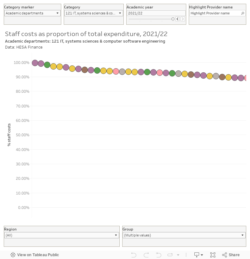
Though not every provider is spending a majority of their money on staff, if you drill down to spending on academic departments you will note that this is broadly true. This chart allows you to see these proportions across a single provider
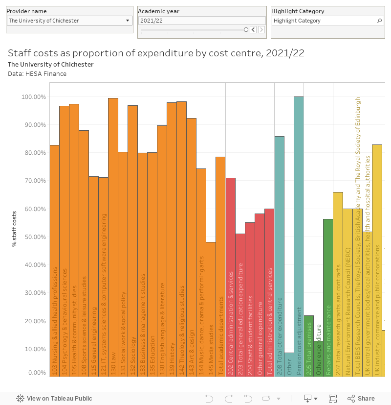
Each Subject area (note that as cost centres these do not necessarily read directly across to the departmental structure of your provider – HESA collects this data but I have no idea what it does with it!) sees staff costs vary from pretty much 0 to 100 per cent. This could show different approaches to data categorisation, but it is fair to imagine that there are also some enormous differences in approaches to teaching and student support of the sort we may fairly wish to take an interest in.
Too important to fail?
There is no in-built reason why the Office for Students needs to take such a hardline free market stance on provider failure – particularly as the pressures faced by universities in England are either entirely exogenous (war in Ukraine, global financial instability) or driven by specific government policy (fee freeze, changes to subject premium funding, the peculiarly harmful version of Brexit we appear to be doubling down on). As things stand in a time of unusually high inflation providers can only retain their current capacity by growing income, which in the main means doubling down on recruitment without the capacity investment (staff, accommodation, resources) to ensure students are getting a good quality experience.
Right now a “failing” institution is simply one that cannot or will not continue to grow recruitment, while a “successful” one is piling in more students every year whatever the impact on the student experience. We are punishing providers for failures of marketing, while turning a blind eye to failures in the student experience at their overcrowded but solvent neighbours (at least, until students graduate and can be seen in B3 data). It’s a policy that runs against everything the government once professed to believe about levelling up, upskilling, and “left behind” communities and is is astonishing that a “world leading” sector persists with it.
Let’s have an honest, proper, conversation about the shape, size, and capacity of the higher education sector the country needs. And let’s find better ways of funding and regulating it.
Bonus data: the timeseries
With data going back to 1992 in the case of most large English providers, here’s the 2021-22 update of the sector’s most comprehensive financial visualisation (based on the old HESA Resources data release).
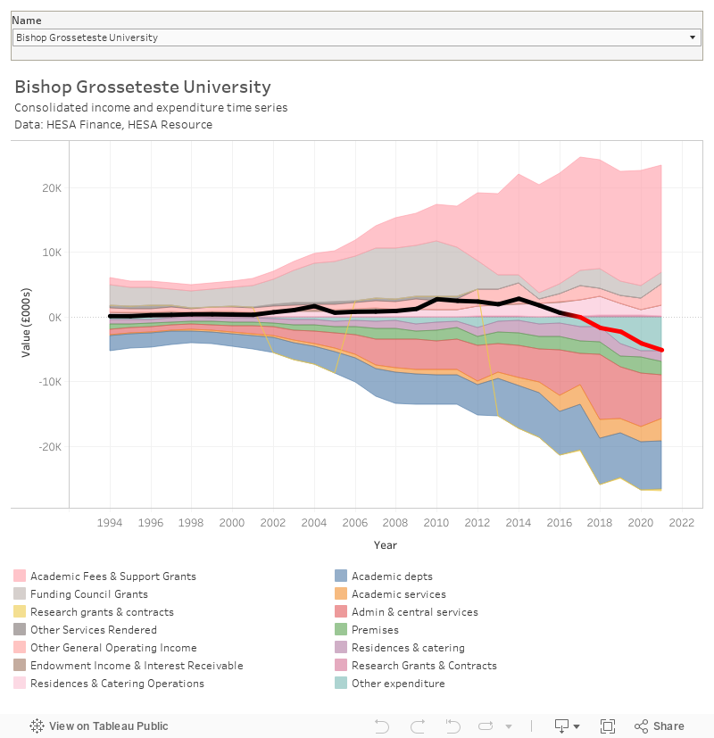
If I’m honest this isn’t spectacularly useful, but it is undeniably cool.