


I think we all look forward to UCAS end of cycle provider level data day more each year.
As a view into the recruitment successes and struggles that play out in every part of the sector it is unsurpassed.
And, more so in 2022 than ever, there are fascinating questions about the strategies and situations within providers that we can begin to trace using this information.
Up for debate
Central to this cycle has been the question of capacity. After a decade of growth (in England and Wales, at least) without limits there is a sense that the combination of two years of higher-than-expected grades and the falling value of the unit of resource (the amount of money – in real terms – available per student) has established what could be described as de-facto number controls in some popular courses at popular providers.
On the other hand, there is a perception that providers are filling places with (more financially sustainable) international students – freezing out qualified UK applicants from the courses of their choice. There’s a suggestion that some providers are using partnerships to drive growth in harder to reach populations.
And all of this has an impact on the cross section of young people that reach various kinds of higher education – there have been concerns about the more traditional widening access work (especially in light of an unequal impact from the cost of living crisis), and about the plight of very able young people from well off backgrounds – who are seen as more likely to feel the effect of capacity constraints.
And finally we see the impact on providers themselves – facing years of real-terms income cuts (forced to expand just to stand still!), struggling to invest in capacity in a newly uncertain financial and lending environment, and struggling to pay staff at the levels they should be paid in the numbers needed to offer a good student experience.
Overall
If we start at provider level, we are immediately struck by the apparent success of Canterbury Christ Church University in 2022 – up 9,000 undergraduate students on last year. I figured it was best to ask a university spokesperson, who told me:
The recent increase in student numbers is primarily due to our successful work with collaborative partners who deliver full time undergraduate courses outside of our traditional three year on-campus provision. These courses have multiple intakes/ start dates across the academic year and are run at different campuses across the UK. They offer greater flexibility and support to students who can’t commit to the traditional higher education model.
With the Office for Students increasingly interested in the outcomes of students enrolled via such arrangements, due diligence on quality and standards in partnerships will be an essential component of any expansions via this route.
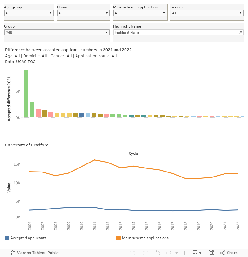
This chart shows the change in recruitment via UCAS between 2022 and 2021. Mousing over a bar at the top allows you to see a full time series on the bottom chart. You can filter on age range, domicile, application route (main scheme or otherwise), and gender) – I’ve also included a filter by mission group and the ability to highlight names. The difference in recruitment between 2022 and 2019 is shown on the tooltip.
A peep at the other end of the chart shows a number of Russell Group providers seeing substantial cuts in recruitment – places like Exeter, Edinburgh, Leeds, Bristol, and Durham. This follows two bumper years, where more applicants attained the grades needed to meet the terms of their offer than were expected.
In such cases these reductions are generally to around or slightly below 2019 levels, suggesting a controlled attempt to return to a more managed approach to growth. Such a decision will begin to return the total undergraduate population to a more manageable level, but at the cost of missing out on recruiting some very able applicants that would otherwise have been attending the university of their choice.
When I think about more selective providers I think of the “big 8”, the providers that bring in around a billion pounds of income each year (Oxford, Cambridge, UCL, King’s, Imperial, Manchester, Edinburgh, Glasgow). Here we see differences by domicile between 2022 and 2021, and 2022 and 2019 – the aim is to demonstrate that although numbers at these notably selective provider have fallen since the last (exceptional later) the number of students placed remains above the pre-pandemic norm.
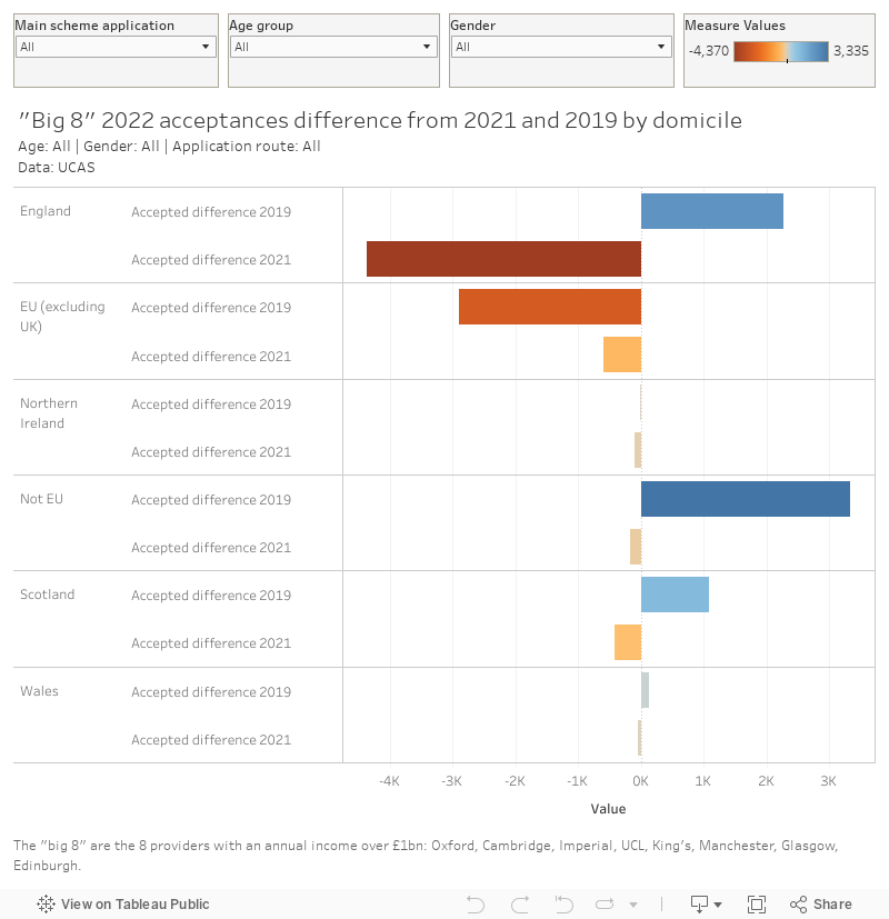
Here I have included filters by application route, age, and gender. In each domicile, the movement from 2019 is shown at the top and the movement from 2021 is shown at the bottom.
Subject level
UCAS provides data at the top level of the Common Academic Hierarchy (CAH) – allowing to look at recruitment patterns in broad subject areas within providers.
This first chart compares recruitment in 2022 with recruitment in 2021, showing provider growth and shrinkage within each of 24 subject groups.
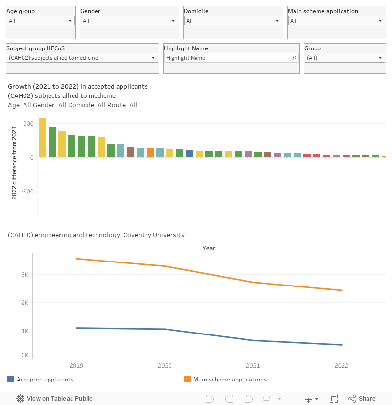
The top chart shows the difference between the number of accepted applicants in 2022 and those in 2021. You can filter by age, gender, domicile, and application route as before – and you can also select the subject area of interest using the filter on the second row of control. That also gives you the opportunity to filter the providers displayed by mission group, and highlight a provider of interest. When you mouse over a bar in the top chart you can see a full time series (2019 to 2022) on the bottom for the provider in question (all the other filters from the top will apply).
Scrolling right along that top chart with CAH25 (creative arts) selected shows you something interesting – a long tail of smaller providers who either recruited to these subject areas in 2021 that did not in 2022, or have newly entered recruitment in this area. Changes to the way the higher cost of such provision is supported in England has clearly resulted in a great deal of “churn” even within a year – though larger specialists are still growing.
Another trend of interest sees some larger, modern, universities failing to recruit in subjects allied to medicine. The boom in healthcare recruitment since the start of the pandemic has been almost axiomatic – but clearly interest (and the availability of placement capacity) has not been uniform.
I’ve also included a chart to see these changes over a longer timeline – plotting changes since 2019 rather than 2022 may show strategic rather than situational movement.
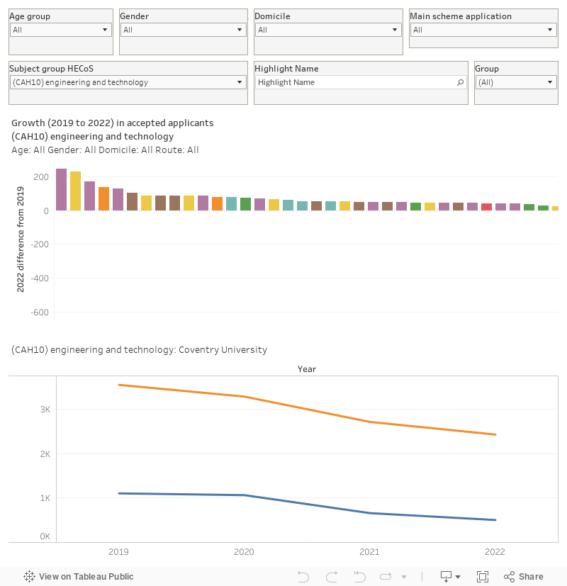
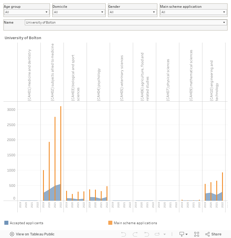
And finally, this is another way to look at application and acceptance changes within subjects within a provider.
David, the lower plot in the Subject level section does not seem to change when one selects a CAH category (or maybe it is only the title that is not changing).
Seems to be working for me. You need to re-mouse over when you change the subject area. If you’re trying to get to a view of recruitment changes by subject within a provider the bottom graph is probably more useful.