


It’s finally here.
Nearly a year later than originally expected the 2019-20 Longitudinal Educational Outcomes Dataset has been released, allowing us to look at graduate salaries and related measures for the year going into the Covid-19 pandemic.
Flaws
LEO has always been a fascinating data set with two fatal flaws – the first is that salary information does not take into account mode of work or hours worked. So to LEO, part-time work just looks like poorly paid full time work.
The second flaw is the sheer number of things that can affect graduate salaries and employment outcomes. I ended up expressing this as Kernohan’s First Law of Output Metrics:
You can’t meaningfully examine output metrics without controlling for sex, background characteristics, subject, provider, and region of residence, and any attempt to do this makes for unusably small sample sizes.
Sector level
The law, I fear, still holds. Once again we do have a lot of evidence to show that characteristics – in particular – have a lot of impact on graduate salaries.
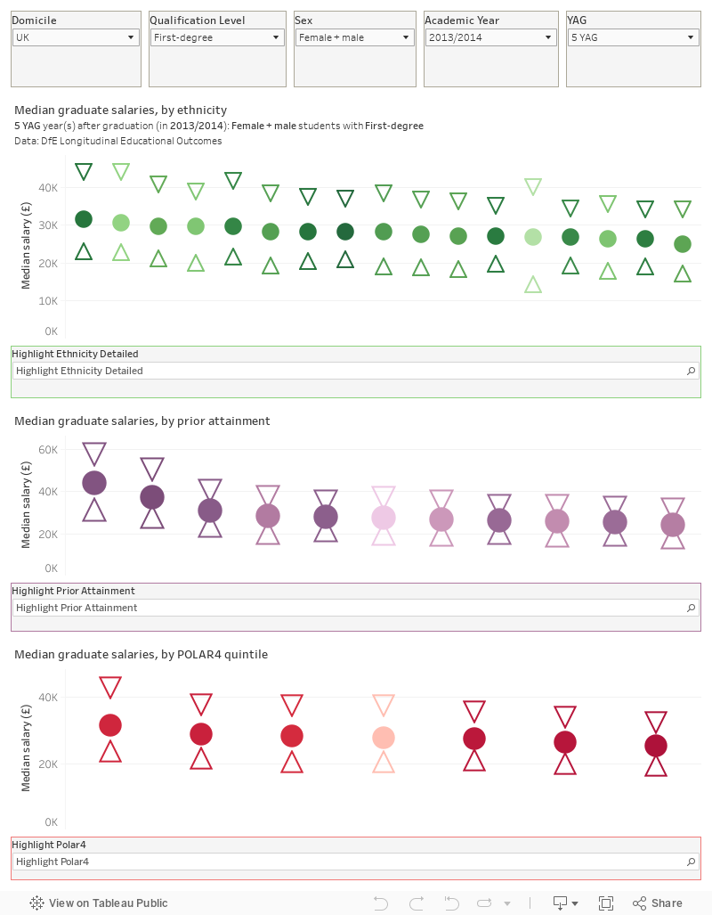
This chart, like most of those that follow, uses symbols to show the median salary and the upper and lower quartile – and I have sorted each in area from highest to lowest. You can choose the academic year of interest and the number of years after graduation (YAG) using the filters (note that the most recent academic year for each YAG is from the – new – 2019-20 tax year data. Gender continues to have a large impact on salary, and I have included filter for the level of qualification and the domicile (at a very broad level) of graduates.
I draw attention to these characteristics effects because the thrust of recent policy has been to minimise discussion these impacts – both ministers and regulators have demanded parity of outcomes for disadvantaged graduates. It’s possible to read this data as evidence that all providers fail in doing this – or (perhaps more likely) as evidence for deeper systemic issues.
There’s also subject area information at this resolution:
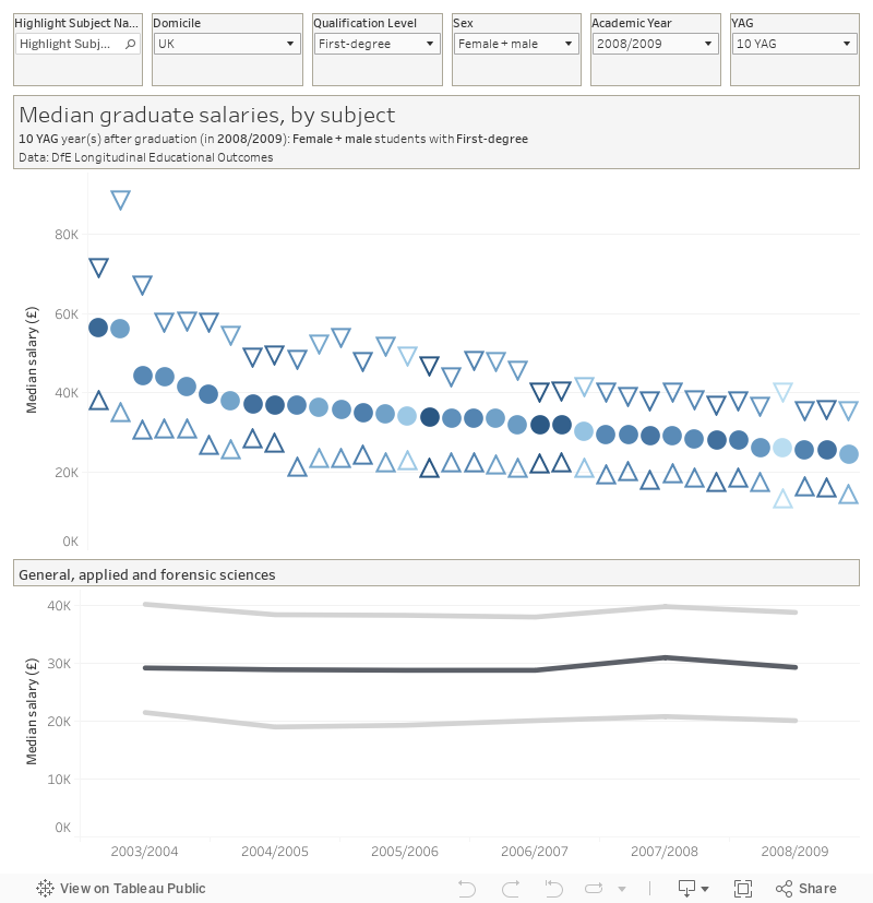
Here, the pattern is one of steady salary growth for all subject areas – you can see the time series at the bottom series by hovering over one of the subject blobs.
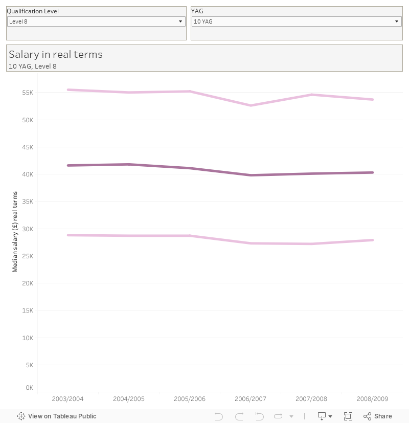
However, in these days of high inflation real terms pay is going to become more important. Here, the record thus far of the sector is patchy – though we only get this at a very high level so all kinds of confounding variables could be involved (the rising proportion of women and non-traditional graduates, the poor overall growth in UK wages…)
Provider level
It’s now possible to look at median earnings for full time first degree students by provider, subject (top level) and entry qualifications, the latter presented as tariff points. We only get this for the most recent (2019-20) tax year. Here the pale bars and the right axis show median tariff points, the marks and the left axis shows median salary. You can filter by top-level subject, years after graduation, sex, and provider type (by default we are looking at HEIs only – there’s an issue with the data when including both HEIs and FECs as for some reason some providers are tagged as both).
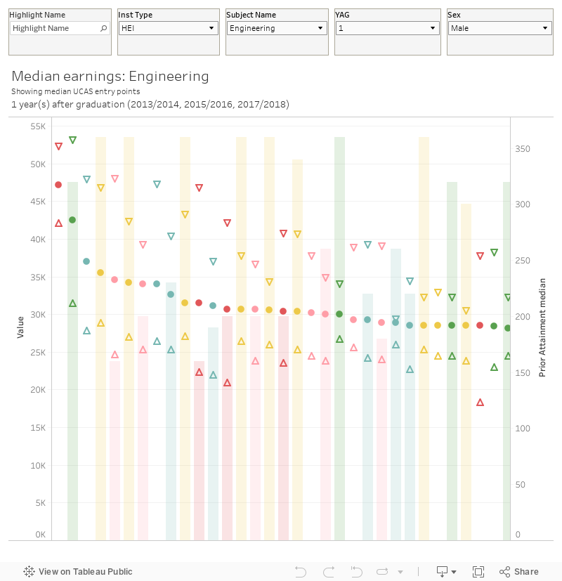
What is notable here is the influence of providers on earnings – there are clearly some universities that see graduates with lower prior attainment land good salaries, and others that do comparatively badly for a cohort with much higher median attainment.
This is not, however, direct evidence of teaching quality – some well performing provider/subject combinations relate to data from low numbers of graduates, meaning that outliers will have a disproportionate effect. But it is still fascinating to note, for instance, that Canterbury Christ Church University seems to get law graduates better salaries than Manchester or Sheffield.
If you wanted to drill right down to what basically amounts to course level, we get data (though without that fascinating tariff point detail) right down to a very low level of the old JACS subject system. I’ve set this up so you look across provision at a given provider by default – mouseing over a mark on the top graph changes the bottom graph to show all providers for that subject. There are more academic years available here too.
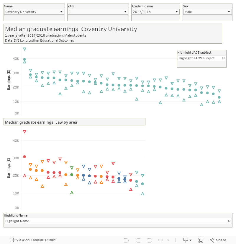
The issue here is too much detail – the vagaries of coding apply and we are dealing with very small groups of students.
LEO – but for good!
LEO is generally thought of as salary data – but the unique way it is collected (via tax data matching to HESA data, basically) means that all kinds of other information is retrievable.
As an example – here is a plot of graduate destinations (whether somebody is in sustained employment) against the proportion of graduates from POLAR4 quintile 1 (the group least likely to attend university). Each mark shows a provider and you can choose sex, top level subject, and years after graduation on the filters. The size of the mark shows the number of graduates, and I’ve also included salary in the tool tip.
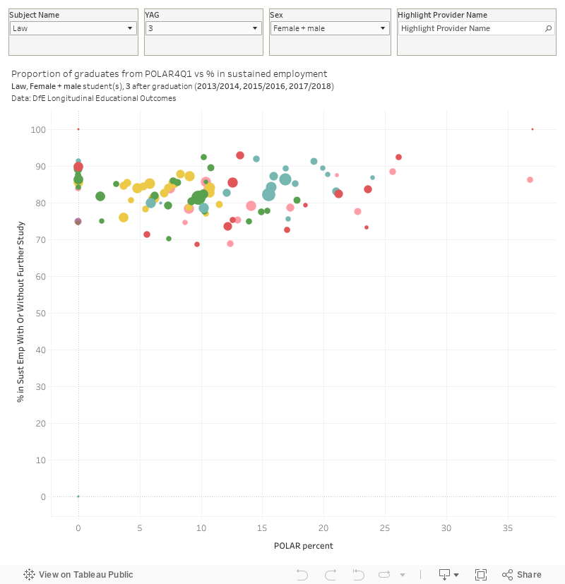
What struck me about this is that you may expect providers admitting non-traditional students to see them less likely to find sustained employment on graduation. It doesn’t, in fact, appear to make a whole lot of difference.
Where next for administrative data
You don’t get to see LEO in regulatory data – the closest we get to that is seeing the median salary data appear in something called “Discover Uni” and some of the regional information in the “geography of employment”. Once the great hope of data-driven regulation, the emphasis on median salary didn’t stand up to scrutiny.
But there are a lot of other things in there – and in its own quiet way LEO offers a challenge to some of the new orthodoxies in the “poor quality courses” landscape.
You may recall that we got fascinating graduate industry data earlier this year – though this has been updated on the Unit for Future Skills dashboard there’s been no sign of the underlying data in a usable format. DfE tells me these sheets will be “hopefully” added today.